Redesign Artist pages
I would like to see a mobile design for artists pages similar to the YouTube music app  The image scales to a square with the buttons and artist's name centered
An Interesting thing I've noticed that's been bothering me is that the banner for the artist is cropped when taking the image directly from the artist's page, example here
compared to in "Fans might also like" here and when directly searching for the artist here
If scrapping these places results in problems or hurts performance, I just noticed that the link preview image for an artist's page is the full image, that honestly looks like the best solution for this: https://music.youtube.com/channel/UCaPIRYCKs51kvD4jrbwMH1w
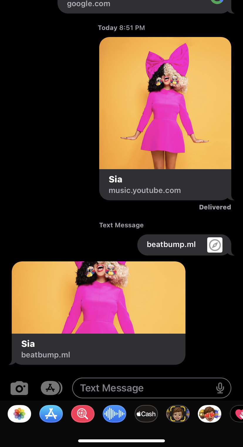
Here's how the link preview for YouTube music looks compared to Beatbump
One thing I've realized is that for images, i might need to do is (potentially) make the API work in a platform-specific way. Because my logic behind this is, at the moment, that if someone on an iPhone/Android phone and they share, then we'd want to use the mobile-specific image instead of the desktop specific image.
I've been pondering how to do this exactly, since it would require extending how the API functions presently, but I've been keeping an eye on it and testing it out! One other thing I kind of remember (but haven't looked at in awhile) is that there's a query param for images (for example, thumbnails) that when removed, it makes the image appear 'bigger'/as intended