Custom colorization of scales
I love this app, thanks a lot for making it available!
For better usability, I think it would be useful to change the colors of scale. There are too many colors (white and black for non-selected, yellow/brown for selected...).
My preference would be to have something like grayed-out non-selected keys and highlighted selected keys (even same color would be ok, don't need to have black/white I'd think).
Given my preferences are subjective, having customizability could help
Interessting idea, can you create a simple example of how it might look like?
Implementation wise it could be a selectable theme. Predefined themes are quite easy to implement, the biggest part is the customization screen.
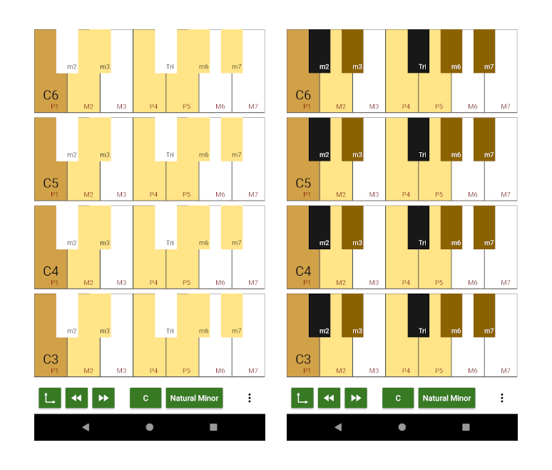
The idea could be to make all non-selected keys white, and selected keys yello. What I find hard to understand is that there are basically 4 colors when you pick (for example) a natural minor C:
- Yellow: D F G
- Brown: C Eb Ab Bb
- Black: Db Gb
- White: E A B
I think it would be better to have only 2 colors, so even sharps/flats would be yellow if selected or white if unselected. It'd be ok to use brown for the tonic.
I'd pick such color scheme w/out bothering with customization, as I do understand customization makes the task harder :)
So it would use three colors:
brown for the root note (=tonic) yellow for members of the scale white for all other keys
I'll give it a try, did you mean something like this (black keys still need frames):
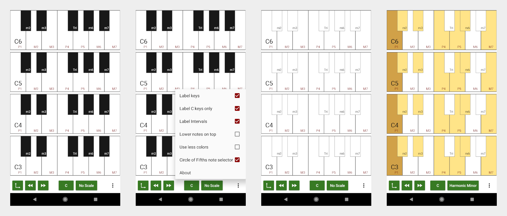
Uhm, it's still confusing.
How about just overlaying a little colored circle above the key ? Just like the labeling. Maybe only labeling the keys which belong to the scale
Hm ... I am used to this kind of colorization from a couple of DAWs, e.g. Renoise:
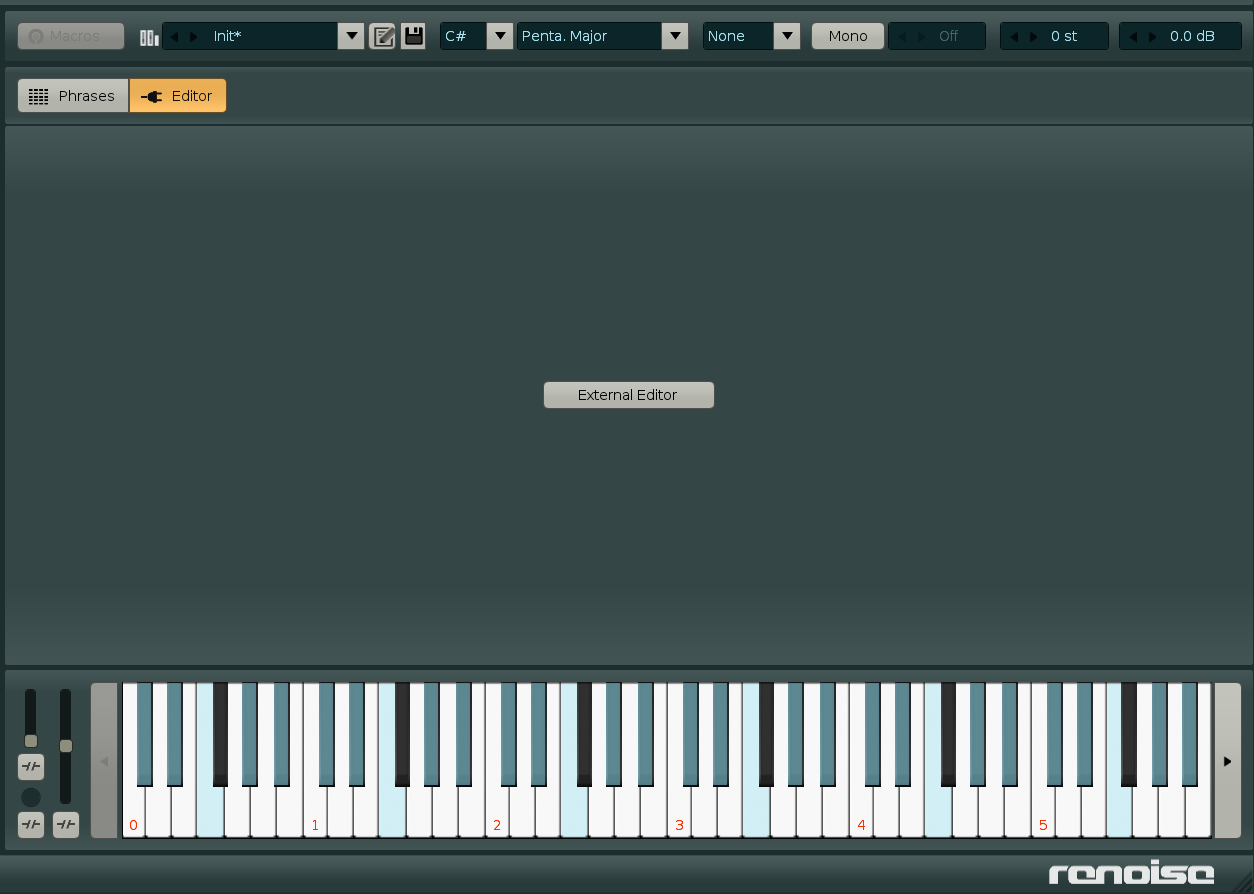
Colored circles would be nice although it requires reworking the drawing routine. Or maybe just coloring the lower 10% of each key in a rectangular way (also new drawing routine)?
I think at some point I need to redo the drawing routine anyways.
That image captures my attention to the very only black key, which is intead supposed to be disregarded (or not? I'm not sure what I'm looking at)
Indeed it does. Still I like the way it is done, since the scale is just an overlay over the usual black and white keys. For me it is easy to see which keys are part of the scale and which not. Even if it means that a single key sticks out visually.
The image is for the C# Pentatonic Major scale.