 slidevjs
Check if dark theme is enabled to conditionally render images
Is your feature request related to a problem? Please describe. When I have an image with black text, it only looks good in light mode and vice-versa.
Describe the solution you'd like
Something along the lines of $slidev.isDark
Describe alternatives you've considered Helper image component that has two sources for the light and dark theme
You can do that programmatically already 😋
See eg. https://github.com/slidevjs/slidev/discussions/85#discussioncomment-727923
From there, you can build your own image wrapper to switch out images depending on the set mode.
@manniL Thanks, that worked.
I've created this simple component
<script setup lang="ts">
import { isDark } from '@slidev/client/logic/dark';

const props = defineProps<{
  dark: string;
  light: string;
}>();
</script>

<template>
  <img :src="isDark ? props.dark : props.light" v-bind="$attrs" />
</template>
But I still think something like this should be a native feature, as it's a quite common problem when using images with black/white text.
If we find a good name for it, this component might probably be integrated in slidev. What name did you use?
This issue has been automatically marked as stale because it has not had recent activity. It will be closed if no further activity occurs. Thank you for your contributions.
![stale[bot] avatar](https://avatars.githubusercontent.com/in/1724?v=4 "Published by a pub.dev verified publisher")
This issue has been automatically marked as stale because it has not had recent activity. It will be closed if no further activity occurs. Thank you for your contributions.
This issue has been automatically marked as stale because it has not had recent activity. It will be closed if no further activity occurs. Thank you for your contributions.
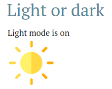
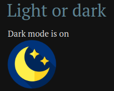
Hello, I push a commit contaning a component named LightOrDark.
You can used it to render something different between the light and dark modes (it can be anything, not only images).
Simple usage:
<LightOrDark>
  <template #dark>Dark mode is on</template>
  <template #light>Light mode is on</template>
</LightOrDark>
Render some images:
<LightOrDark width="100" alt="some image">
  <template #dark="props">
    <img src="https://cdn-icons-png.flaticon.com/512/7645/7645197.png" v-bind="props"/>
  </template>
  <template #light="props">
    <img src="https://cdn-icons-png.flaticon.com/512/1687/1687686.png" v-bind="props"/>
  </template>
</LightOrDark>
You can get the props passed to the LightOrDark component and reuse them inside the slot by using scoped slot props: https://vuejs.org/guide/components/slots.html#scoped-slots
With markdown (we need blank spaces between the template and the markdown):
<LightOrDark>
<template #dark>

</template>
<template #light>

</template>
</LightOrDark>
Example:
This is available on newly published 0.38.4 version