 siteorigin
Styles: Add Toggle Field, and Box shadow & Box shadow hover Settings
This PR adds a Toggle field for Styles and adds a Box shadow and Box shadow hover settings. These settings are able to be applied to Rows, Cells, and Widgets. If either Box Shadow is enabled and none of the box shadow settings are adjusted, the box-shadow that'll be used is: 0 3px 10px rgb(0 0 0 / 0.2).
This PR will require a build to test as core PB JS and CSS is adjusted.
Thanks, mate. Below is what I'm seeing at the moment. The build is on the demo server.
@AlexGStapleton Thanks, mate.
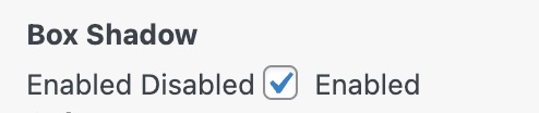
Both Disabled and Enabled display for me at the same time:
Are we perhaps able to use number fields?
The box-shadow hover effect seems to be present without me enabling that settings section.
#pg-24638-0> .panel-row-style:hover {
    box-shadow: 0 3px 10px rgb(0 0 0 / 20%);
}
I guess the field type for the settings values is consistent with what we've used for similar settings.
Both Disabled and Enabled display for me at the same time:
That's how it was in the reference image - it's to indicate which side is enabled and disabled. Although, in retrospect, the toggled state should be more obvious than the reference image.
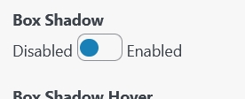
Wait... you're not seeing the toggle field. Does this build display a toggle field? (rather than a checkbox) It should look like this:
Please note that the above linked build includes the most recent commits, and the screenshot was taken before https://github.com/siteorigin/siteorigin-panels/commit/21a51a7361cdc8253e175a711a31efc83ba23f45
The box-shadow hover effect seems to be present without me enabling that settings section. I can't seem to replicate this. If you're still able to replicate this with the latest version of this branch or the provided build, can you please send me a copy of the layout you're using?
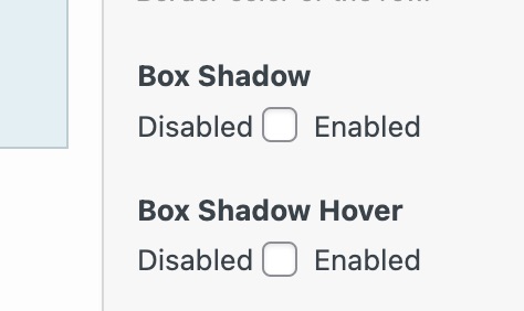
Thanks, mate. Yeah, the toggle field wasn't displaying for me. Which reference image are we using for this? I'm a bit lost.
Hate to rollback work like this but I think we should use the same pattern as we do for Toggle Visibility > Scheduling.
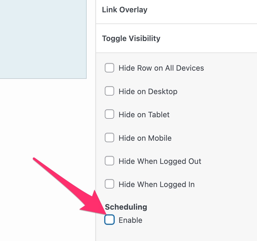
Thinking about it now. I'm ok with keeping the toggle but let's change the label to just say "Enable"
The actual toggle styling doesn't load for me. Perhaps I need to try a build?
Which reference image are we using for this?
https://siteorigin.slack.com/archives/D0MGRNNTA/p1647871476550329
Feel free to make any adjustments you would like. If you decide you actually would like how the Toggle Visibility handles things, let me know and I'll make that now.
Oh! That's what it's meant to be. My mistake.
The actual toggle styling doesn't load for me. Perhaps I need to try a build?
I'm not too sure why it's not working but yes, please try a build. Here's a build I tested just now and it's working as expected.
@AlexGStapleton This looks close to ready. Can we load up all the defaults in the settings?
When enabling hover but making no adjustments, are we loading a default as we do for the main setting? (0 3px 10px rgb(0 0 0 / 20%);)
Thanks for the effort, mate. Regarding the drop shadow on the settings. I'm keen to keep the styling as if the toggle wasn't there. Same spacing, basically and perhaps no drop-shadow for the settings.
When enabling hover but making no adjustments, are we loading a default as we do for the main setting? (0 3px 10px rgb(0 0 0 / 20%);)
Yes. Having a different default hover wouldn't be a bad idea. Do you have one in mind?
@AlexGStapleton Moving my Slack feedback here.
- Can we use
left: 9pxfor ON. - Is it possible to use
box-shadow: rgba(0, 0, 0, 0.15) 0px 5px 15px 0px;as our default. This is the Shopify example from https://getcssscan.com/css-box-shadow-examples. - For the hover default, how about
box-shadow: rgb(0 0 0 / 30%) 0px 5px 15px 0px;with a.3stransition.