sregistry website container page entries not readable
the sregistry containers page is not readable. the uri is truncated as well as entries which are too long. it could be ok on a desktop laptop but on a cell phone it is unreadable. Could it be possible to have the CSS tweaked so that the layout is ok? there is a lot of room per line.
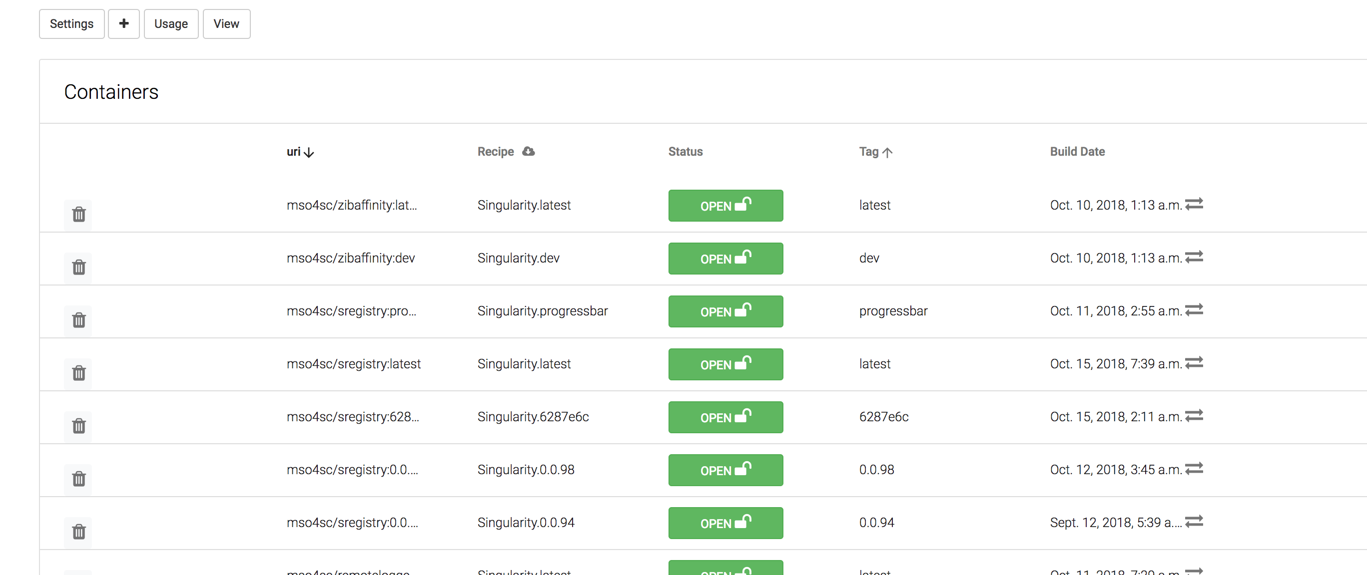
see the sregistry screenshot at CESGA for example
A few more suggestions:
- [ ] remove tag from uri, the tag is already present in the line
- [ ] hovering over a long text field should provide a tooltip with the complete text field
- [ ] in container page when clicking on an uri, provide command line to download the image
HI @prudhomm ,
I didn't try to explore the web from a mobile phone or something like that before. I agree with you that a particular collection page is not friendly. Having a more responsive view could be great. Without diving too much from my mobile, the rest of the web seems Ok.
I don't really want discuss about your suggestions. I'm not an expert and I prefer not to try to provide solutions and let the expert (@vsoch ) to think about it and maybe suggest something.
@prudhomm , the usage button in the collection view provide info about how to download and use a container with both, singularity and sregistry. See the following link:
https://sregistry.srv.cesga.es/collections/1/usage
Please feel free to make a PR with suggested changes! I’m not super experienced with mobile front end, and until you can pull a container from your phone, the site isn’t intended for mobile use. ( but I must admit that sounds cool!)
it is not only on the mobile but also the desktop. I think the CSS needs to be adapted somehow so that the ui appear properly. I will eventually have a look at the CSS when I have time
@prudhomm did you ever have a chance to take a look? Our last correspondence was almost two years ago, wow time flies!