roadmap
 roadmap copied to clipboard
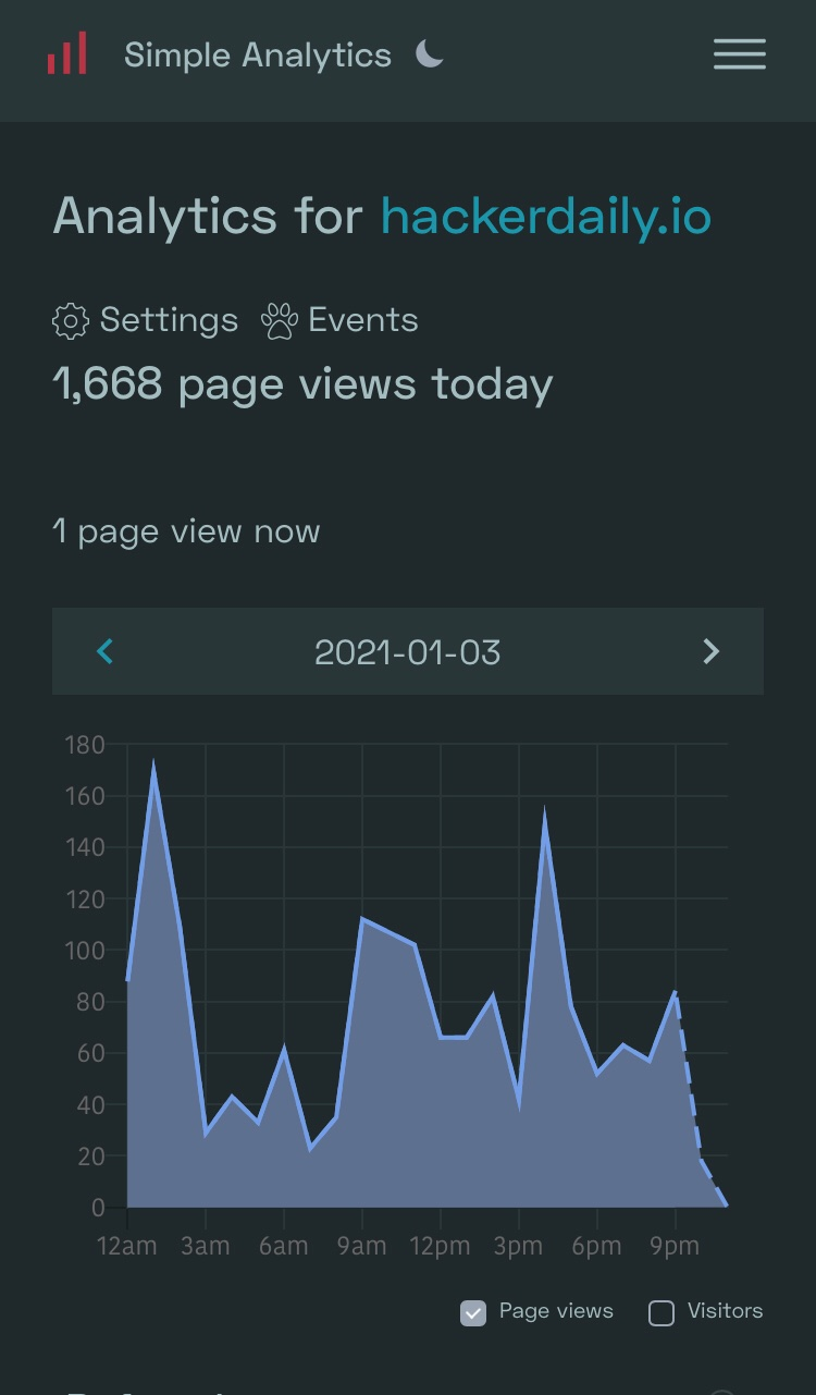
Make today dotter line in chart optional or fix it
Some customers don't like the today part. We should make this optional and just hide the while today thing when disabled.
@RubenvanEldik via Twitter DM
Thank you for taking it up!
My main issue with the dotted line right now is that it goes to 0 for all future hours. This looks a bit weird and makes reading the number of visitors in the current hour quite hard. The dotted line might be fine if it just stopped at the current hour, instead of going to 0.
This also makes more sense since you're using an area-graph, and there is now also some colored area below the current hour and hour+1, which is technically incorrect. 🙃
Well, this is only a problem in the day view. It shows all hours of the day, which is fine, but the line going back to 0 makes it seem a bit abrupt.

The problem is that the dotted line goes to 0 for all future hours. This makes it especially hard to read if the number of view for the current hour are roughly half of last hour, since it looks like the dotted line goes in a linear line to 0. (while in reality it goes from 600 last hour to 300 this hour to 0 next hour.
I can think of 3 solutions:
-
Use a bar chart. The number of visitors per hour are often not very related from one hour to the next (except if you have a big spike due to HN/Twitter etc.). Since there isn't really a trend it makes a bit more sense to use a bar chart.
-
Make the line from n-1 to n dotted and remove the line for n to >n.
- Make the dotted line move forward at the same rate of the current hour. This kind of shows what would happen if the site keeps the same pace as the current hour and makes it even easier to see the number of views for the current hour. (this is an interesting approach, though I think it might lead to confusion for some users).

My preference is for option 1, since its technically the best way to show a non-trend dataset.
Yes, probably a striped/different colour/semi-transparant bar for the current hour and no bars for all future hours.
Not sure if it is possible but I think a nice thing to do would be to show a dot for the current hour value and have a pulse effect on it to show its “live” count (can mock something up later)