 silverbulletmd
Improve dark mode
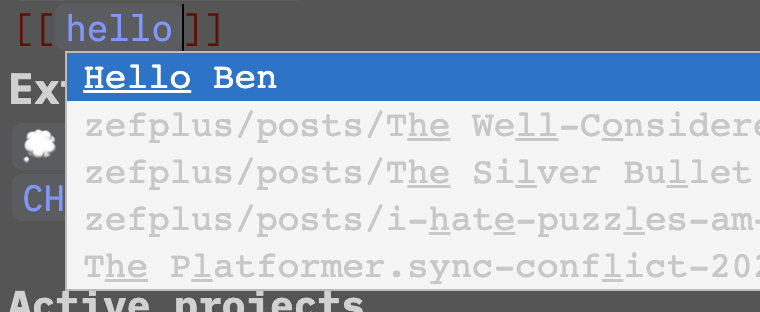
Recently (likely because I'm not a heavy user) dark mode has been regressing a bit in terms of looks. It would be great if somebody with interest in this (and some CSS skills) could improve things and make it look better. Various things can use improvement, but especially the code completion panel looks pretty bad right now.
@zefhemel Hey Zef! Apart from the code completion panel, I'm curious to know what other aspects of the UI (dark mode or otherwise) need improvement 🙂
I'll go through some of the ui and take some screenshots with pointers. Some may just come down to taste, but some are just objectively bad 🤡
I imagine if you operate in dark mode for some time you'll see stuff as well.
@zefhemel That would be helpful! Yes, I noticed some things in dark mode can be hard to read (like when you're typing a page name to open in the "open page/navigate to page" panel). I was looking through the SCSS files and I was thinking it might be helpful to define palettes for the light and dark themes using SCSS maps and then using values from those maps across the rest of the SCSS files.
In the CSS area I'm 100% open to any suggestions for improvement. This is definitely not my area of expertise.

So if I knew how to improve this I'd do it, but I'm pointing out some things that don't feel great, per arrow
- Contrast
- Button color
- Wiki link color
- Header color
Thanks for sharing some screenshots! I guess the best place to start is to make sure all colour palettes conform to WCAG standards for colour and contrast. I can start tackling this issue if you'd like :)
@zefhemel Created a draft PR at: https://github.com/silverbulletmd/silverbullet/pull/179 ✨
Another thing is to increase the contrast between the background color and main text: simply white text rather than gray?
I just finished fiddeling with the customStyles feature to fix up the dark mode (the invisible cursor drove me mad) and ended up with something usable:
customStyles
html[data-theme=dark] #sb-editor .sb-line-fenced-code {
  background-color: rgba(72, 72, 72, 0.1) !important;
}

html[data-theme=dark] #sb-editor .sb-line-fenced-code .sb-code {
  background-color: transparent;
}

html[data-theme=dark] #sb-editor .sb-string,
html[data-theme=dark] #sb-editor .sb-string2,
html[data-theme=dark] #sb-editor .sb-number {
  color: #986db9;
}

html[data-theme=dark] .cm-cursor {
  border-left: 1.2px solid white !important;
}

html[data-theme=dark] #sb-editor .sb-variableName {
  color: #41a3ce;
}

html[data-theme=dark] #sb-editor .sb-atom {
  color: #bd3838;
}

html[data-theme=dark] #sb-editor .sb-meta {
  color: #d6222e;
}

html[data-theme=dark] #sb-editor .sb-line-li .sb-meta ~ .sb-meta {
  color: #d6222e;
}

html[data-theme=dark] #sb-main .cm-editor .sb-table-widget thead tr {
  background-color: rgba(72, 72, 72, 0.4);
}

html[data-theme=dark] #sb-editor .sb-table-widget tbody tr:nth-of-type(even) {
  background-color: rgba(72, 72, 72, 0.3) !important;
}

html[data-theme=dark] a,
html[data-theme=dark] #sb-editor .sb-link:not(.sb-meta, .sb-url) {
  color: #7e99fc;
}

html[data-theme=dark] #sb-editor .sb-command-button {
  color: white;
  background-color: #555;
  border-color: #666;
  border-style: solid;
  border-radius: 5px;
}

html[data-theme=dark] #sb-editor .sb-command-button:hover {
  background-color: #777;
}

html[data-theme=dark] .sb-notification-info {
  background-color: #1b76bb;
}

html[data-theme=dark] .sb-notification-error {
  background-color: #a32121;
}
I also have some ideas on how to do theming and started refactoring the scss files to use css variables. Is this something where help is still needed?