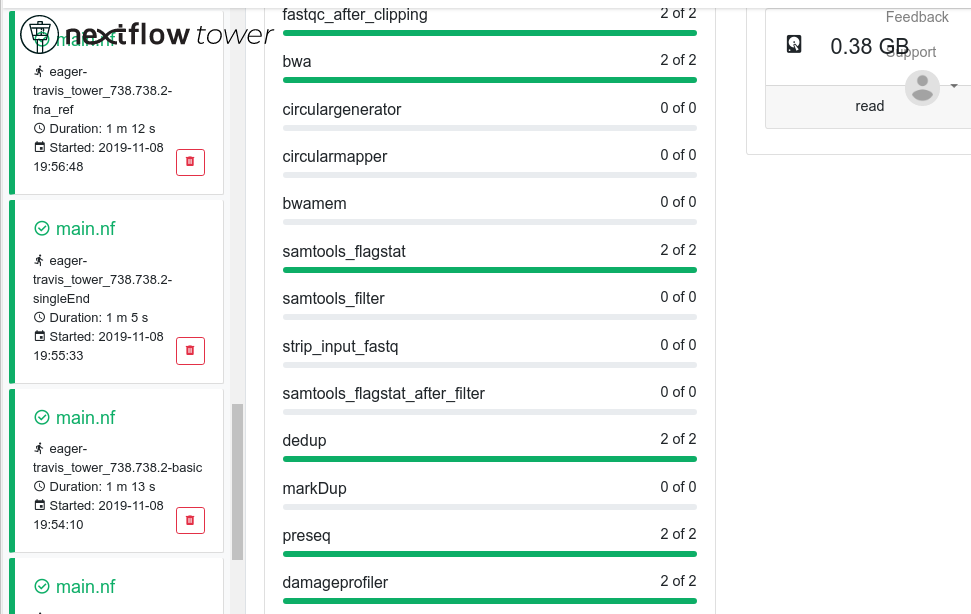
Compact processes visualisation
We have a very complex nextflow pipeline with nf-core/eager, with lots of processes. This makes the 'Processes' box of tower very long - and takes a long time to scroll down to the other info boxes like 'Utilisation', 'Load' etc.
Maybe it would be possible to have a compact representation of the 'Processes' loading-bar like visualisation. I was going to say small rings like in Utilisation but I guess this goes towards piecharts which are a bit meh (and not popular ;) https://github.com/seqeralabs/nf-tower/issues/168)
Yes, that occurs when I make the width of the window smaller.
Ubuntu 18.04.3 LTS Google Chrome Version 78.0.3904.97 (64-bit)
I would second on this feature: our Sarek workflow is also pretty complex, would be nice to have a way to aggregate chunks (i.e. Mapping | BQSR | Variant Call| Annotation | QC) . As a first step maybe we can put labels into the Sarek nextflow itself, or a yaml/json key/[processes] file to define the chunks.
Not sure to second this. I agree that's needed a smarted way to display many processes. In the short term, just a scrolling area could do the trick.
Unless we use the subworkflow feature to group together related tasks and shows them as a single-expandable item in the list. That would be neat!