craft-linkfield
 craft-linkfield copied to clipboard
Improve UI responsiveness
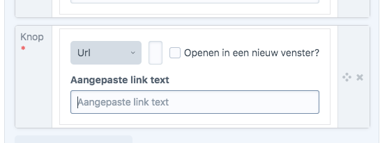
Things can easily start to overlap:
There should be more responsive/stacking styles.
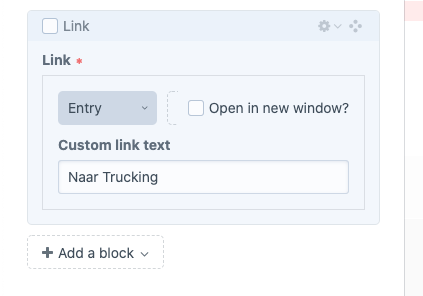
I get this when I choose to add a new entry within an entry select field.
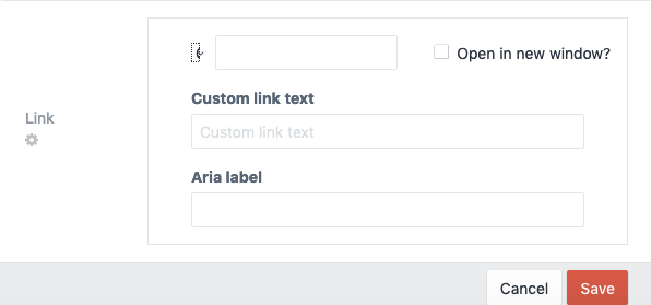
This also happens at the Live Preview, when the sidebar with the fields isn't wide enough, see screenshots:
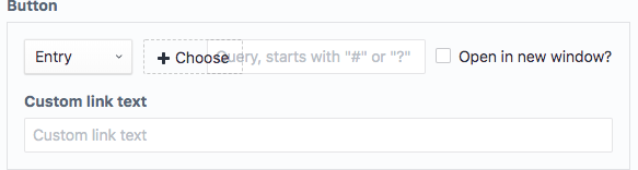
 Button to pick an entry is barely visible
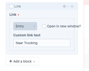 "Open in new window" text goes outside of the div. This gets worse for other languages where the sentence is longer.
Edit: This is Craft 3.5.5
A quick fix for the "open in new window" bit would be throwing text-overflow: ellipsis on there.
As this issue keeps popping up constantly I think of replacing the checkbox with an icon or placing it in an new line...
@sebastian-lenz I had a play around with it in the inspector, and I think a new line wouldn't be the end of the world. We know what it means, we're devs! But for a better AX I think the wording is clear for those less-techy clients of ours.
The problem still persists? suggestion: Add media queries to your css? .linkfield--field { flex-direction: column } fixes it for certain screen sizes