SDMetrics
 SDMetrics copied to clipboard
Published
20 hours ago •
 sdv-dev
`get_column_plot` produces misleading graphs (for uniform-like distributions)
get_column_plot produces histograms which take a lot of liberty when representing the data, especially at the edges.
The Real data and the matplotlib plot represent the same data (ignore the synthetic data). Basically, the edges always start at 0.5 with the get_column_plot graph, which can be quite misleading.
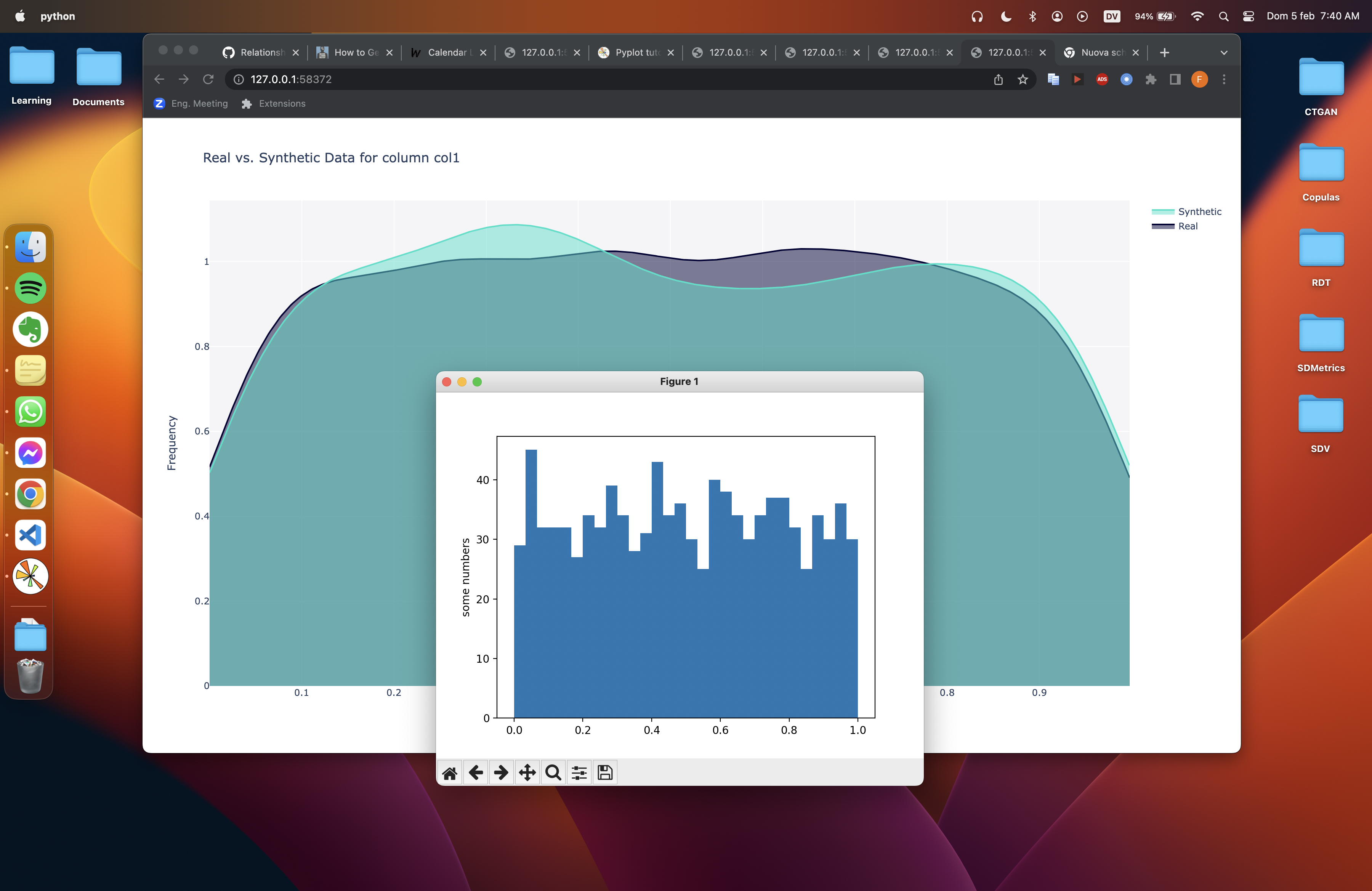
SDV code to generate the above:
    data = pd.DataFrame({'col1': np.random.random(1000)})
    metadata = SingleTableMetadata()
    metadata.detect_from_dataframe(data)
    synthesizer = GaussianCopulaSynthesizer(metadata)

    # Run and Assert
    synthesizer.fit(data)
    samples = synthesizer.sample(1000)
    print(samples)
    get_column_plot(data, samples, metadata, 'col1').show()

    import matplotlib.pyplot as plt
    plt.hist(data, 50)
    plt.ylabel('some numbers')
    plt.show()