[FEATURE] 2D ratio plots with text overlay
Often when displaying scale-factor or other 2D ratio plots it is useful to overlay a colored z-axis with text of histogram central values and errors to concisely convey information. It is a common enough need that I think it would be a good addition to the library.
If this is already possible with fairly minimal code then we should have an example posted somewhere!
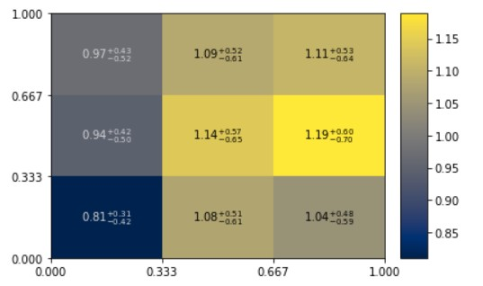
Here is an example of the plot style, apologies for potato quality, but I think it conveys the point:

An example of a 2D plot with text using matplotlib exists in the now very old mpl-hep gallery: https://nbviewer.jupyter.org/github/nsmith-/mpl-hep/blob/master/binder/gallery.ipynb#2D-Colormap although it does not have uncertainties shown. For determining uncertainties for a ratio, we have now hist.intervals.clopper_pearson_interval. The rest may be lightweight enough to be a recipe.
fwiw, all 2d plots are just thin wraps on pcolormesh and we could do without, but actually writing out the errorbars in the bins sounds useful
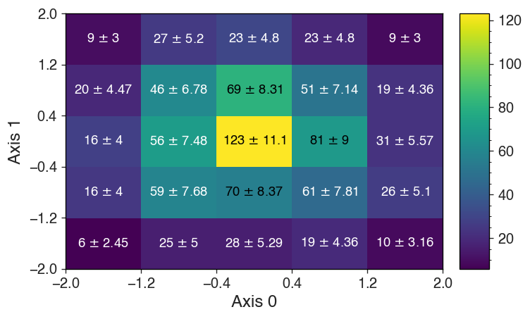
hi all, here's a standalone recipe I use to mimic ROOT's h.Draw("colztexte"):
import matplotlib.pyplot as plt
import numpy as np
import hist
h = hist.Hist.new.Reg(5,-2,2).Reg(5,-2,2).Int64().fill(*np.random.normal(0,1,size=(2,1000)))

fig, ax = plt.subplots()
c, cbar = h.plot()

xyze = np.c_[
    np.tile(h.axes[0].centers, h.axes[1].size),
    np.repeat(h.axes[1].centers, h.axes[0].size),
    h.values().flatten(),
    h.variances().flatten()**0.5,
]

colors = np.zeros((len(xyze), 3))
r, g, b, a = c.to_rgba(xyze[:, 2]).T
darkness = a * (1.0 - (0.299 * r + 0.587 * g + 0.114 * b))
colors[darkness > 0.45] = 1

for (x, y, z, e), color in zip(xyze, colors):
    ax.text(
        x,
        y,
        r"{:.3g} $\pm$ {:.3g}".format(z, e),
        color=color,
        ha="center",
        va="center",
        fontsize=12,
        wrap=True,
    )
Here's a more minimalist example I gave on mattermost, if it helps. I expect if we want this to be shorthand method, considerable effort will have to go into making sure the labels format right for large/small values.
import mplhep as hep
from hist.intervals import ratio_uncertainty
ratio = a / b.values()
err_down, err_low = ratio_uncertainty(a.values(), b.values(), 'poisson-ratio')

labels = []
for ra, u, d in zip(ratio.values().ravel(), err_up.ravel(), err_down.ravel()):
    ra, u, d = f'{ra:.2f}', f'{u:.2f}', f'{d:.2f}'
    st = '$'+ra+'_{-'+d+'}^{+'+u+'}$'
    labels.append(st)
labels = np.array(labels).reshape(3,3)

hep.hist2dplot(ratio, labels=labels, cmap='cividis');