 schlagmichdoch
[Bug] Name input isn't intuitive to use
Describe the bug
Maybe it's just me, but the name input is far from intuitive.
As a new user the input looks like a non-editable label at first glance. Visually it's closer to Githubs presentation of labels and you wouldn't expect to be able to edit this text:
Since the actual input does not seem to be editable, the "edit button" next to it must be there to toggle it. At least that was my thought.
As nothing happened after clicking the image that I misidentified as a button, I revised my previous assumption and tried to use the input by clicking in it. The barely or even invisible cursor adds to that confusion:
Firefox:
Chrome:
Expected behavior
I can see two possible solutions:
- use a text input with less styling and a working curosr so that the user can visually identify it as such
- keep the current styling but implement a toggle mechanism by treating the pen icon as a button. This way we can have the nicely styled label and use a regular input when editing
White text on a gray background should also be avoided, as the contrast is far too low.
see https://webaim.org/resources/contrastchecker/?fcolor=FFFFFF&bcolor=A5A5A5
Thanks for your input! The edit pen icon is styled in such a way that clicking it focuses the input field as is expected by an edit button.
I like the current design as it is optimized for mobile:
- Tap either on the name itself or on the edit pen icon
- The keyboard opens up
- Type in the new name
- Close the keyboard / press enter / tap somewhere else
- The name is changed
I agree that it might be less intuitive for new users on Desktop browsers as there is no keyboard to pop up.
Ideas to make it more intuitive:
- As soon as the input field is focused, change the badge to a white background with grey border with a visible cursor to make clear that it's an editable input field now
- Increase the contrast by switching to a darker gray
Any other ideas?
I think the missing cursor is the biggest offender to be honest. At least on Firefox you get no real feedback.
I guess the autogenerated name isn't really set as content and rather as a placeholder? Because as soon custom text is entered, things are working as expected:
Could we fill in the input instead of using a placeholder? Clicking the edit button should focus on the input and select the entire text. That should be enough to make desktop users happy and keep things slick on mobile.
Ah! It's not an input at all:
Switching to a proper text input might solve our problems.
The contenteditable div seems to trigger a known Firefox bug: https://bugzilla.mozilla.org/show_bug.cgi?id=904846
I don’t think it has anything to do with the node type. ~~Also, the Firefox bug seems to only impact nodes with a ::before pseudo-element which we do not use.~~ (Edit: I overlooked this on mobile, sorry! Caret is not only placed at the start but it is also hidden behind the background color of the node.)
The current behavior (apart from the missing cursor) is by design but seems to be unintuitive for you so I’m open to change it.
I’ll increase the contrast and try to force the cursor to be clearly visible on all platforms.
If things are working as expected for you as soon as text is entered, we could simply clear the placeholder field if the name node is focused. Then, clicking the node or the edit icon focuses the text field and the random name gets hidden which should be enough to indicate to the user, that they can simply type a name now.
Alternatively, we could add „Custom Name“ to it if clicked and select it. This way it is clearer that it’s a text field and as soon as something is typed „Custom Name“ is overwritten (because it is selected).
Although the first idea removes the hint, that leaving the name empty resorts to it being random again, I prefer it to the second idea. What do you think?
I don’t think it has anything to do with the node type. Also, the Firefox bug seems to only impact nodes with a
::beforepseudo-element which we do not use.
This may be an implicit behavior. At least Firefox shows the ::before for this div in the inspector:
Switching from <div> to <input> would fix this. At least judging by a quick experiment manipulating the DOM from the Firefox developer console.
It's also a bit cleaner from a semantic point of view.
we could simply clear the placeholder field if the name node is focused.
Much appreciated. I think this can be done with plain CSS:
input:focus::placeholder {
  color: transparent;
}
Minimal CSS to restore most of the look:
input:focus::placeholder {
  color: transparent;
}
input::placeholder {
  font-family: "Open Sans", -apple-system, BlinkMacSystemFont, sans-serif;
  line-height: 20px;
  opacity: 1;
  font-weight: 400;
}
div:
input:
input:focus:
You were too fast! I corrected my mistake one minute earlier :P
Anyways, apparently Firefox cursor position is broken whenever the div is completely empty:
Probably, this is why they always add a line break to a div whenever text is deleted which I needed to work around in the current design: https://github.com/schlagmichdoch/PairDrop/blob/a68cd75b715d62f46192ac2e3cef6000eca37114/public/scripts/ui-main.js#L262-L265
I'll play around a little and come up with a solution
I'm curious but why is a
<div>used here?
While a div is just a plain container, an input node is rendered differently on every OS and browser. As you have experienced earlier we would have to reset the default input css first before adding our own. I prefer to start with a clean canvas.
 http://man.hubwiz.com/docset/HTML.docset/Contents/Resources/Documents/developer.mozilla.org/en-US/docs/Web/Guide/HTML/Forms/The_native_form_widgets.html#Single_line_text_fields
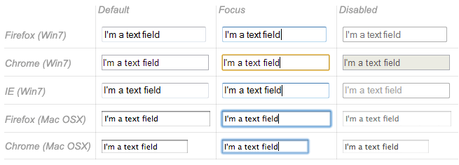
While this is old it brings the point accross, I think.
As PairDrop is a web app, I'd like to have as much control on its look as possible.
I have implemented a fix. Please test this on different browsers: https://pairdrop-next.onrender.com
While a div is just a plain container, an input node is rendered differently on every OS and browser.
Thanks for the insight. Sounds reasonable :slightly_smiling_face:
I have implemented a fix. Please test this on different browsers: https://pairdrop-next.onrender.com
Just gave it a try on Firefox and Chrome. Both browsers now behave similarly and the user feedback is much better IMHO.
One nitpick:
- enter a custom name
- select the text or parts of it
- click anywhere else
- the text remains selected
Can we switch the background color to e.g #33333 ? This would improve the contrast and would match the color of the current icon set:
vs
That's too dark for my liking but I see your point. I propose #757575 which sits somewhere in the middle and passes your WebAIM AA rating with 4.6:1 and looks good on light and dark mode:
One nitpick:
1. enter a custom name

2. select the text or parts of it

3. click anywhere else

4. the text remains selected
Good catch! New try: https://pairdrop-next.onrender.com
Beautiful!
That's too dark for my liking but I see your point. I propose #757575 which sits somewhere in the middle and passes your WebAIM AA rating with 4.6:1 and looks good on light and dark mode:
Sounds good :+1:
One last thing I noticed is that the name tends to get applied prematurely in Firefox:
- enter a custom name for the first time -> erratic apply after X ms without typing (?)
- edit an existing custom name -> nothing
It also feels a little different in Firefox and Chrome. Maybe the focus is somehow lost?
I cannot reproduce this. Is this still an issue? Could you capture a screencast of it?
Perfect! I'll push the color change then and will release it as part of the next minor version 1.10.10
I just released the newest version and deployed it on pairdrop.net. Thanks for your help! :)