metalk8s
 metalk8s copied to clipboard
UI improvement for UX
Component: UI
Why this is needed: Having a better UX
What should be done:
-
[x] 1.The search bar should have the same height as the buttons. ( It looks like know the search bar height is calculated with padding) The correct height is 32px, or matching it with button size On Volume page and Node page.


-
[x] 2. The Latency in the volume tab of Node should be aligned to the right (because it's a numerical value)

-
[x] 3. The unit in the Partition tab of the Node page should have a space between the value and the unit, for having consistency.

-
[ ] 4. 4 px (or rem/em equivalent) space between the label and its sorting icon In Volume page, and in Volume tab of the Node page. For instance:

-
[x] 5. Having consistency (and 1 decimal) for usage units
-
GiB everywhere (@ChengYanJin to confirm)
-
Add a space between unit and value
-
Add a decimal In the Overview of Volume page.

-
[ ] 6. Pods tab
-
8 px between the columns 'Name & Status"
-
The column and their header should be properly aligned
-
Age column and header should be aligned to the right, and the value (for hours especially) should have a leading "0"

-
[ ] 7. Update the chart header style The Metrics tabs in Volumes should be aligned with the metrics tabs in Nodes
-
Remove UPPERCASE, put it as Pascal Case
-
Same date format for legends

-
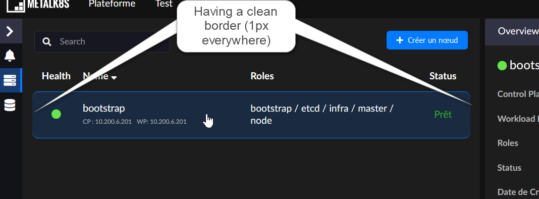
[x] 8. Having a full clean border on the left and right of Nodes rows
Hello @Cuervino Most of the points listed here have alreeady been addressed in PR #3305 What is missing:
-
The column and their header should be properly aligned We have this issue in ALL the tables because the scrollbar takes some space.
-
The Metrics tabs in Volumes should be aligned with the metrics tabs in Nodes
-
8px between label and icon. Because in the small screen we just don't have enough space..
