Button loading indicator could be improved/refurbished
Using 1.16.0
Right now the loading indicator looks dotted/jagged and sometimes it doesn't form a proper half-circle when it is small:

Maybe it would be better to switch to a SVG based solution?
@VyMajoris is this screenshot from Firefox?
No, that was on Edge. Here is a comparison:
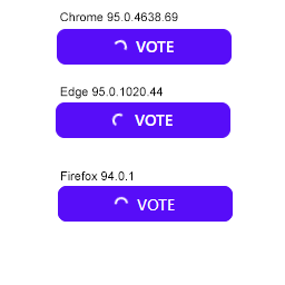
It's subtle, but you can see that on Edge and on Chrome there are some "dots" where the white color is faded. I believe this is caused because the browser is not interlacing the rounded border to a sufficient degree. So when you make it small it seems that some parts get "phased out".
This could be remedied by adding some anti-aliasing, but I don't know if that's possible on borders.
not sure if changing the default spin icon to a radial one is an option, plus increasing the spinning speed can make the aliasing unnoticeable.
The current spinner spins sooooo slooowwwlllyyy it kinda makes the UI feel slow. I'm looking to speed it up! Easy to do with custom CSS but I figured I'd mention here that I would personally prefer a faster default animation closer to .5s or .3s rather than the 2s default.
The current spinner spins sooooo slooowwwlllyyy it kinda makes the UI feel slow. I'm looking to speed it up! Easy to do with custom CSS but I figured I'd mention here that I would personally prefer a faster default animation closer to .5s or .3s rather than the 2s default.
That button loading class is going to change in daisyUI 3.0
But for now you can change the speed using custom CSS or using an ugly class like this:
[&.btn:before]:[animation-duration:.3s]
https://play.tailwindcss.com/DlrGGnPgW1