nerd-fonts
 nerd-fonts copied to clipboard
Noto Fonts "Mono" variant is too widely spaced
🎯 Subject of issue
The "NotoSansMono Nerd Font Mono" seems to have been spaced more widely than the non-mono version "NotoSansMono Nerd Font" The fonts were downloaded from the official Nerd Fonts website. This issue also happens with RobotoMono Nerd Font: #597
Screenshots are below
🔧 My current set-up
- Noto Sans Mono Nerd Font Mono 11
- GNOME Terminal, Alacritty
- Fedora Linux 34 x86_64
★ Screenshots
-
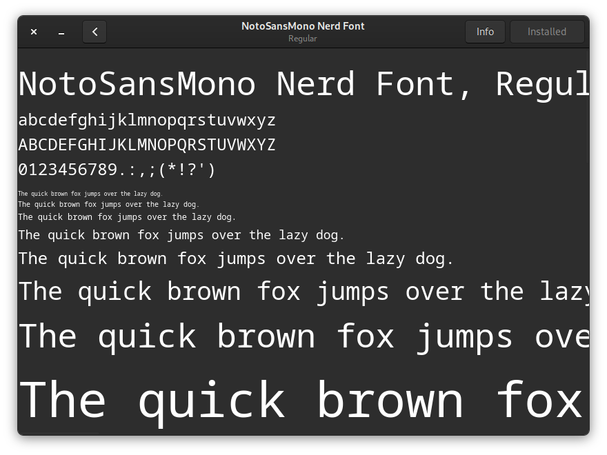
Font on GNOME Font Viewer - Opening the "Noto Sans Mono Regular Nerd Font Complete Mono.ttf" file
 The space between characters is too wide
 -
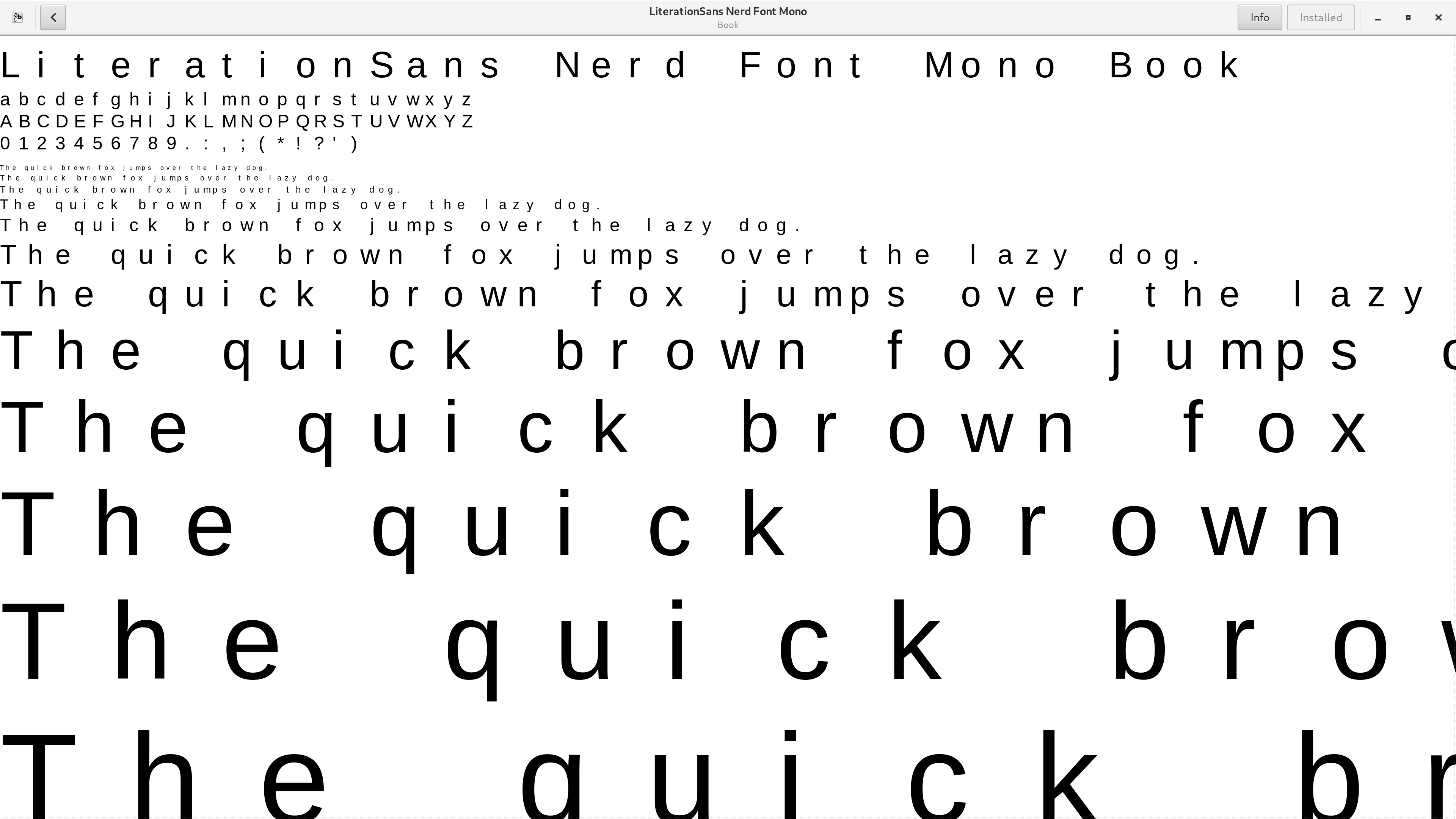
Font on GNOME Font Viewer - Opening the Not Mono variant
 Spacing is correct
 -
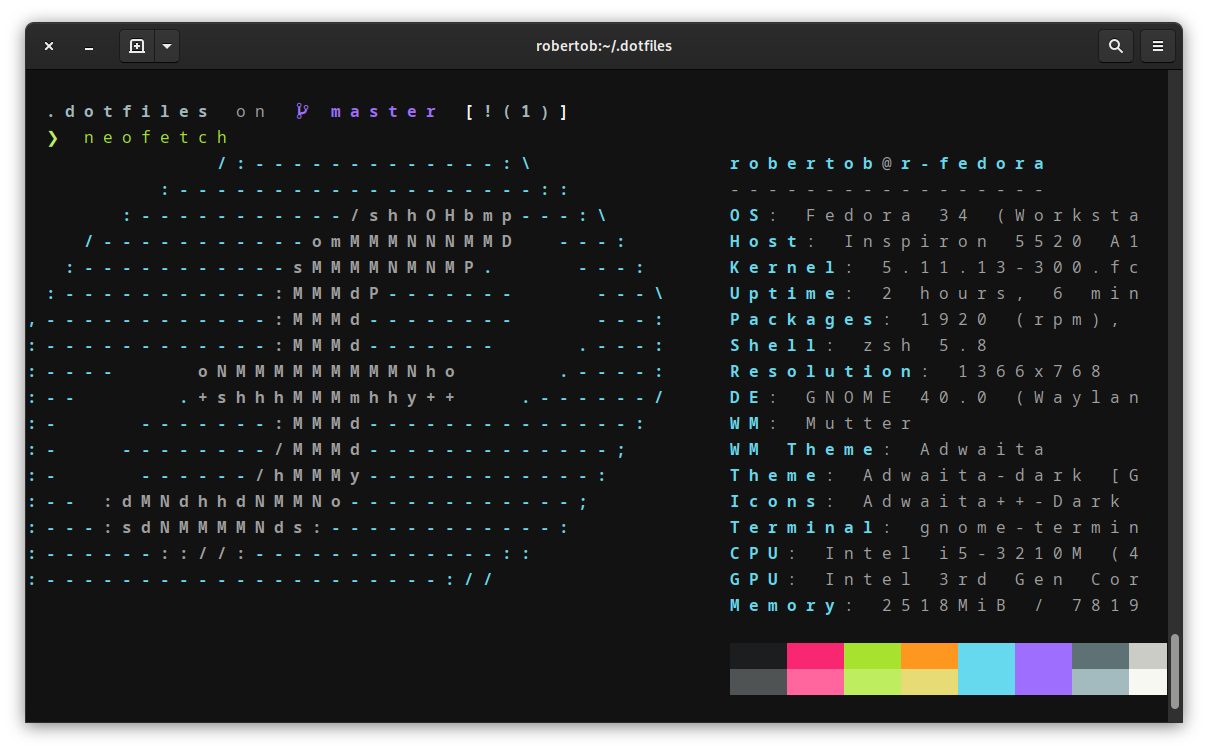
After setting font on GNOME Terminal
-
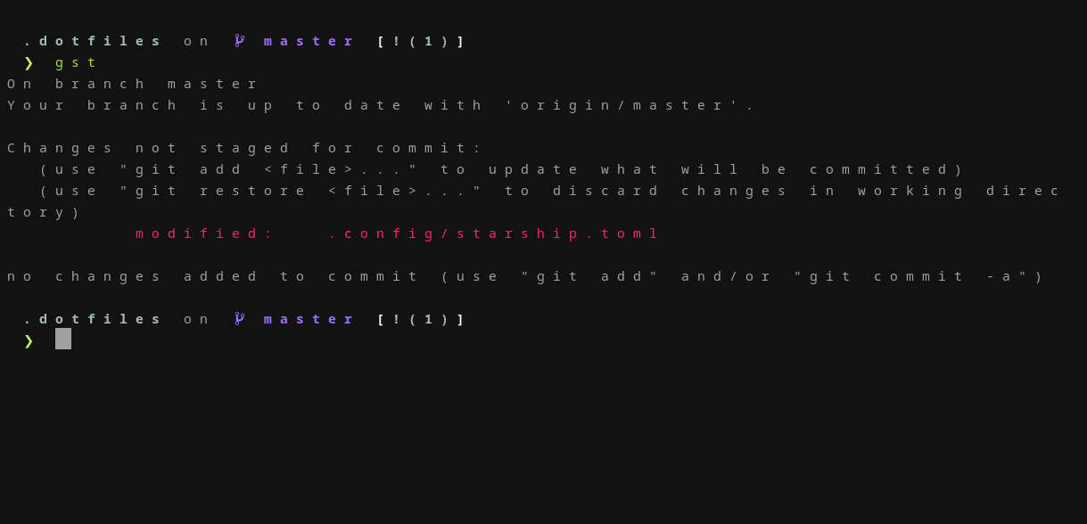
After setting font on Alacritty
Bumping up. Anybody have ideas on how to fix this?
I am using "NotoSansMono Nerd Font" inside the terminal
This issue has been automatically locked since there has not been any recent activity (i.e. last half year) after it was closed. It helps our maintainers focus on the active issues. If you have found a problem that seems similar, please open a new issue, complete the issue template with all the details necessary to reproduce, and mention this issue as reference.