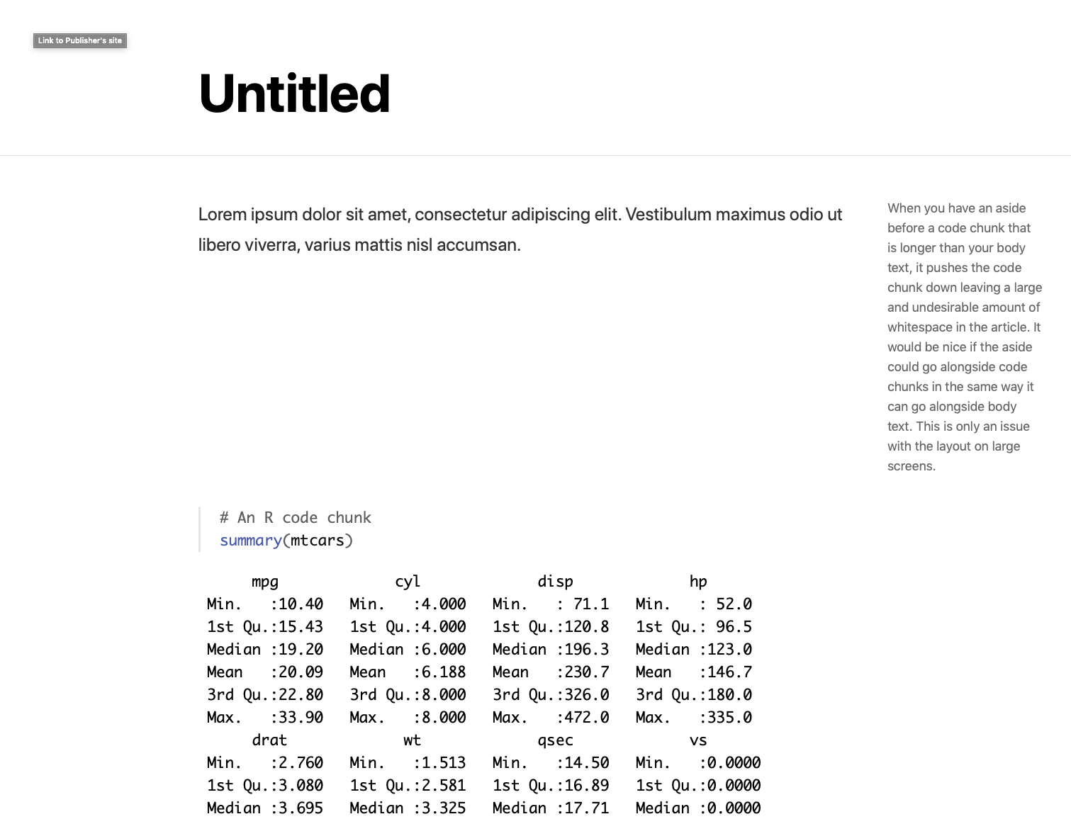
Asides push code chunks down in large screen layout
When you have an aside before a code chunk that is longer than your body text, it pushes the code chunk down leaving a large and undesirable amount of whitespace in the article. It would be nice if the aside could go alongside code chunks in the same way it can go alongside body text.
Here's a minimal reproducible example, along with a screenshot.
---
title: "Untitled"
output: distill::distill_article
---

Lorem ipsum dolor sit amet, consectetur adipiscing elit. Vestibulum maximus odio ut libero viverra, varius mattis nisl accumsan.

<aside>

When you have an aside before a code chunk that is longer than your body text, it pushes the code chunk down leaving a large and undesirable amount of whitespace in the article. It would be nice if the aside could go alongside code chunks in the same way it can go alongside body text. This is only an issue with the layout on large screens.

</aside>

```{r}
# An R code chunk
summary(mtcars)
```
This is only an issue with the layout on large screens, since asides currently go inline with body text on smaller screens. I suspect the reason for the gap is that the asides are still treated as inline on large screens? And the reason for that is related to the reason we don't have floating TOC, because it would conflict with full width figures:
No current plans to do that (although I agree it's useful which is why we added it to the standard html_document format). The major issue is that we want to allow figures and tables to occupy the full width of the page which would conflict with a TOC in the gutter.
Originally posted by @jjallaire in https://github.com/rstudio/distill/issues/16#issuecomment-423292010
But it would be nice to allow asides to float beside code chunks. I often run into a case where I want to use an aside but can't because of the large gap it creates. Or there are times where I specifically want to place an aside beside a code chunk because they're meant to go together, but the current behaviour prevents that.
Thanks for the report.
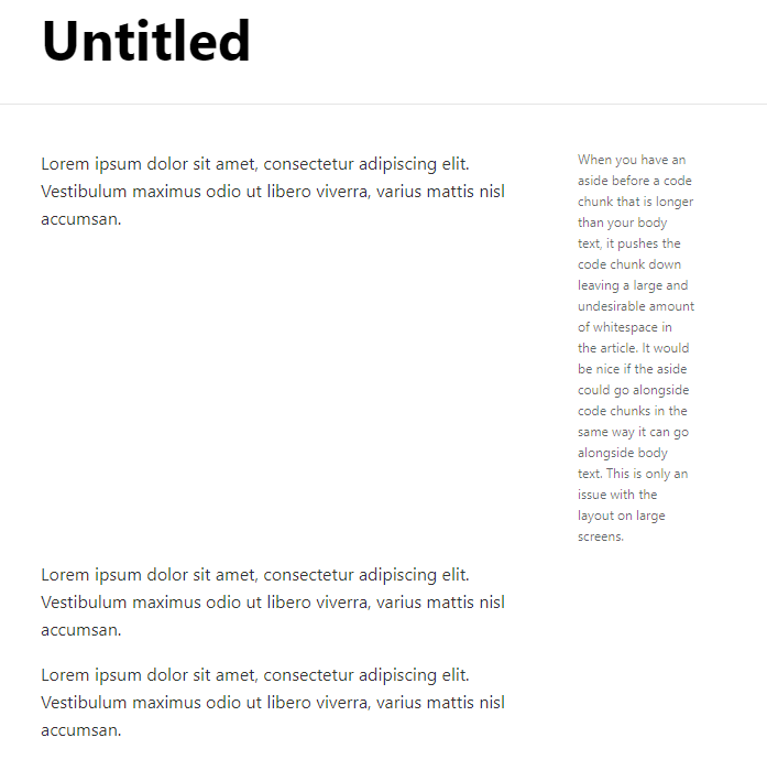
I am not yet well acquainted with JS and CSS stuff within distill so here are some test I made to understand the behavior.
It does not seem to be something specific to Code chunk. An aside won't go along a body either and creates the big cap if it is longer.
Code for example
---
title: "Untitled"
output: distill::distill_article
---

Lorem ipsum dolor sit amet, consectetur adipiscing elit. Vestibulum maximus odio ut libero viverra, varius mattis nisl accumsan.

<aside>

When you have an aside before a code chunk that is longer than your body text, it pushes the code chunk down leaving a large and undesirable amount of whitespace in the article. It would be nice if the aside could go alongside code chunks in the same way it can go alongside body text. This is only an issue with the layout on large screens.

<aside>

Lorem ipsum dolor sit amet, consectetur adipiscing elit. Vestibulum maximus odio ut libero viverra, varius mattis nisl accumsan.

Lorem ipsum dolor sit amet, consectetur adipiscing elit. Vestibulum maximus odio ut libero viverra, varius mattis nisl accumsan.
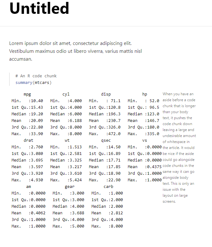
Also setting it below the code chunk will make it go on the right.
Details
---
title: "Untitled"
output: distill::distill_article
---

Lorem ipsum dolor sit amet, consectetur adipiscing elit. Vestibulum maximus odio ut libero viverra, varius mattis nisl accumsan.

```{r}
# An R code chunk
summary(mtcars)
```

<aside>

When you have an aside before a code chunk that is longer than your body text, it pushes the code chunk down leaving a large and undesirable amount of whitespace in the article. It would be nice if the aside could go alongside code chunks in the same way it can go alongside body text. This is only an issue with the layout on large screens.

</aside>
I don't think this would be easy to change this behavior in the current distill layout. It would probably require to play with floating or use grid. 🤔
I had similar issues these days and here is my solution from CSS in RMarkdown:
Step 1: Add a CSS block
d-article aside {
  height: 0px;
  overflow: visible;
}
Step 2: write your [aside] block as usual before the code chunk.
<aside> YOUR_NOTE_HERE </aside>
YOUR_CODE_CHUNK
In fact, you can use the RStudio inspector to check the CSS and change them any way you want. The trick here is that I used height to remove the white space and then use overflow to show the actual content. But please note,
Just an addition notes here that a new project called Quarto (https://quarto.org/) has been announced. It is a about scientific publishing and is built on the R Markdown experience. The benefit is some of the format and feature have been done from scratch and without any other lib like Distill.js here.
Especially feature of Margin content is already there (https://quarto.org/docs/authoring/article-layout.html#margin-content) also for caption and reference.
Quarto could be considered an option for anyone feeling limited with current distill work.
We'll also focus most of our effort about new features in Quarto in the future.
i'll see if I can add the CSS workaround shared above without breakage.