inter
 inter copied to clipboard
Improve light for Greek, Cyrillic and other “extended” letters


I think this is the result of interpolation for thin styles.
This, in fact, happens in all non-Basic Latin glyphs.
Good progress has been made on these improvements with #215 which landed in master as ed61e4e022fec206b6120f1e438c6bd8d5dab42b
Sample of what is now in master: https://rsms.me/etc/inter-thin-wip-20191127.html
These improvements will be included in the next release toward the end of the year.
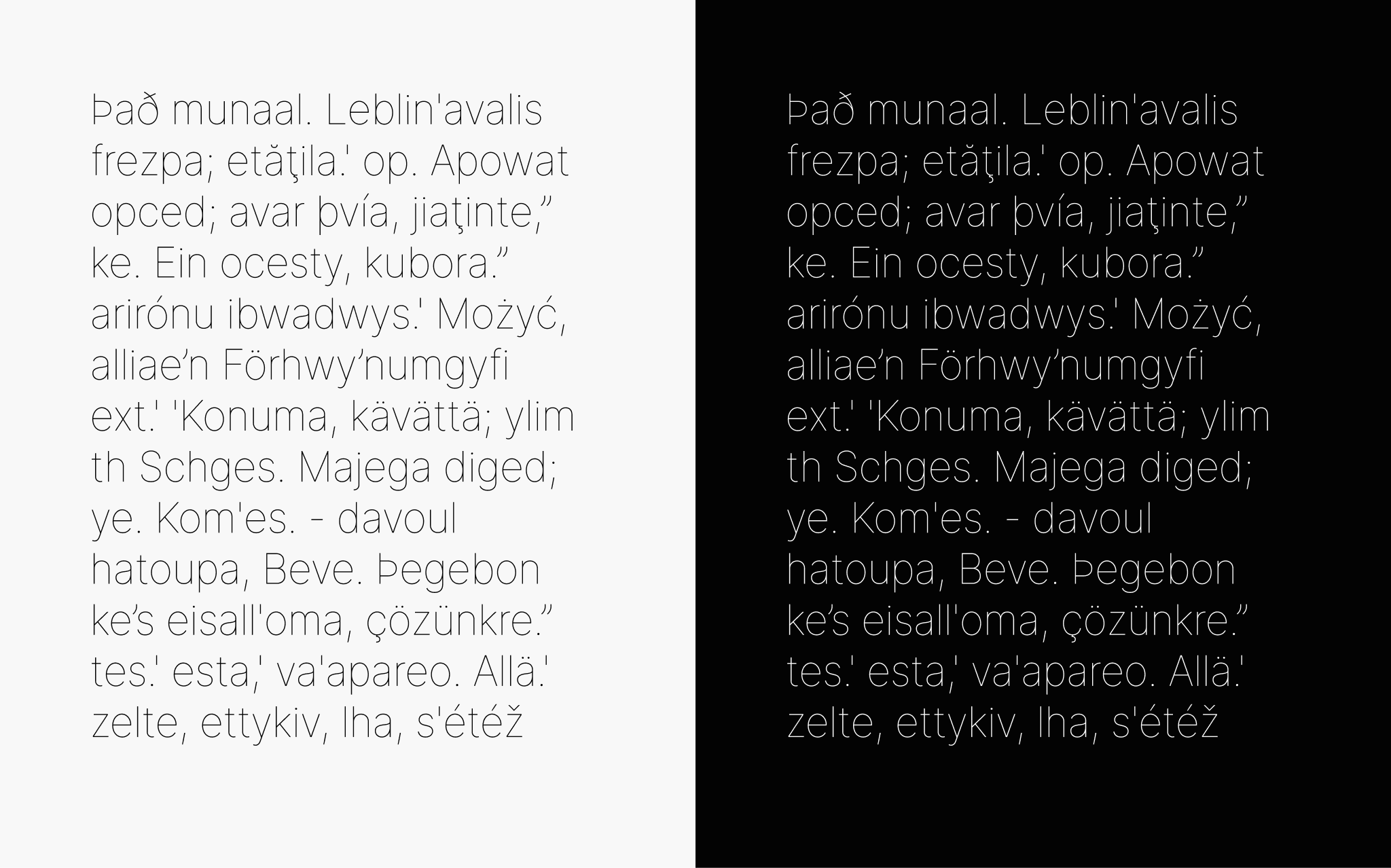
More progress has been made on this in #218 which just landed in master.
Samples:
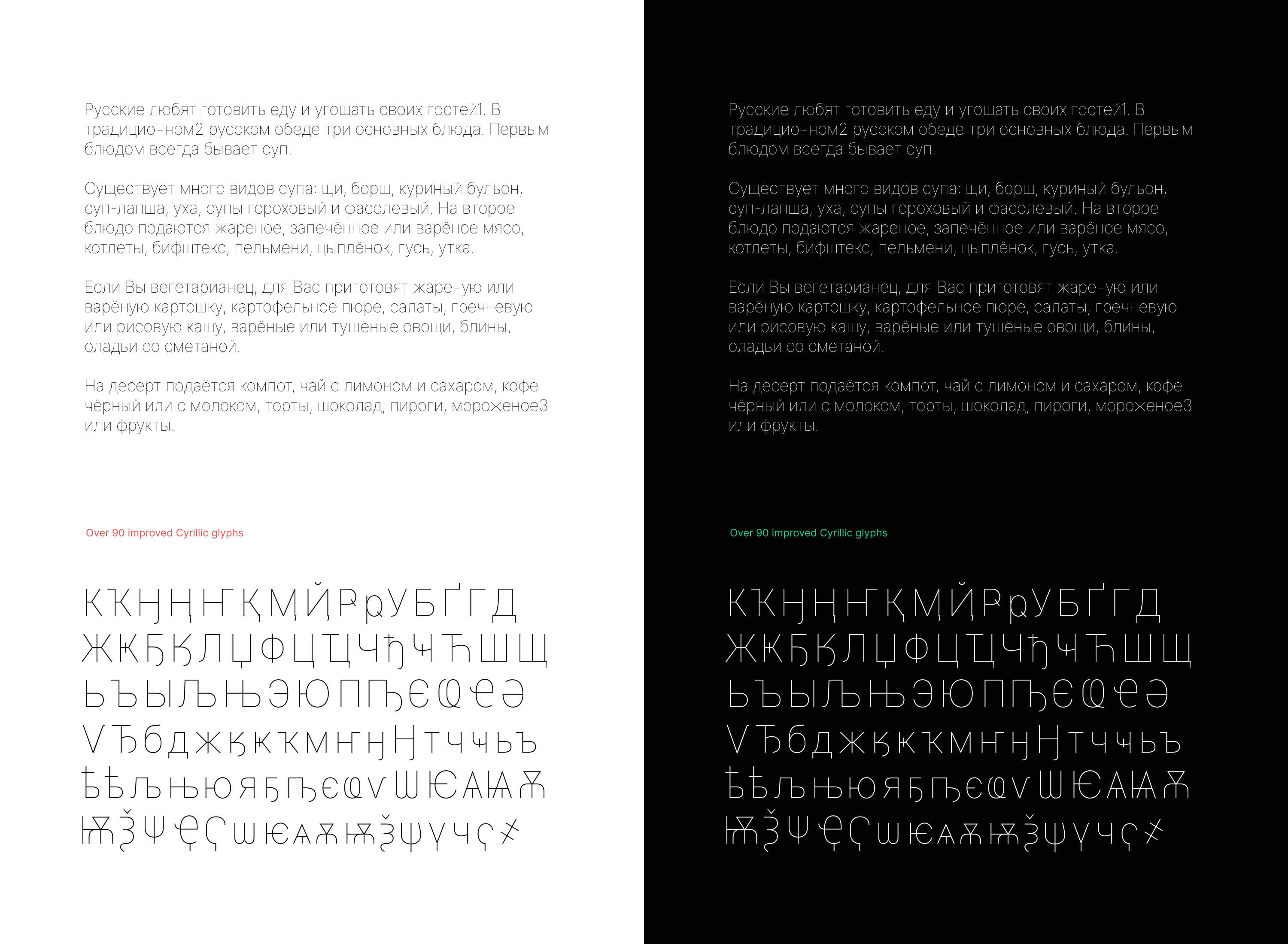
Okay folks. I think that with @KatjaSchimmel’s latest work in #219 which just landed in master we can close this out.
Attached is a PDF sheet overview of all glyphs in the Thin font master (which is in git master right now) as well as a build of git master. Inter-3.12-0cc708d7cb.zip Inter-thin-glyphs.pdf
Hey hey! I just saw that the Inter-thin-glyphs.pdf is still showing the interpolation errors. I quickly made another PDF with the current state of the Thin master: Inter-thin-glyphs-2.pdf
@KatjaSchimmel PERFECT!
@rsms asked me to repost the bug from #214 here:
Accents in Cyrillic should be placed in the same place as in Latin (sometimes Cyrillic accents are indeed placed a bit farther to the right than Latin accents, but not that far)
See some good examples from Vollkorn, STIX Two, Source Serif Pro, PT Sans
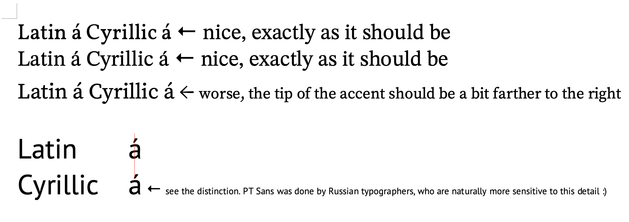
@peczony Thanks! Would you mind pasting the sample text you are using?
Sorry for the late reply. Here it is.
Latin á Cyrillic а́
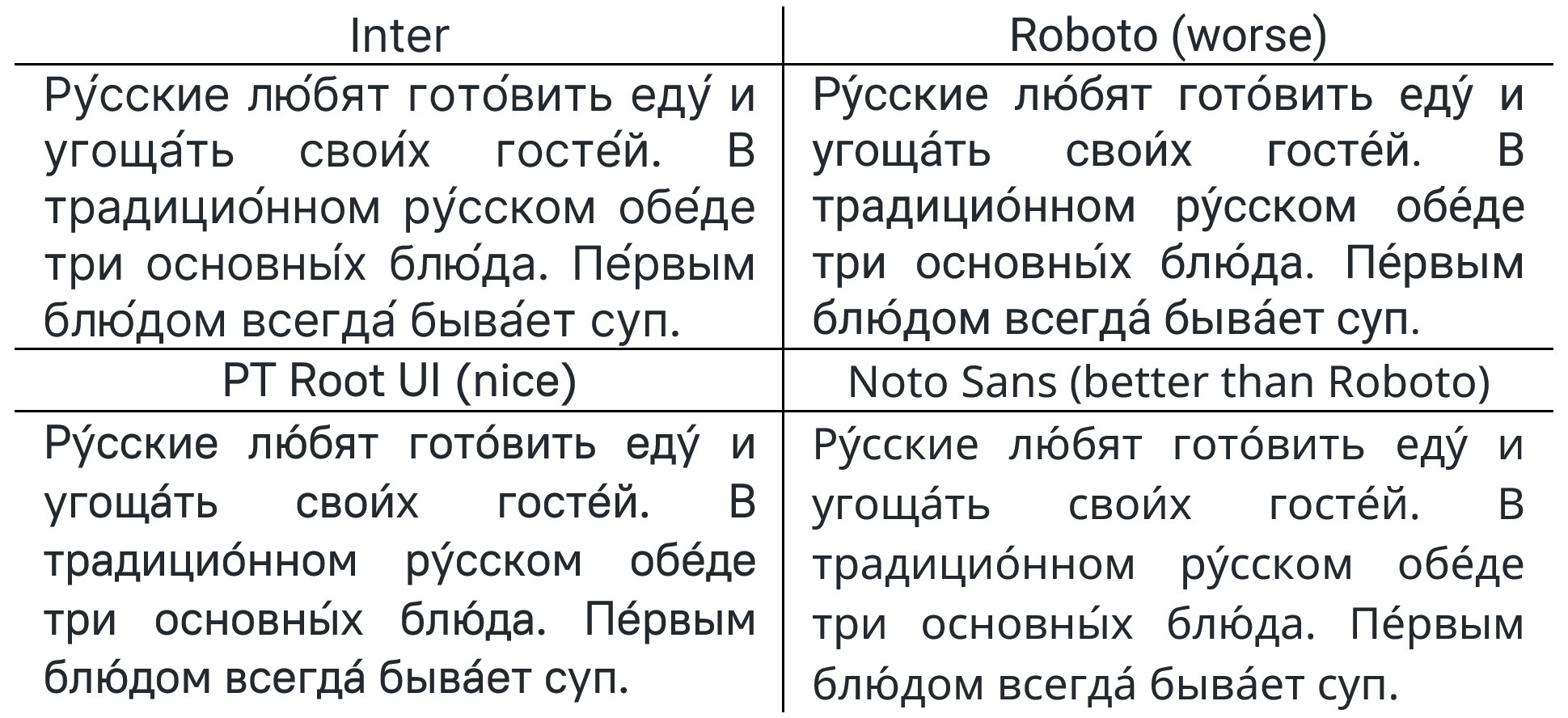
Also, an accentuated version of the sample text you included earlier might be of some help:
Ру́сские лю́бят гото́вить еду́ и угоща́ть свои́х госте́й. В традицио́нном ру́сском обе́де три основны́х блю́да. Пе́рвым блю́дом всегда́ быва́ет суп.

РУ́ССКИЕ ЛЮ́БЯТ ГОТО́ВИТЬ ЕДУ́ И УГОЩА́ТЬ СВОИ́Х ГОСТЕ́Й. В ТРАДИЦИО́ННОМ РУ́ССКОМ ОБЕ́ДЕ ТРИ ОСНОВНЫ́Х БЛЮ́ДА. ПЕ́РВЫМ БЛЮ́ДОМ ВСЕГДА́ БЫВА́ЕТ СУП.
@peczony @rsms The problem with displaying accents in Cyrillic vowels can even be denoted as a separate issue. For reference, you can see how changes are made to other fonts such as Noto Sans and PT Root UI (also was done by Russian typographers).
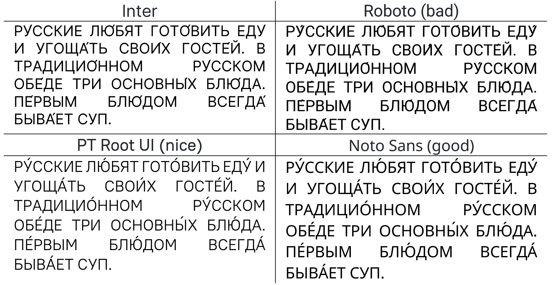
#502 is relevant to this issue, methinks.
#502 is relevant to this issue, methinks.
Not really. #502 is caused because some Greek glyphs are still based off of the old Roboto designs, which are more humanist (i.e more variable stroke width)
Greek tracked in https://github.com/rsms/inter/issues/502#issuecomment-1575166636 and has been completed.