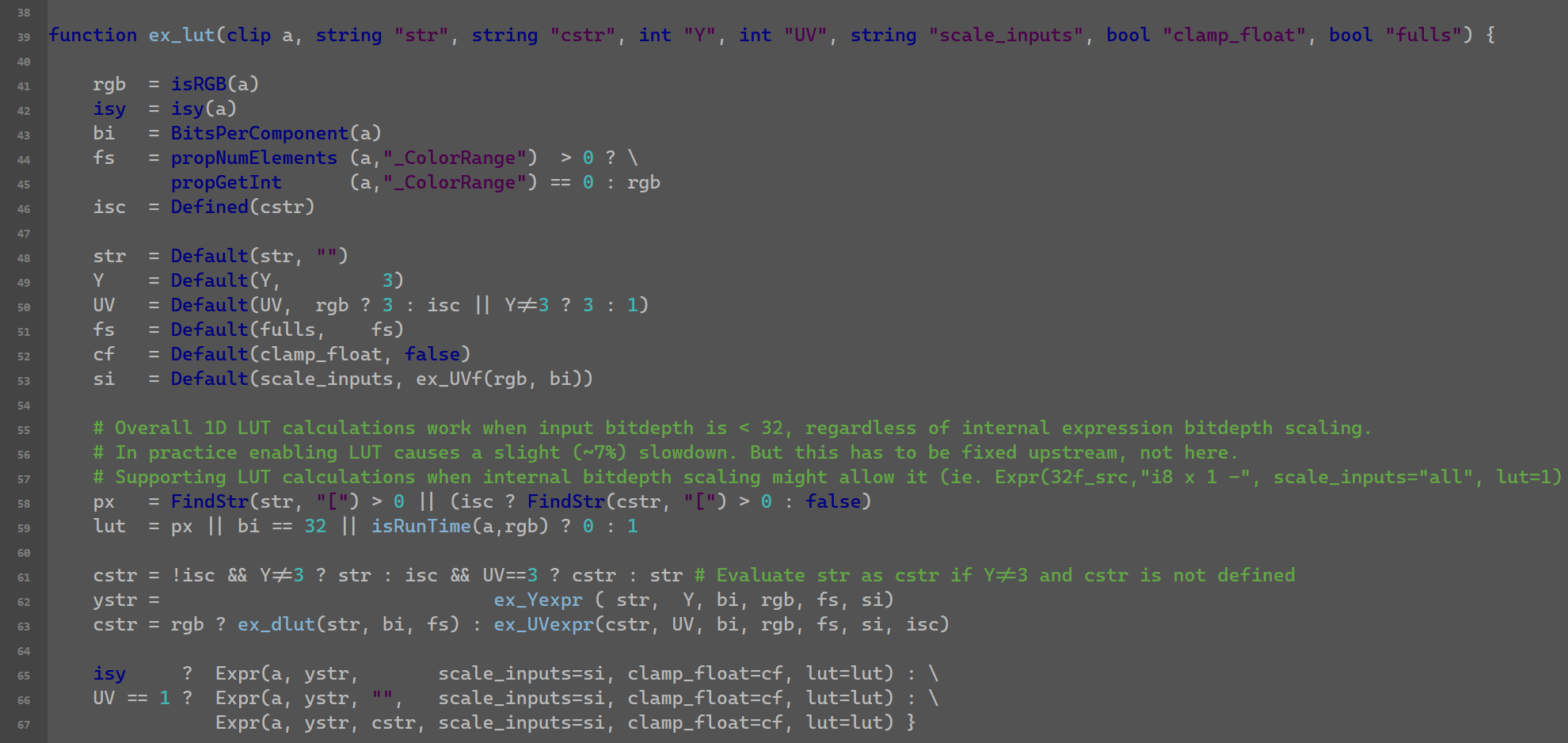
Visual changes compared to Notepad2
 As you can see in the image there are several visual changes compared to Notepad2 and that I haven't been able to reproduce in Notepad3.
- Dialog is too narrow so you can't properly read the path, and dialog color is too bright (doesn't respect Windows theme)
- Status bar colors don't match, background too bright , font color too dim (no editable colors for either) (doesn't respect Windows theme)
- Selected font color doesn't dim like in Notepad2
- Visual Brace Matching doesn't work for indic_textfore (I use old Visual Brace Matching in .ini)
- Also Visual Brace Matching option is not ticked when selected on View Menu.
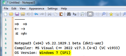
I'm using Notepad3_5.22.302.1_beta on Windows7 SP1.
Thanks
Hello @Dogway , There's nothing wrong with those little layout differences. Of course, Notepad3 is a fork of Notepad2, but it evolves in its own way without constraint from its past. 😃
On the colors it reduces the visual contrast so it doesn't respect the Web Content Accessibility Guidelines of contrast ratio of at least 3:1 (Dialog and status bar are 1.74:1).
This is the same principle for the selected text. If you darken background, you expect font also to darken otherwise it pops out more since the contrast increases and now it doesn't get a good separation from unselected text.
These quirks are making me to not fully move to Notepad3. The hidden status bar option was also a stopper but I managed to make an autohotkey to toggle it with the keyboard.
I will open a new ticket for the Visual Brace Matching issues.
Try to play around with settings:
[Settings2]
DarkModeBkgColor=0x1F1F1F
DarkModeBtnFaceColor=0x333333
DarkModeTxtColor=0xEFEFEF
The default colors for Syntax-Highlighting in DarkMode are optimized by several people. Try other Themes (Dark, Obsidian, Sombra), feel free to create your own and provide the exported .ini-File.
Now using v5.22.1023.1 beta.
Nothing has changed since then.
- Close dialog is too narrow so you can't properly read the path
- Status bar BG color is still too bright, so it's hard to read anything
- Selected font color doesn't dim like in Notepad2-mod. Moreover when the window is out of focus the bluish background color is switched to a clear gray (!)
- Visual Brace Matching fore color can't be set, and background color and alpha can't be disabled, this is the same for Matching Occurrences, the alpha can't be disabled.
Overall my claim here is not that "it has changed", but that things that are supposed to work are not working. In this sense the scheme configurator looks like a black-box with no control from the user end. We don't even have the chance to define language configs for more updated/granular color schemes.
@RaiKoHoff : Those themes are too dark+contrasty, that's like stabbing your eyes with knives. You should at least respect WCAG 2.2. The darkest background I'd go would be a graphite black, but normally I work with a bit brighter background (OP shots). Some guidance for eyecare: link
The best way would be to change the default darkmode scheme to ged dedicated colors/contrast for DarkMode initial settings. @hpwamr has been in contact with the developer of this scheme, I doubt that he has developed it using the guidance for eyecare. I think you don't like to spent the time for detailed adjustment of all DarkMode colors for all aspects of the lexers?
As a workaround, I add a (manual) config ([Settings2] DarkModeHiglightContrast=75) to control the contrast of the foreground highlighting (text area). Maybe this can reduce the eycutting effects.
I will try to give the darkmode scheme a look with appropriate eyecare contrast values. matte paper : ink has a contrast around 50:1, the effect is not proportional when inverted so I will have a look there. Will be achromatic since temperature should be handled globally (DisplayCal, f.lux, etc)
As a workaround, I add a (manual) config ([Settings2] DarkModeHiglightContrast=75) to control the contrast of the foreground highlighting (text area). Maybe this can reduce the eycutting effects.
Hello @Dogway ,
Feel free to test the "BETA/RC PortableApps", version "Notepad3Portable_5.22.1029.1_beta.paf" or newer, see 1st list in issue #1129.
"Notepad3Portable BETA/RC PortableApps" version can be used with or without ".7z" extension.
Also, feel free to test the "BETA/RC Setup", version "Notepad3_5.22.1029.1_beta_Setup" or newer, see the 2nd list in issue #1129.
Comments and suggestions are welcome... 😃
I don't have time for a full-fledged scheme, but played with a graphite base for coding:
Default=font:Fira Code Retina; size:+4; fore:#C8C8C8; back:#383838
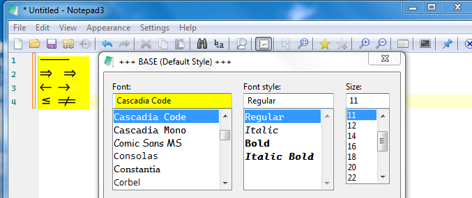
The font size is for a 42" UHD display. The fore and back ratio is 7:1 which is minimum required for good legibility and avoid glare. The font is Fira Code Retina, the retina version helps the font to retain some body for better visibility. I chose this one because Cascadia Code PL wasn't rendered monospaced on Notepad3 (I'm on Win7 still, so please try on Win10 and 11). Cascadia Mono PL was monospaced but didn't render the ligatures.
As for the color scheme you should use sepia tones around the same luma value of foreground color. For example this is Comment, an example for color but subdued to a ratio of 3:1 so while still legible doesn't visually interfere with code.
Comment=fore:#6B9F60
I also made a Paper scheme for Text types:
Default=font:Georgia; size:+8; fore:#1E1A13; back:#A3A09E
It lacks the texture and it's black over white, but if you are into that that's fine, otherwise use the inverted scheme above.
Cascadia Mono PL was monospaced but didn't render the ligatures.
FYI: Cascadia code is a monospace font that supports ligatures.
https://github.com/microsoft/cascadia-code
Font Variants
- Cascadia Code: standard version of Cascadia
- Cascadia Mono: a version of Cascadia that doesn't have ligatures
- Cascadia (Code|Mono) PL: a version of Cascadia that has embedded Powerline symbols
Probably it doesn't support ligatures on Win7 if notepad3 doesn't have its own font renderer, because it also doesn't work with variable fonts. Meanwhile Photoshop CC 2019 supports variable fonts probably using its own render engine.
EDIT: Well, it's odd because Fira Code does render ligatures, confusing.
Well, it's odd because Fira Code does render ligatures, confusing.
Hello @Dogway ,
I've started an old laptop Win7.1 to test Notepad3 (x64) v5.22.1029.1 beta with Cascadia Code.
- First downloading the Cascadia Code from there: Cascadia Code Releases,
- After installing on my Test Laptop Win7.1 the fonts
"Cascadia Code"and"Cascadia Mono", I can confirm that Notepad3 on Win7.1 supports ligatures!
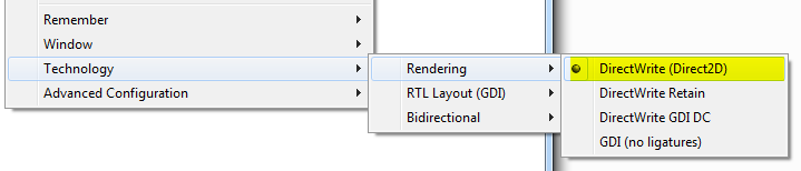
Important: Technology, Rendering must be "DirectWrite (Direct2D)".
Yes, thank you! I can confirm, Cascadia Code works now for me (variable fonts). Monospaced + ligatures. Actually the only difference with Fira Code is that == isn't a ligature, but on the good side Regular is thicker than Fira Code Retina Medium.
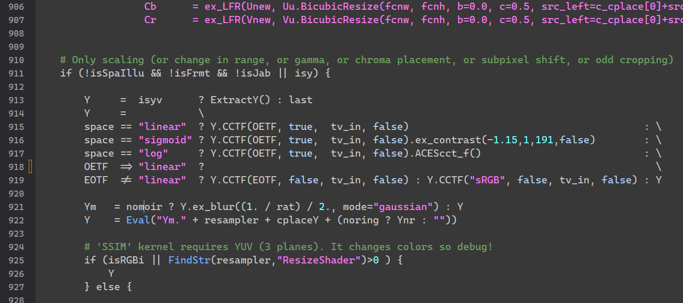
By the way, as you can see in the image, many functions are lacking syntax highlighting, for example ExtractY() is an internal function, but it would be good to be able to add user made function to some list (ie. external functions) to color code them differently.
PR #4295 contains additional highlighting options for AviSynth Lexer (add Identifier and User Defined Functions, some more filters 'ExtractY', 'PlaneToY' ) The "User Defined Functions" are still empty (see: https://github.com/rizonesoft/Notepad3/blob/master/src/StyleLexers/styleLexAVS.c). If there are some more tokens to be filled in the lexer's categories, feel free to provide them...
Yes, sorry didn't tell. AviSynth+
Hello @Dogway ,
Feel free to test the "BETA/RC PortableApps", version "Notepad3Portable_5.22.1115.2_beta.paf" or newer, see in issue #1129.
"Notepad3Portable BETA/RC PortableApps" version can be used with or without ".7z" extension.
Also, feel free to test the "BETA/RC Setup", version "Notepad3_5.22.1115.2_beta_Setup" or newer, see the 2nd list in issue #1129.
Comments and suggestions are welcome... 😃
Thanks, the lexer is very short and outdated, also some functions were mixed in as plugins. Here's an updated list for AviSynth+, I removed some very old, superseded filters but replaced with current AVS+ ones. Lexer.zip
@Dogway : Thank you for providing new word lists for AviSynth (PR #4299). I need to put keyword and datatype coloring together, the Lexer has no special wordlist for datatypes. I also changed some syntax highlighting colors - maybe you like to provide your settings (for light and dark mode).
I have the light theme I currently use in Notepad2, but needs some modifications for release (comment green needs more separation against BG). For dark mode I've been playing with some color the other day and they are mostly done. Will update the comment later today with the syntax themes.
Hello @Dogway ,
Feel free to test the "BETA/RC PortableApps", version "Notepad3Portable_5.22.1118.2_beta.paf" or newer, see in issue #1129.
"Notepad3Portable BETA/RC PortableApps" version can be used with or without ".7z" extension.
Also, feel free to test the "BETA/RC Setup", version "Notepad3_5.22.1118.2_beta_Setup" or newer, see the 2nd list in issue #1129.
Comments and suggestions are welcome... 😃
I tuned a bit some colors in light and dark modes. One thing to note is that even light mode is white text over grey background just as my OP screenshots.
The definitions of what I shared are: Filter -> Internal filter functions Clip Properties -> Internal clip property functions (I unified the color scheme with internal filters) Plugin -> External Plugins Function -> User defined functions
I left operators at default text color, otherwise it distracts too much. For data types I would like: fore:#2CA7A7, but since there's no distinction with keywords, maybe use the keywords scheme which is the same as Internal Filters. The keywords define global structures so I like them to stand out but in subdued color like marine blue. [Deleted] I'm open to suggestions
EDIT: Looks like there's a new indentifier now called User Defined Function. I'm gonna edit the scheme with it and edit the internal filter color a bit to don't be so dark (as it appears quite often) LexerSyntax.zip