revault-gui
 revault-gui copied to clipboard
refac transaction spend detail
fix the view for a better display of buttons according to the spend request status
Related to this, nits:
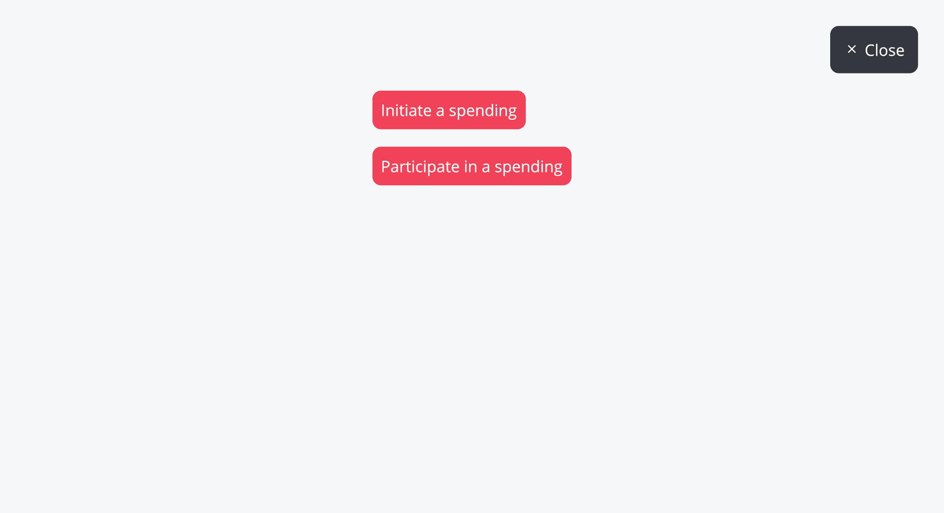
- [x] The buttons should be centered

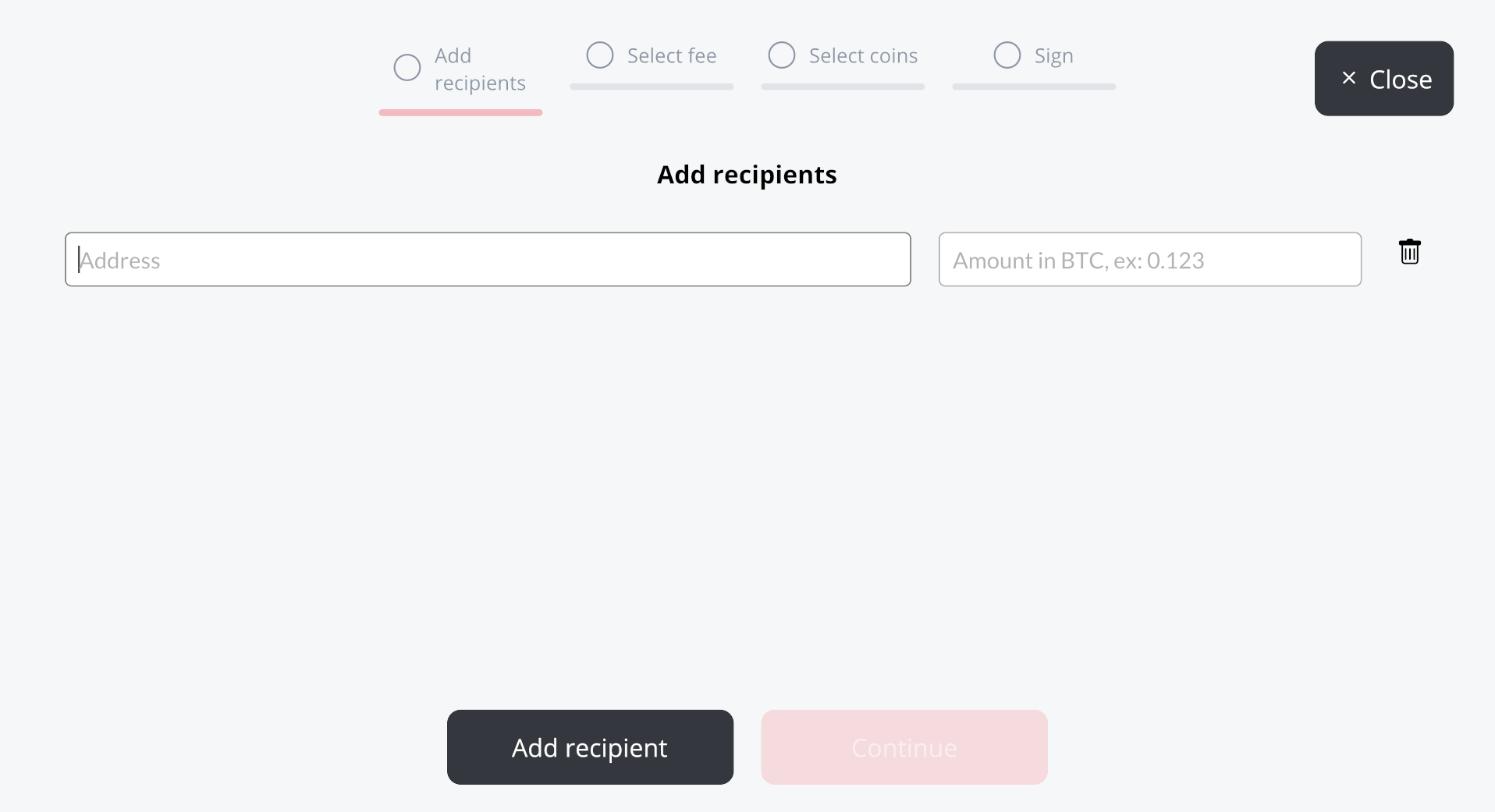
- [ ] The "Add recipients" overflows, we should either find a shorter name or have longer tabs

- [ ] It complains that I have multiple recipients with the same address even if all of them are empty. Maybe we should just forbid adding a recipient if the last one is empty? (tracked in https://github.com/revault/revault-gui/issues/283)
