 readthedocs
hard coded max-width
I've noticed that sphinx isn't super friendly for wide monitors. Here's a few screenshot from Google's Resizer on the page I noticed it:
 But if I remove the a max-width rule:


I can't see a clear reason for having a the max width here but I haven't followed the project so perhaps it was an aesthetic choice or there's something I'm missing.
Love the project though and a quick fix either way:
diff --git a/sass/_theme_layout.sass b/sass/_theme_layout.sass
index 416a9db..d5fc678 100644
--- a/sass/_theme_layout.sass
+++ b/sass/_theme_layout.sass
@@ -311,7 +311,6 @@
 .wy-nav-content
   padding: $gutter $gutter * 2
   height: 100%
-  max-width: 800px
   margin: auto

 .wy-body-mask
This doesn't seem like the correct approach, as the line length is specific to readability and usability. A more correct fix would be altering the font size with screen size to scale this wider.
Will this be fixed anytime soon? The docs are on half screen and there is nothing I can do about it.
@ron819 sure you can. one easy way is to override max-with in custom css. create a css file with following content:
.wy-nav-content {
   max-width: none;
}
make sure your conf.py file looks like this:
def setup(app):
   app.add_css_file("PATH_TO_YOUR_CSS_FILE.css")
@bearsh I'm not sure what you mean... This happens in every site that uses readthedocs
This maybe dumb but why this fix can't be submitted to solve this issue for everyone everywhere?
This isn't a bug of the theme, it was done on purpose. The reason behind strict width is that reading comprehension drops when having to parse a long line like a full window width document. We'll address this through responsive rules to adjust type size on wide displays, instead of removing max-width.
@agjohnson while sharing your opinion on readability in general, every human has different feeling of what is the best way for him (this doesn't mean it really is the best way but he thinks it is). the he gets distracted by this. so a user configurable way to select width and font size would be best to solve this (e.g. a javascript gui element to configure it on client side). furthermore the max width rule makes sense on text but what about big tables and picture?
I think this particularly breaks down when you have wide preformatted sections like this:
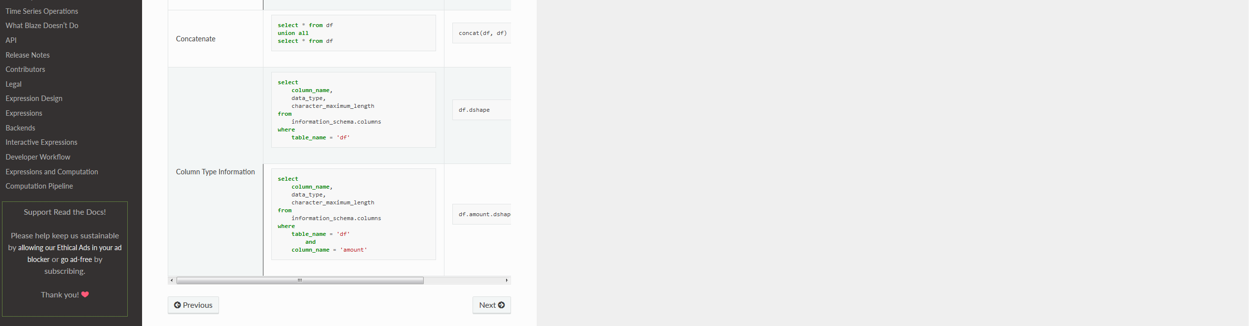 It's almost comical having to side scroll on this table when I have so much dead space on my screen.
That said I get the readability argument, it's ultimately a trade off that the project maintainers have to make so I'm fine closing this issue if they think this is a feature not a bug.
I'm running in the same issue where sideways scrolling is required for some figures and tables. I've tried adding the stylesheet.css as proposed by @bearsh https://github.com/rtfd/sphinx_rtd_theme/issues/295#issuecomment-455226058. But it doesn't seem to work for me.
- ReadTheDocs page of branch
- Build 9043912
- GitHub conf.py
- GitHub stylesheet
What I'm I doing wrong?
@AJJLagerweij your html_static_path is set to nstatic`` but you also have that directory in the CSS include nstatic/stylesheet.css. Try removing nstatic/` from the latter.
In _templates folder, create layout.html (if you don't have, create it) paste
{% extends "!layout.html" %}
  {% block footer %} {{ super() }}

  <style>
         .wy-nav-content { max-width: none; }
  </style>

{% endblock %}
Enjoy
For users finding this issue while trying to figure out how to read docs tables, here's a Stylus workaround :
/* https://stackoverflow.com/questions/23211695/modifying-content-width-of-the-sphinx-theme-read-the-docs

and https://github.com/readthedocs/sphinx_rtd_theme/issues/295

*/
.wy-nav-content {
    max-width: 1500px !important;
}


/* and fix wrap bug per https://rackerlabs.github.io/docs-rackspace/tools/rtd-tables.html */
.wy-table-responsive table td {
    /* !important prevents the common CSS stylesheets from overriding
    this as on RTD they are loaded after this stylesheet */
    white-space: normal !important;
}

.wy-table-responsive {
    overflow: visible !important;
}
and here is a test website: https://tsfresh.readthedocs.io/en/latest/text/list_of_features.html