Stack Decision Region Plots in 3D
Hi everyone. First of all, I'm quite new at using matplotlib and mlxtend, so I apologise in advance if what I ask is stupid or simply wrong.
The thing is that I want to stack some decision region plots in 3D depending on the filler value that I set for the third feature so it looks similar to this:

From: https://kaleidoscopicdiaries.wordpress.com/2016/08/22/stacking-density-plots-in-3d-in-matplotlib/
Since the plot_decision_regions method returns a matplotlib.axes.Axes object, I have not been able to figure out how to do it properly. Is there an easy way to do it?
Hm, this sounds interesting but tricky. You can actually pass an axes object to the function, which you would need for a 3D projection, i.e., sth like
ax = fig.add_subplot(111, projection='3d')
However, the parts
 ax.contourf(X, Y, A1, 100, zdir='z', offset=0)
ax.contourf(X, Y, A2, 100, zdir='z', offset=0.5)
ax.contourf(X, Y, A3, 100, zdir='z', offset=1)
is where it would become tricky, as there's currently no way of doing that via the input arguments. I think your best bet would be modifying the function for your purposes: https://github.com/rasbt/mlxtend/blob/master/mlxtend/plotting/decision_regions.py
or just return the xx, yy, Z from line 234 (https://github.com/rasbt/mlxtend/blob/master/mlxtend/plotting/decision_regions.py#L234) and collect them from multiple filler value runs and then pass them to your custom contourf 3D plots
Thank you very much, I'll give it a try.
Also, another quick question. When I plot the decision regions of a decision tree, the function returns something like this:
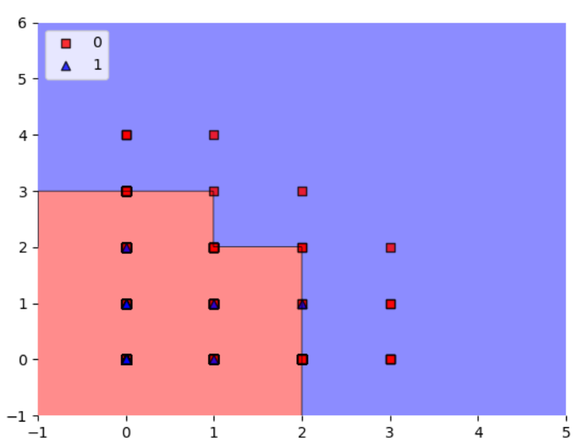
My question is: which category do the figures that are in the edges fall into? Or, how do I know if the algorithm predicts they are a 0 or a 1? Because I was expecting the edges to fall in decimal values, so it would be easier to identify those cases. By the way, all the values I work with are integers.
Hard to tell. If you are using scikit-learn decision trees, they set the threshold at x_i <= x_j. So if your the red squares are at x_1 = 2 are on the boundary, they will fall left of the boundary. The line then does not appear precisely at the tickmark for x_1 = 2, but that may be due to
a) imprecision of the way it visually appears when converted to a given file format like png
b) the resolution of the grid along the x_1 axis is not large enough and it may only evaluate points like ... 1.99, 2.01 ... In this case, you can address this by choosing a smaller value for the res parameter in teh decision plot function but it will take more computational time
Based on how complicated the function has become recently, this should really be a plot_decision_regions_3d to not further complicate things.