 radix-ui
[Select] Allow positioning of options beneath trigger
Feature request
Overview
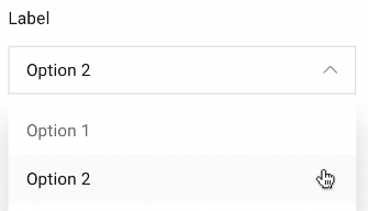
Currently the Select menu will position the currently selected option in the list on top of the trigger. This means that depending on the selected option the menu changes positions.
There are times where designs from clients who would like to see the menu positioned below the trigger cannot be currently achieved.
I would like to see an option that will place the menu just below the trigger as seen in the examples below.
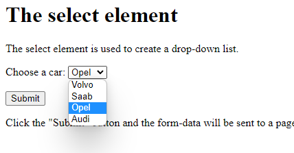
Examples in other libraries
https://mui.com/components/selects/ https://react-select.com/home
Notice the menu appears beneath the trigger
Who does this impact? Who is this for?
This would be an option for all users. Anyone who has designs or wishes the select menu to appear below the trigger.
I think a solution, or hack, for this might be to reorder the list putting the selected item at the top so that the dropdown always opens from the bottom of the input. I am going to try this and will report back with a snippet if it works out.
Hey @afridley,
Thanks for suggesting this. It was very much a design decision to prioritise the UX as it currently stands. However, Radix should be as customisable as possible, so we should look into seeing if we can provide the ability to do what you are asking.
@benoitgrelard I appreciate all the work! I'm wondering if you are able to give an estimate on when this could be supported?
@benoitgrelard I appreciate all the work! I'm wondering if you are able to give an estimate on when this could be supported?
Not at the moment I'm afraid.
I definitely need this too. Using a dropdown instead of this right now to achieve the desired effect. I feel the way it's currently implemented is too opinionated
Bumping this, the select should be available as a drop down, with a "side" prop like other radix components.
I'd also love to see this. We like the select menu so far, but the positioning restrictions make it frustrating when the UI is closer to the top. It feels clunky.
…but the positioning restrictions make it frustrating when the UI is closer to the top. It feels clunky.
Can you explain a bit more here? I'd love to understand what you mean given that this is how native select works too. Allbeit, it might happen less often as they can pop "out" of the browser on the native layer.
Absolutely, I'll do my best to describe what's happening/what we found. To preface all of this, I should mention that we're currently rendering a react iframe into an ember page. (This is only temporary until we can get the rest of our page converted to react.)
The select menu is located near the top of the iframe and, initially, we noticed the select content was positioning itself how we expected for the items towards the top of the list but it wasn't behaving as expected for the rest. I think the content menu ran out of room at the top which forces the menu to stay put and also for ScrollUpButton to appear.
Additionally, this menu only has 6 items to render (with more on the way) so having to scroll up for one or two items here feels kind of wonky. We were hoping that we could have a bit more control so that we could force the content to display under the trigger for this instance.
I hope this helps! Please let me know how I can clarify further, I'm very new to react and component libraries in general so hopefully this makes sense. Appreciate you reaching out!
To preface all of this, I should mention that we're currently rendering a react iframe into an ember page.
That makes sense, thanks for the explanation. Being that only one part of the page is in an iframe, that probably means you have even less available space for layout, thus more collisions.
This component has potential but until we can have the simple and standard behavior of opening below the trigger, it cannot be used in a real setting. Frequently the drop down will be placed near the top. If an item close to the bottom of the selected items is picked, the drop down behaves in a very unreasonable when opened again.
To repro just use the sample drop down, pick the last item in it. Then scroll page page so that the drop down is near the top of the viewport, and open it. Instead of seeing all options below as expected, you see just 2 or 3 and then the user has to scroll up to see the rest.
Please implement something standard - these are supposed to be primitives. Let the people change the basics if they want to :+1:
Hi @nosachamos,
This component has potential but until we can have the simple and standard behavior of opening below the trigger, it cannot be used in a real setting.
Please try and be a little more considerate, there are tons of teams using it in a "real setting", it might not be exactly what you're after at the moment, but that doesn't mean it isn't what lots of other teams are happy with.
…the drop down behaves in a very unreasonable when opened again. To repro just use the sample drop down, pick the last item in it. Then scroll page page so that the drop down is near the top of the viewport, and open it. Instead of seeing all options below as expected, you see just 2 or 3 and then the user has to scroll up to see the rest.
There is nothing unreasonable about the way it works currently. There are no "standard" way as different platforms implement these differently natively. The way we have it working (and the way you describe it here) is exactly how native select behaves on MacOS. In many situations, the MacOS way has better UX, especially in edge-cases like the one you mention.
Please implement something standard - these are supposed to be primitives. Let the people change the basics if they want to 👍
Unfortunately there are some things that wouldn't be possible to build "after the fact" and this type of select is something that is also highly requested so it's not as simple as just doing the basics and leaving the rest for everybody to work out.
However, I agree with you that having options is a good idea, and we will get there.
✌️
First of all, thank you for making this package. It's fantastic!
I'm also running into an issue where I would like to have more control over the positioning of the content area when it opens. In my case, the select is in a control bar across the bottom of the viewport, and while the viewport is large enough to display the entire list, it only displays a few items, requiring the user to scroll to reveal the full list of options.
Hey all 👋,
I'd love some quick feedback from all of you who are after some more flexibility regarding positioning.
What is the primary reason you want to position options below the trigger
- is it mostly because you do not like the fact the selected option will align with the trigger (in best case scenario)?
- is it mostly because you do not like the fact that the user has to scroll when in edge cases (close to the top/bottom) and you'd rather show all options? (at the detriment of the selected one being far away from the trigger)
- other?
Please respond with 1, 2 or 3 and some more details if you wish.
Basically, I'm trying to figure out whether if we provided an option to bypass the minimum height constraint (that is used to make sure the selected item isn't too far from the trigger when in edge-cases) would be enough for most of you.
ie.
Current behaviour (which would be the default)
https://user-images.githubusercontent.com/1539897/174257651-8acf7fbb-acf6-4581-bc56-3bc4bde8cf9b.mp4
With option (new behaviour)
https://user-images.githubusercontent.com/1539897/174257420-2cb4b163-c3df-452e-a6ae-87044cd10019.mp4
- I like the default behaviour but unfortunately I have to align with designs.
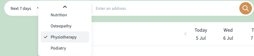
In my case, I need the options to always be positioned below the trigger:
#3. Other: To better align with certain formats (windows)
For me it's that our UI designers bring up designs based on common standards. And a regular HTML select looks like this on Windows:
On a Mac, whether Chrome of Safari, it behaves like your select component here. And it seems on Android it brings up a full-screen menu, which is another beast altogether.
But the design I got from our UI department was based on the Select component as they understand it from a basic html tag, and that one behaves more like a dropdown.
@benoitgrelard For us, #2 feels like the most obvious choice. Our biggest struggle is the collision when items are too close to the top or bottom (but, again, that's due to our react iframe inside of an ember app that limits our available real estate). That said, it would be a nice win to be able to tell it to always populate the popper below the menu but I completely understand if that functionality is a bit too much.
Our menu will only show up to 6 options (for now) so being able to see all of them would be great, too. Thanks for collecting feedback and for your willingness to listen. We appreciate you and all your team does.
@benoitgrelard #2 would be perfect. To give some context, a number of users are notifying us that when they click on the select menu they need to scroll up in order to see the other options — this is because the dropdown is always at the top of the screen. Have screenshot an example in safari, mac os. In this scenario the current selected option isn't important to them when opening the select menu — they're wanting to see what other options there are and swap. If there was an option to set a variant for the position that would be great!
On that note would there be a hacky way to achieve #2 with the current component?
Edit: You can achieve #2 in a hacky way by doing the following:
SelectPrimitive.Content override css with max-height: none !important and overflow: visible !important
and also SelectPrimitive.Viewport override css with overflow: visible !important
This is a hacky way to achieve what I'm after that just works for my situation.
#3 - My designer doesnt like the MacOS style combobox, and prefers the combox box to be below the trigger.
Been following this thread for a while, along with the development of Select. I just want to chime in that I also can't adopt the Select component until it has a more menu-like layout (below the trigger; we're still using Menu as a fake Select).
- Overlaying the currently selected answer has its oddities as mentioned before. It's not always desirable compared to getting a sense of all options.
- Optimizing for filling the viewport's height feels a bit invasive (blocks more UI than intended) and too opinionated if that's the only option provided.
@benoitgrelard It is both 1 and 3 for me. I like how select works. It looks good. But this isn't the standard behavior of the plain select. Therefore, it doesn't feel as natural.
I use the radix select for my projects and I like the way it works. But it doesn't work for every project. For example, my client has a design made and the way they designed is similar to the plain select. Which looks better for their case.
Also in the demo of the component, content shift happens when the direction arrows change states.
I don't want to give up the current behavior. However, there should be a viewport option that disables this behavior. Maybe making it as a default, and making the item offset an option, would be even better.
But this isn't the standard behavior of the plain select.
It is the standard behavior on MacOS. Unfortunately there aren't any "overall" standard, so Windows will have a different way for example. So there's no easy way to make it feel natural for all your users.
But this isn't the standard behavior of the plain select.
It is the standard behavior on MacOS. Unfortunately there aren't any "overall" standard, so Windows will have a different way for example. So there's no easy way to make it feel natural for all your users.
I didn't know that. Maybe my "standard" wording was not correct. Even though MacOS style looks good, most GNU/Linux GUIs, Windows and maybe others which do this make select feel simpler.
Yeah that is the issue as ours matches the MacOS experience. But ultimately you are right, we need to provide a way to build both experiences 👍
It would be really nice as well if we could add something like max-height to the select options. I have a select with more then 100 options, and it takes the whole screen to display them, the UI looks very weird the way it is now.
I understand the philosiphy behind this design decision, and I think it will work amaizingly for modern web apps that almost feel native (e.g. linear). However, not all websites are like that and some times a more traditional approach might be better given different audiences.
I am a huge fan of this project and have used it extensively, so I say with love: I also struggled to adopt the Select component mainly because of design decisions. Hey, I thought the design decisions would be up to me in a headless component library. But Select makes a lot of decisions, like locking the scroll (unwanted), positioning the select (I had positioning bugs that I struggled to reproduce), and even inline styles that I wasn't able to override.
Select is good -- I forked it and was able to remove the lock, absolutely position the dropdown and maintain keyboard navigation without locking scroll. It was pretty straight-forward to modify but I totally get why it's hard to support multiple behavior styles. I just think Select maybe needs to not style so much and it would be much easier. Maybe some of the behavior could fit into optional components?