 radix-ui
[DropdownMenu] data-side on Trigger
Feature request
Overview
I want to style trigger depending where dropdown menu opens. Content already support this feature, I want the same for Trigger. WDYT?
https://www.radix-ui.com/docs/primitives/components/dropdown-menu#collision-aware-animations
Examples in other libraries
Who does this impact? Who is this for?
Additional context
Hi @stereobooster, can you show what you have in mind in terms of design?
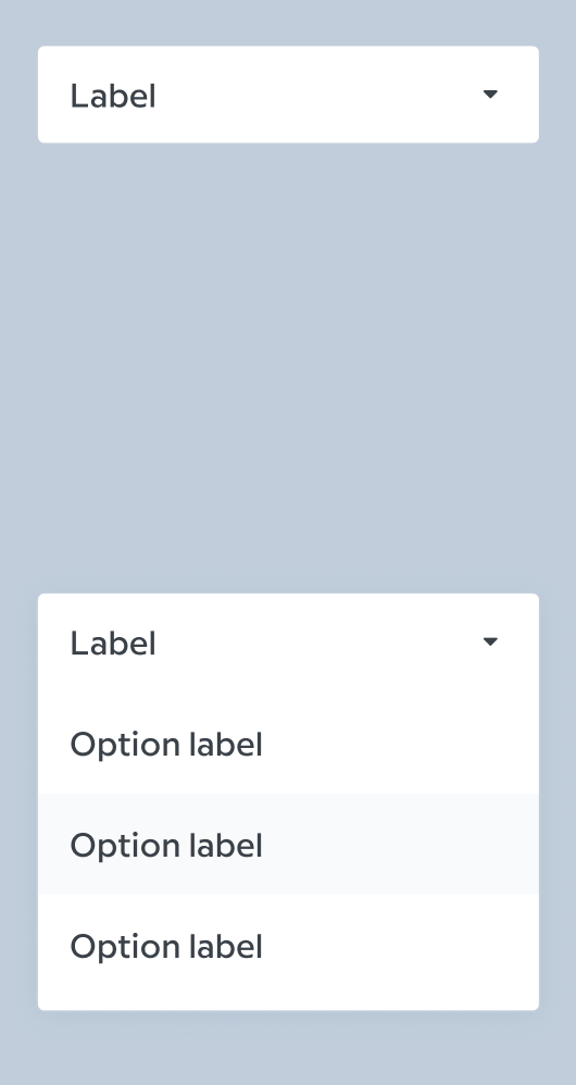
It has radius and border. When it's opened, I want it to look like single rectangle with rounded corners, rather than two next to each other
I see! It is definitely a menu with actionable items right? You're not trying to build a Select out of the dropdown menu are you?
Well in this cases it is a menu. But is there a problem building a Select out of it?
PS: I'm aware that I can style HTML select:
Yes there is, they are completely different accessibility pattern so it would be wrong to build a Select out of a DropdownMenu. We have a Select primitive coming soon btw.
Sorry for the tangent, but regardless, I think your idea makes sense considering the styling you want to achieve so I could see it valuable if we exposed it somehow.
The placed side is only calculated once the content has been opened, so worth noting it wouldn't be available to the trigger until then. I think that's probably fine for you example, as I imagine when closed the trigger would be rounded all around and once open, it would rid itself of the border radius at the top or bottom right?
Given it's calculated in the content, we're gonna have to send it back up, but I think it should be possible via context potentially and/or using CSS variables, but I can't promise we won't hit issues with regards to nested menus.
I'll label the issue as enhancement though as I think it would be nice. Thanks for bringing it up!
Yes there is, they are completely different accessibility pattern so it would be wrong to build a Select out of a DropdownMenu.
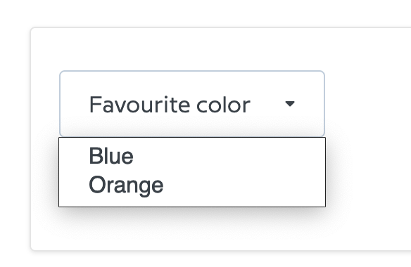
For a different case, I actually did it 😬 :
<Content align="end">
        <RadioGroup value={value} onValueChange={onValueChange as (value: string) => void}>
          {(Object.entries(itemsPrepared) as Array<[K, AddaptiveOption]>).map(([v, i]) => (
            <RadioItem key={v} value={v}>
              {i.desktop}
            </RadioItem>
          ))}
        </RadioGroup>
        <Arrow />
      </Content>
We have a Select primitive coming soon btw.
nice
UPD. Found it. I suppose to use this for select https://www.w3.org/TR/wai-aria-practices/examples/listbox/listbox-collapsible.html
Note: This may be achieved by the proposal of adding an
onSideChangeas suggested in #791