questdb.io
 questdb.io copied to clipboard
Published
20 hours ago •
 questdb
Bug - Inconsistent UI in Community page
Bug description: The UI of the community page is inconsistent and not visually pleasing.
Location: The community page has this issue.
Screenshots:
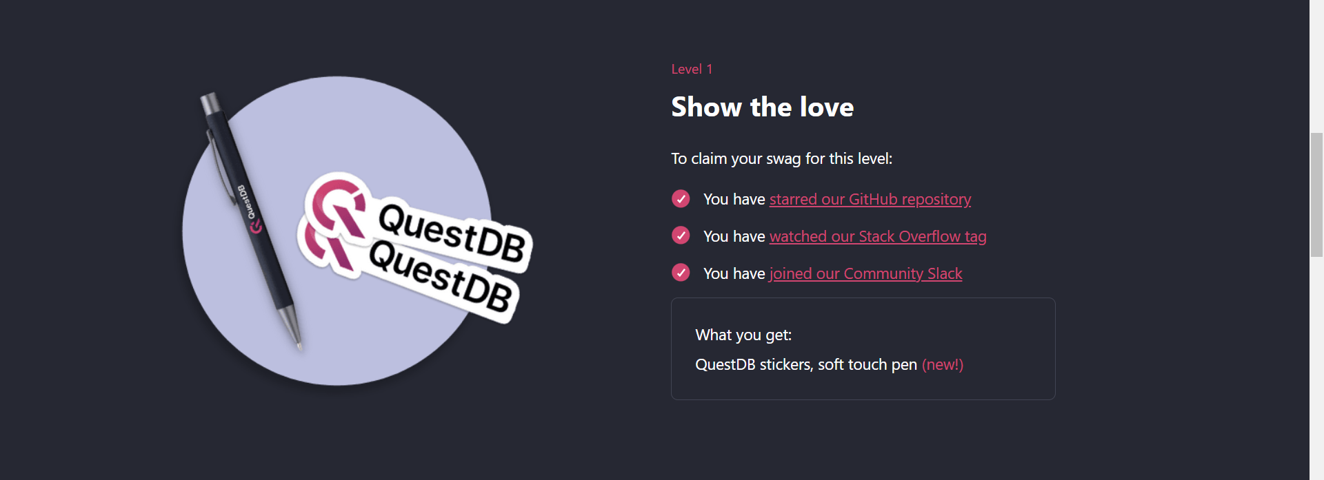
- In the above screenshot, the text inside What You Get div is aligned normally.
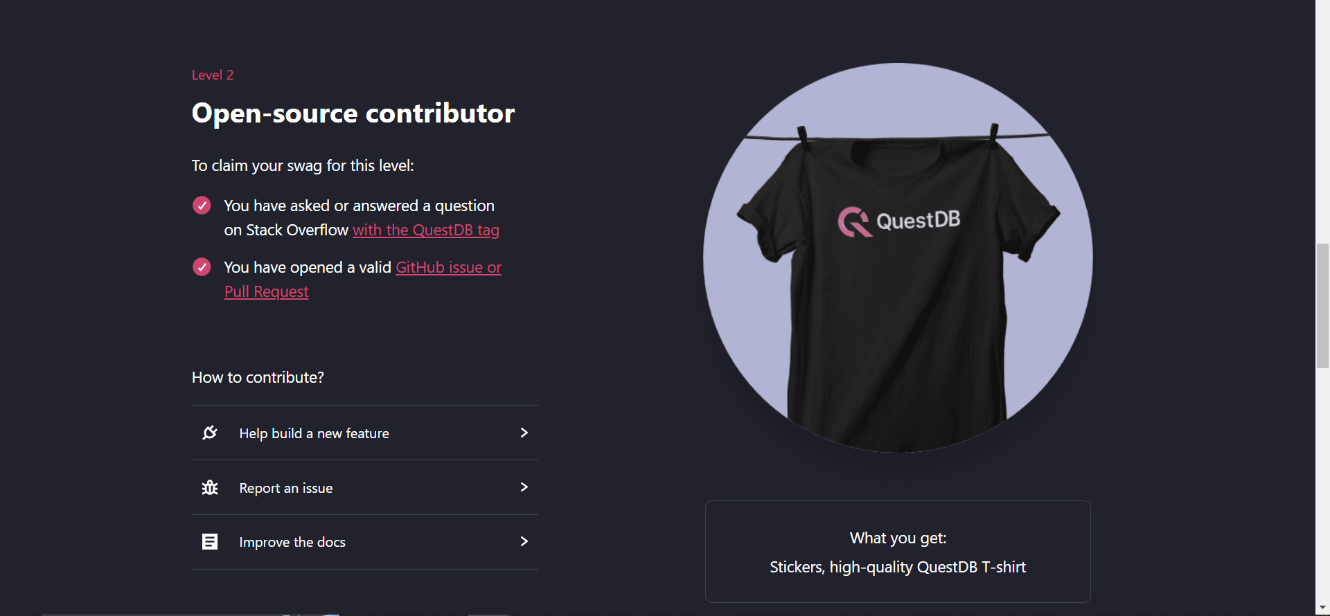
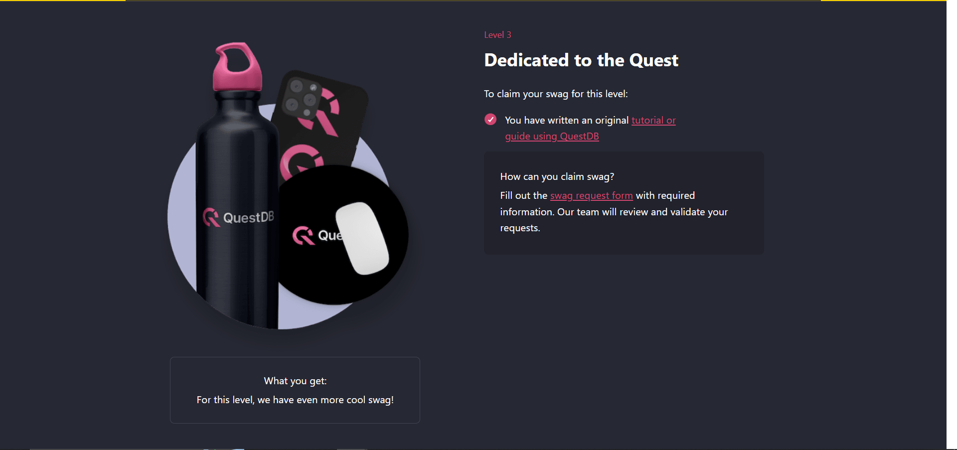
- In the other two What You Get divs, the text is aligned to the center.
- One more inconsistency is that the What You Get divs are aligned to the right in the first two levels and to the left in the third level alone.
- The final inconsistency is that the How can you claim the swag div is not positioned at the right place.
- The first time I saw the page, I was searching for instructions on how to get the swags, but it was not visible to me at the first go.
- Finally, I found that it was near the third level. Initially, I thought that that is something specific for level 3.
- I feel that the How can you claim the swag should be positioned below all the 3 levels so that it is clearly visible to the newcomers like me!
Browser and OS:
Microsoft Edge 106.0.1370.37 (64-bit), Windows 10