EMAworkbench
 EMAworkbench copied to clipboard
KDE/Contour plot option in PRIM show_pairs
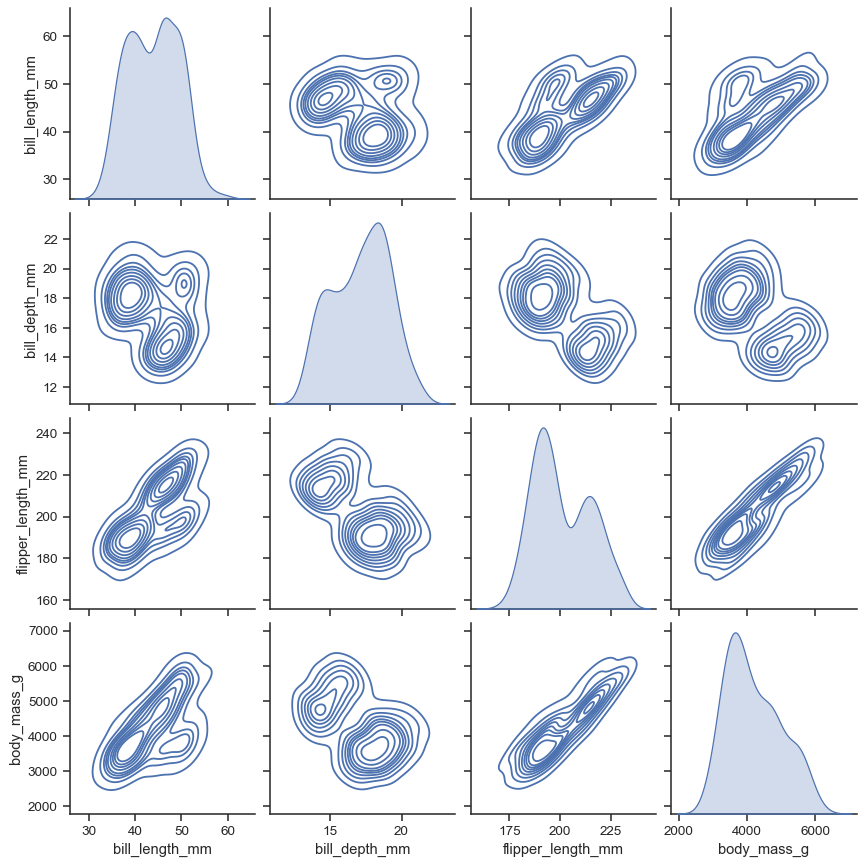
Seaborn 0.11.0 (September 2020) added functionality to the sns.pairplot() function for kde (contours) and histograms (discretized heatmap). It would be great for EMA to add this functionality, especially since the contour plot would better show the distributions within PRIM results compared to the current scatter plot approach.
e.g. from https://seaborn.pydata.org/generated/seaborn.pairplot.html
There are two main downsides to a contour plot I can see:
- Where there is no strong distinction and the failed and successful runs overlap quite a bit, the plot becomes very confusing.
- Unlike in a single contour plot, the pairwise() function does not allow the user to set the parameter
levels, so lines can become very confusing. In simple testing with a single contour, I found that 4 levels is a nice balance, but 3–5 will probably be ok too.


probably have a dict keyword argument that is passed to seaborn allows users to control this for their case
Here's another example of the levels issue. There are way too many lines and islands (peaks), which will distract a reader. I will investigate if that's already an issue identified on the Seaborn side and submit an issue if not.

EDIT: this is with Sobol sampling, so islands may be exaggerated vs LHS sampling.
I have been using pair plots a lot recently to inspect scenario boxes and have found contour plots really useful. Seaborn's PairGrid plot seems more powerful than the PairPlot used by Jason. Below is an example. Maybe the code is useful at some point?

import numpy as np
import pandas as pd
import matplotlib.pyplot as plt
import seaborn as sns

%matplotlib inline

import matplotlib.patches as patches

#import demo data
data = pd.read_csv("./bryant et al 2010 data.csv", index_col=False)
x = data.iloc[:, 2:11]
y = data.iloc[:, 15].values

#format data
data['y'] = y
data.sort_values('y', inplace = True)

#build pair grid
#draw contours twice to get different fill and line alphas
grid = sns.PairGrid(data, vars = ['Cellulosic cost', 'Total biomass', 'Demand elasticity', 'Biomass backstop price'], hue = 'y', diag_sharey=False)
grid.map_upper(sns.scatterplot) #or sns.histplot
grid.map_lower(sns.kdeplot, fill = True, alpha = 0.8, bw_adjust = 1.4, levels = 8, common_norm = False)
grid.map_lower(sns.kdeplot, fill = False, alpha = 1, bw_adjust = 1.4, levels = 8, common_norm = False)
grid.map_diag(sns.kdeplot, bw_adjust = 1.4, fill = True, common_norm = False)


#manually providing box limits
boxlim = {
    'Cellulosic cost': [75, 135],
    'Total biomass': [450, 760],
    'Demand elasticity': [-0.42, -0.2],
    'Biomass backstop price': [150, 200]
}

#shortened version of what's already used in analysis.scenario_discovery_util.plot_pair_wise_scatter
for row, ylabel in zip(grid.axes, grid.y_vars):
        ylim = boxlim[ylabel]
        y = ylim[0]
        height = ylim[1] - ylim[0]

        for ax, xlabel in zip(row, grid.x_vars):
            if ylabel == xlabel:
                continue

            xlim = boxlim[xlabel]
            x = xlim[0]
            width = xlim[1] - xlim[0]

            xy = x, y
            box = patches.Rectangle(xy, width, height, edgecolor="red", facecolor="none", lw=3, zorder = 100) #note zorder to draw box on top of contours
            ax.add_patch(box)
This is very useful. I'll try to find time to integrate this into the workbench for the next release.
If you want I can also take a look at it.
If there are any other visualizations you think could be useful, let in know!
OK cool. Happy to take a stab at it. Two discussion items:
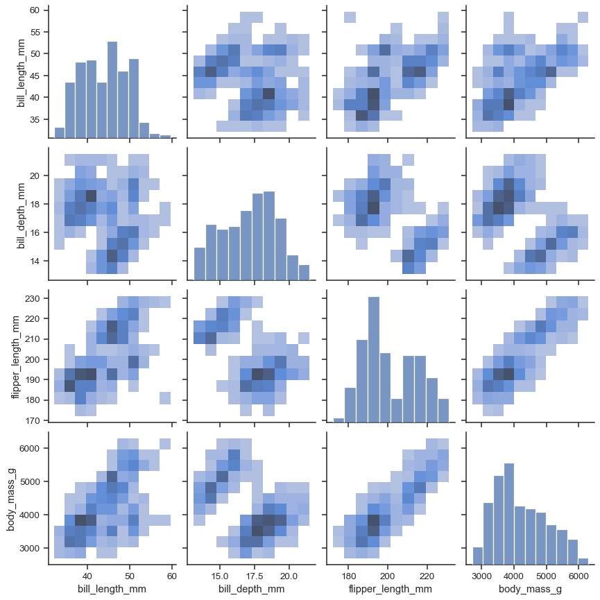
- There is also the option to do a bivariate histogram, see upper triangle here:

I think it's an interesting option as well. Not sure if bivariate histogram and contour plot together are that useful (plus its nice to have the "ground truth" scatterplot to refer to), but maybe there could be an option to choose? The current setup is that the user calls show_pairs_scatter, which in turn calls analysis.scenario_discovery_util.plot_pair_wise_scatter. So maybe two parameters in the former for specifying whether the upper and lower triangles should be a scatter (current behavior), contour, or bivariate histogram could make sense?
- I looked at getting rid of the whitespace between data and figures in the PairGrid. I got to where there is no whitespace at all, but I'm not sure it's a more appealing figure:

Some padding would be nice, but this would take some more thinking on how to rescale the axes in a smart way, which based on my initial tests seems to require a moderately deep dive into the underlying matplotlib stuff. Just sounding out your opinions on whether this is worth pursuing - it's purely asthetic. Same goes for the axis ticks and tick labels btw, which are currently not aligned between x and y axes of the same variable.
Update, i figured out the axis rescaling this morning. Implemented a first version and also included an old TODO mentioned in a comment for cdf's on the diagonal. Function call is now something like plot_pair_wise_scatter(x, y, boxlim, box_init, restricted_dims, diag = 'kde', lower = 'contour') with alternatives for diag and lower being 'cdf' and 'hist':


Will submit a pull request in the coming days.
Looks awesome, looking forward to the PR!
One idea I had, can we use opposing primary colors, like blue and yellow, to represent fail and succes, and then use their shared secondary color (like green) for area’s in which they are both.
I've done some more testing with categorical and boolean parameters (hence #236) and things are moving in a good direction. The bivariate histograms even work for cats/booleans (ignore the box)!

I also independently considered the multi-box plotting that had already been proposed in #63. I still think it's worth considering, since it would also open the door towards the multi-subspace visualization and separability questions discussed in https://doi.org/10.1016/j.techfore.2020.120052 and https://doi.org/10.1016/j.envsoft.2021.105177 (among others). Maybe for a future release.
Just a quick update, I haven't forgotten about this, but I recently found some weird edge case where the code for modifying the axis limits doesn't work. Need to find a quiet moment to dig into that.