diffsims
 diffsims copied to clipboard
Logo For Diffsims
This is something that has come up a couple of times when trying to explain the pyxem hierarchy. I think that diffsims needs a logo. I've starting writing a pyxem paper and was working on a dependency tree figure that doesn't really work without a logo.
I can draw up some designs. I'm not sure if @pc494 you guys had a logo when it was first created?
I was thinking something like this:

I need to tweak it a little bit and make sure the colors match the pyxem logo but I figure it might be good to have a constant theme.
Great initiative. Sorry to spoil your particular effort here a bit, but the logo should reflect diffraction, not diffraction in TEM. diffsims, particularly diffsims.crystallography.ReciprocalLatticeVector, is much used in kikuchipy (see e.g. our kinematical simulations tutorial), and it would be unfortunate if the logo does not reflect diffraction in the SEM as well.
I'm afraid I don't have a suggestion for a logo myself... Is it possible to use the pyxem logo for the time being?
Fair enough! My original idea was to using something like a more classic diffraction example but worried that it didn't really describe TEM diffraction very well. I fear that I may have gone too far in the opposite direction.
We could just have something like this?
Or combine the two?
Otherwise we could just take the pyxem logo and replace the text with "diffsims"
Just playing around with it....
I probably need to work on the realism of my Kikuchi pattern and we could add in an example of X-ray diffraction as well.

I like your idea of having a probe, a material with some property of interest, and a product out. We use diffsims in our forward models to predict the outcome of an experiment. Would be good if the logo captures this somehow, with relation to diffraction.
We never had a diffsims logo. My suggestions would be:
- simplify a lot, it needs to vaguely make sense when very small on a big screen
- I wouldn't use the pyxem colour scheme, will struggle to make them distinct, could use black as the background?
- I also don't really like text on logos (can you guess that the pyxem logo wasn't my design).
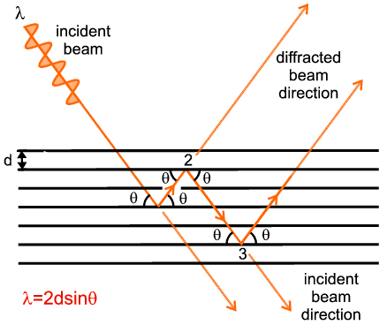
In the end it's a logo, it just needs to vaguely look sensible, it doesn't need to capture all that the package can do. Even three planes, and a stylised wave on a black background would do it for me.
So something like this?

I can play around with the colors a bit. Right now it might be too close to the background pyxem color.
@pc494 perfect I'll vectorize the image and create a svg. Admittedly this was my first concept but then I kind of overthought it. :)
Looks great! To make it clear when smaller, say, as a favicon in the browser in the extreme case, is it possible to increase the wave amplitude and the line widths?


