Pulse Shaping - Python Exercise - Make +1 and -1 lines more visually distinct
The current plot pulse-shaped plot generated in the python exercise uses 'grid' to provide reference lines:

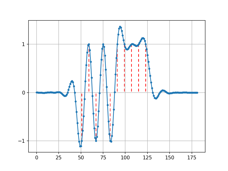
But it would be visually helpful to emphasize the y=+1 and y=-1 lines to make it easier to note that the plotted curve has value +1 or -1 at integer values of t, and if the vertical lines went from 0 to +1 or -1, for example:
from email.base64mime import header_length
import numpy as np
import matplotlib.pyplot as plt
from scipy import signal

num_symbols = 10
sps = 8

bits = np.random.randint(0, 2, num_symbols) # Our data to be transmitted, 1's and 0's

x = np.array([])
for bit in bits:
    pulse = np.zeros(sps)
    pulse[0] = bit*2-1 # set the first value to either a 1 or -1
    x = np.concatenate((x, pulse)) # add the 8 samples to the signal

# Create our raised-cosine filter
num_taps = 101
beta = 0.35
Ts = sps # Assume sample rate is 1 Hz, so sample period is 1, so *symbol* period is 8
t = np.arange(-51, 52) # remember it's not inclusive of final number
h = np.sinc(t/Ts) * np.cos(np.pi*beta*t/Ts) / (1 - (2*beta*t/Ts)**2)

# Filter our signal, in order to apply the pulse shaping
x_shaped = np.convolve(x, h)
fig, ax = plt.subplots()
plt.plot(x_shaped, '.-')
for i in range(num_symbols):
    xpos = i*sps+num_taps//2+1
    ypos = x_shaped[xpos]
    plt.arrow(
        x=xpos, y=0, dx=0, dy=ypos,
        color="red",
        ls=(0, (5, 5))
        )
plt.grid(True)
ax.set_yticks([-1, 0, +1], minor=False)
plt.savefig("pulse_shaping_python3_grw.png", format="png", dpi=150   )
yields
100% agree, and thank you for sharing a great way to do it! It's live https://pysdr.org/content/pulse_shaping.html I can't wait to see what you think of the RDS chapter, it's brand new so probably rough around the edges, not a lot of folks have read it yet.
Oh also I just realized this is actually the old repo that never got used for the textbook, although I'm not surprised google brought you here
Perhaps this code:
# Apply the pulse shaping
x_shaped = np.convolve(x, h)

# Plot the signal
fig, ax = plt.subplots()
plt.plot(x_shaped, '.-')

# Mark where the intervals of Ts occur.
for i in range(num_symbols):
    xpos = i*sps+num_taps//2+1
    ypos = x_shaped[xpos]
    plt.arrow(
        x=xpos, y=0, dx=0, dy=ypos,
        color="red",
        ls=(0, (5, 5))
        )

# Only show y grid lines at [0, -1, +1]
plt.grid(True)
ax.set_yticks([-1, 0, +1], minor=False)

plt.show()