docs
 docs copied to clipboard
 pulumi
Responsive Tables
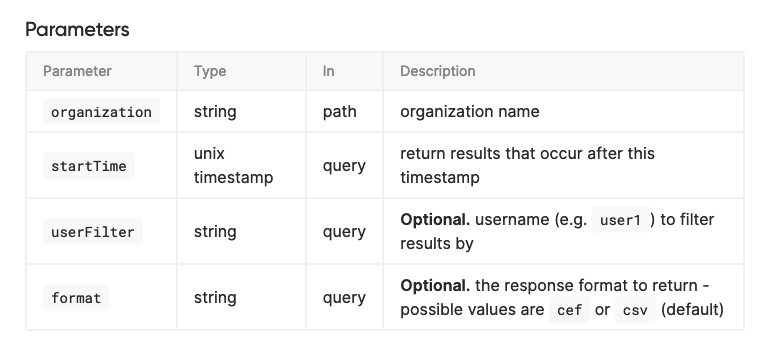
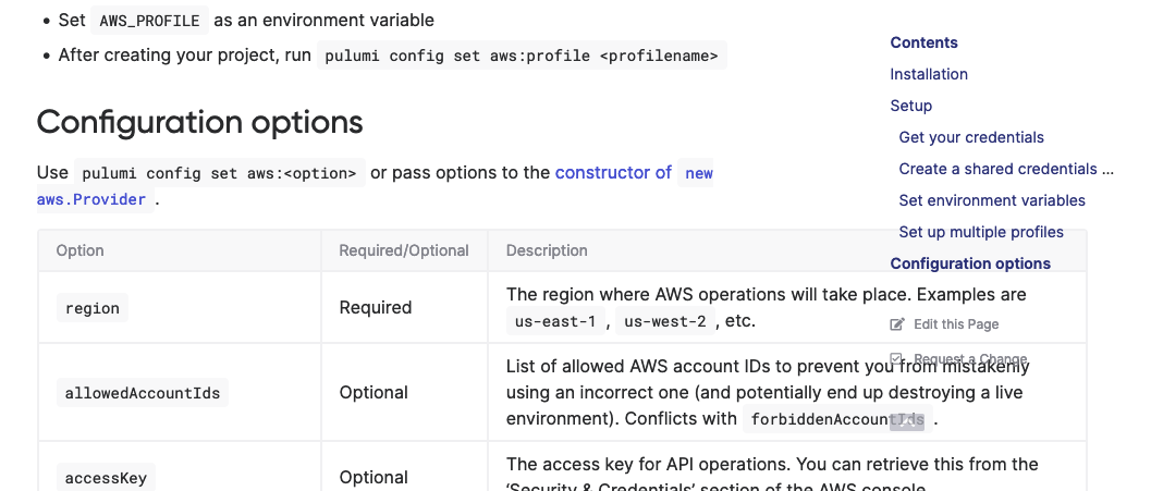
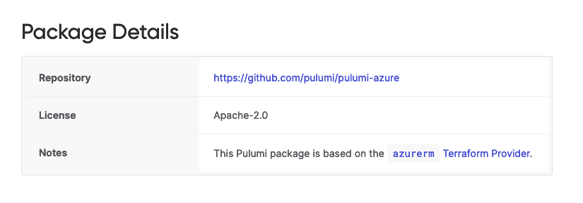
We need a better way to render HTML tables more flexibly. We do some rudimentary styling of tables today, but there isn't much in the way of responsive handling for them, so we end up with tables with columns that are too narrow for their content, scroll sideways, or spill into other columns in the grid.
We do have responsive definition lists:

... and these work pretty well for some use cases, but you have to write them out by hand (to decorate them in particular ways with CSS), and since they aren't tables, well, they aren't really a semantically suitable replacement for tables.
I like how Elastic does this with EUI:
https://elastic.github.io/eui/#/tabular-content/tables
https://user-images.githubusercontent.com/274700/152073052-9739f396-d8db-4625-8d06-fb2a218ff304.mov
These are regular ol' CSS-styled <table> tags behind the scenes, so we should be able to achieve something like this by way of regular Markdown (as we do want to let people continue to write as much as possible in just-Markdown).
Would be great to figure this out, as it comes up often, and it'd instantly make a lot of our existing pages a lot nicer and more usable.