 projectblacklight
[WIP] Make titles and text independent in relevant SirTrevor blocks.
This commit also enables the Heading field for the oEmbed + Text block.
See https://github.com/sul-dlss/exhibits/issues/1208#issuecomment-401400129 for rationale
@ggeisler this affects a few more blocks than originally specified. I think I have done the correct thing wrt the help text in the various blocks, but let me know if anything should be changed.
- Embed + Text (previously did not have a Heading field so I added one)
- Uploaded Item Row
- Item Row
- Item Embed (the original widget that was reported)
- Item Grid
Before
After
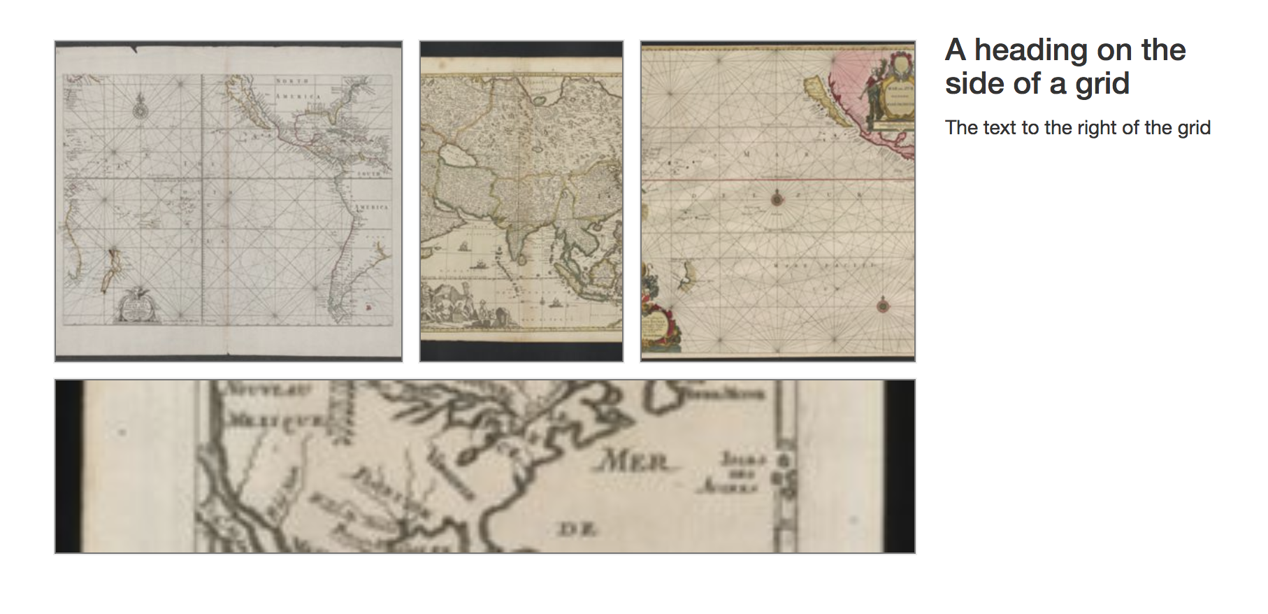
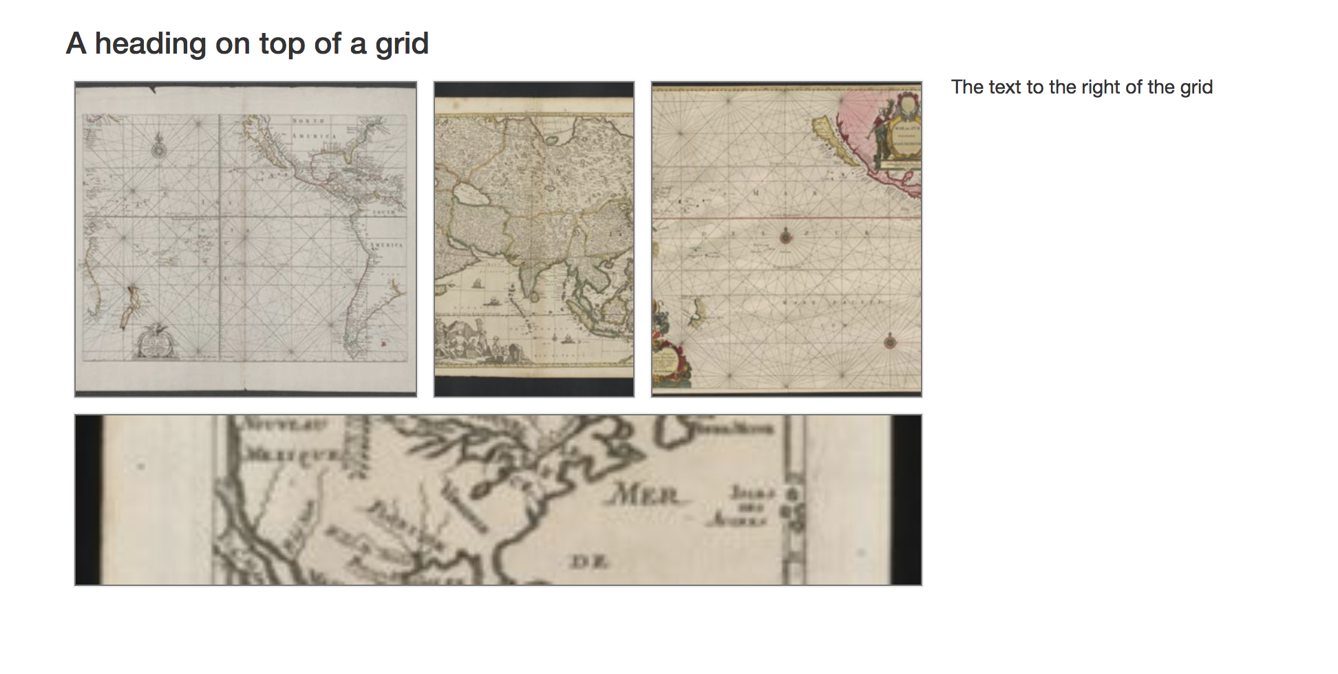
@jkeck I do think we want to hold off on this until I can look into things widget-by-widget. For example, here's an example of the image grid in a published exhibit:
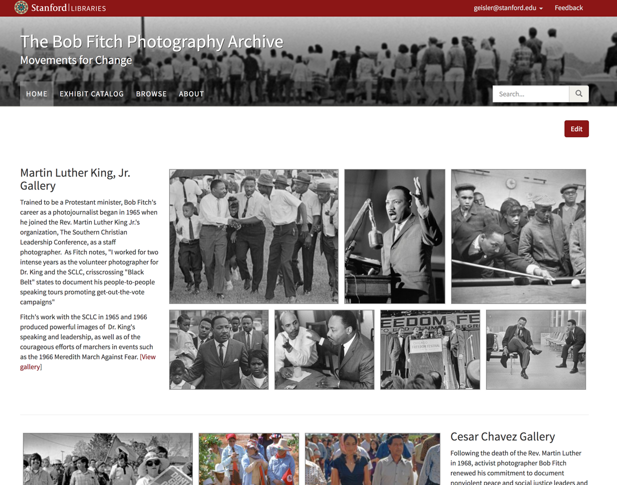
I think the current layout (where the heading is not above the images) actually works well here, since it's a homepage and not having the standalone heading row helps the page feel more compact and emphasizes the images more than I think it would with the heading above the grid.
On the other hand, your motivation for taking this approach (consistency) makes sense as well.
So let's just not merge this for now, and when I have time I'll go through each affected widget and make a decision about whether consistency is more important than considering each widget as an individual case.
@jkeck Below is my recommendation for finishing this up but definitely let me know if anything I'm suggesting concerns you. My recommendation really comes down to just treating the display of the heading field differently in each of the two possible states it can be used. This probably requires you to update what you've done a bit, but I believe we can handle all the widgets in the same way, so hopefully that will make it relatively straightforward.
For these widgets:
- Embed + Text (doesn't currently have a Heading field but one was added in this PR)
- Uploaded Item Row
- Item Row
- Item Embed
- Item Grid
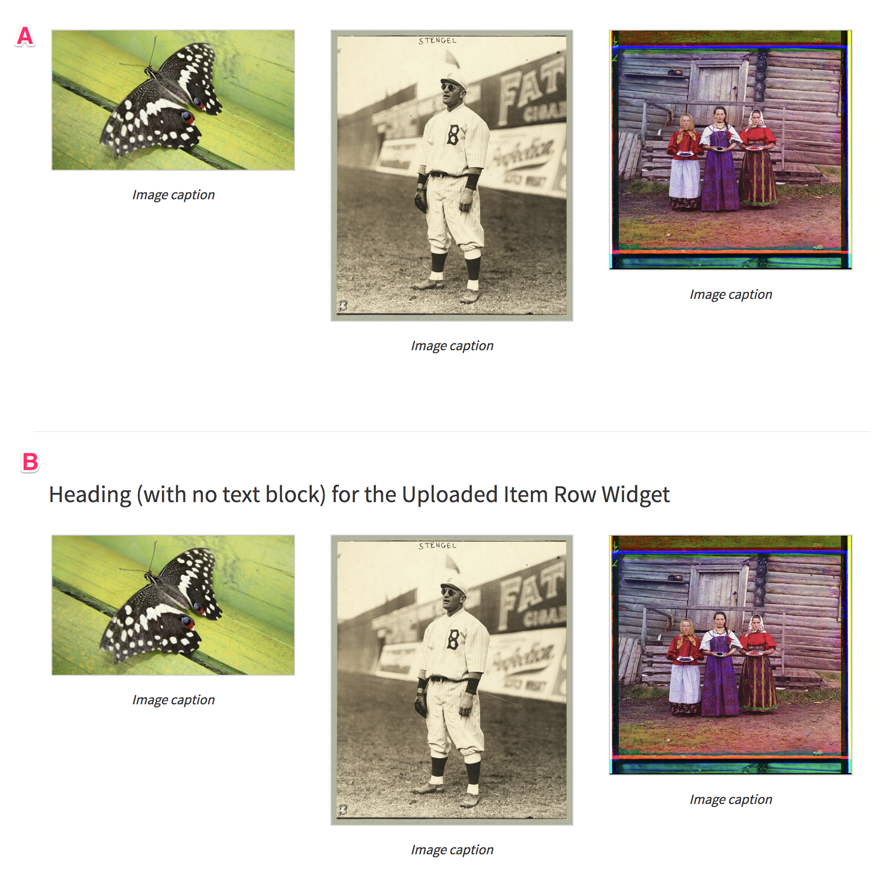
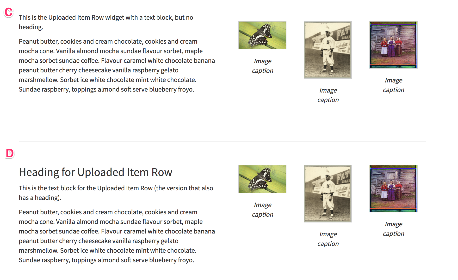
There are four possible states with regard to the optional heading and text fields that are included in the widget configuration:
- A - No heading and no text (just the item)
- B - A heading but no text
- C - Text but no heading
- D - Both a heading and text
I think we can follow the same policy for each of those states, regardless of which widget it is:
-
A: Just display the item(s), using full column width or the specified/natural width of item (as in the Embed + Text widget). I believe no change is needed for this case, it's what we currently do.
-
B: Display the heading above the widget item(s). An
<h3 />heading full column width, followed by the widget item(s) full column width. -
C: Display the text block and the widget item(s) side-by-side. Again, I believe no change is needed for this case, it's what we currently do.
-
D: Display the heading and text block in one column, side-by-side with the widget item(s) in the next column. Again, I believe no change is needed for this case, it's what we currently do.
So I think the real changes are just to:
- Add to the Embed + Text widget support for a heading (I think already in this PR)
- For all the relevant widgets, add support for having only a heading with no text block, following the case B suggestion above for how to display it.
Below are examples of each of the four possible widget states, using the Uploaded Item Row widget as an example: