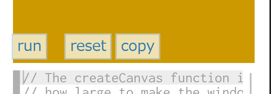
Canvas width too small
Most appropriate sections of the p5.js website?
Examples
What is your operating system?
Windows
Web browser and version
Google Chrome:103.0.5060.114
Actual Behavior
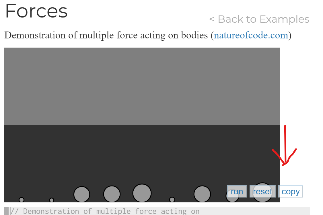
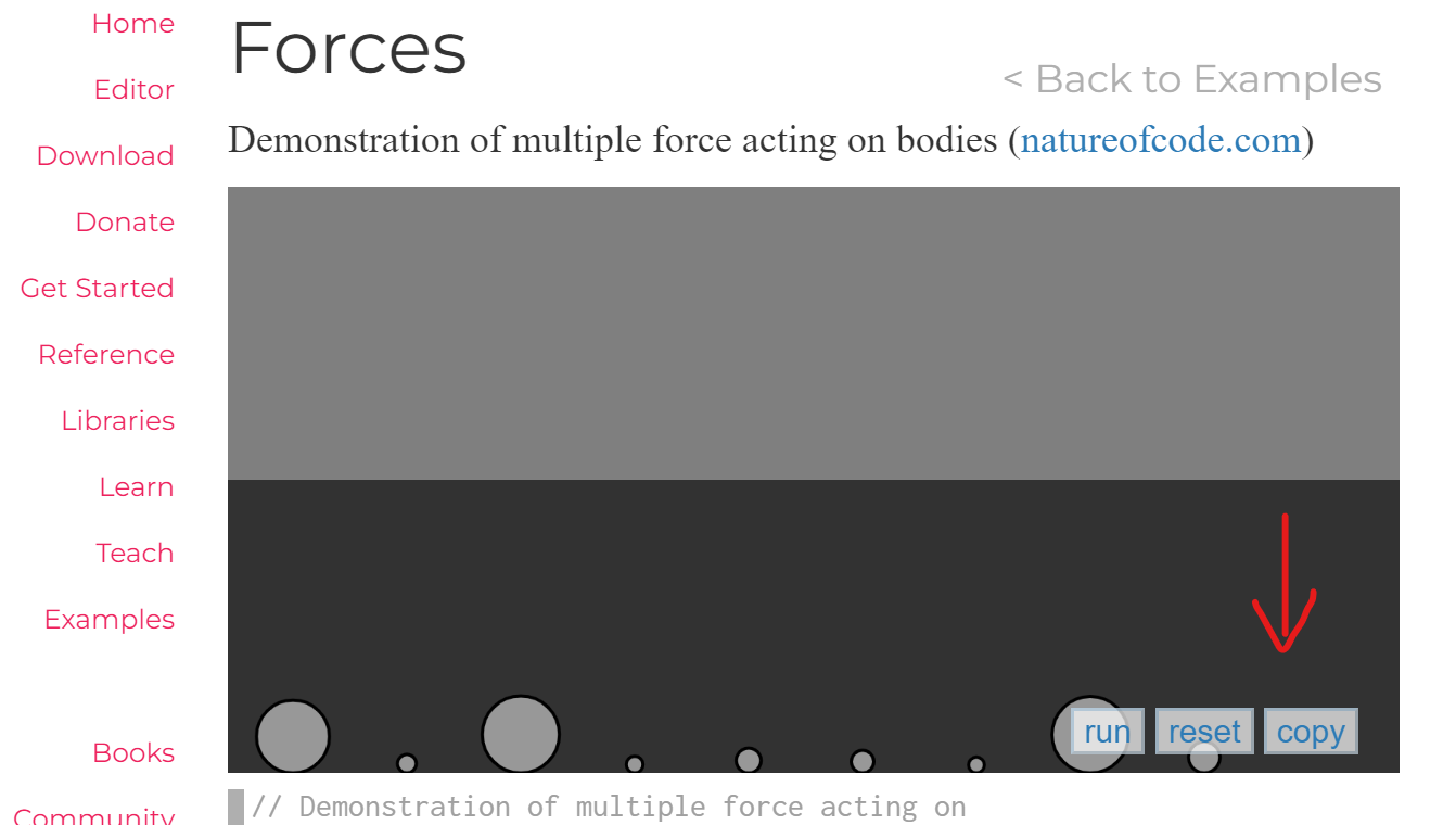
The canvas of the Forces page (https://p5js.org/examples/simulate-forces.html) in the examples section is too small to contain all three buttons and it also doesn't look good.
Expected Behavior
The canvas should be wide enough to contain all the buttons (see image)
Steps to reproduce
- Go to https://p5js.org/examples/simulate-forces.html
- Scroll down to the canvas.
Would you like to work on the issue?
Yes, I would like to work on this issue.
I can update the size of all the canvases which have this same issue under the examples page.
Thanks @adarrssh! Adding Example Stewards to this discussion, @Malayvasa, @tyler-yin, @3ru
Thank you, @adarrssh! I used to think the same thing. Certainly, fixing all canvas sizes this time would be a tentative improvement, but similar problems may occur with additional samples in the future, or with the layout being broken on mobile screens in the first place. Therefore, I suggest that instead of modifying each sample one by one, the structure of this sample page itself should be modified.
What about the others? @Qianqianye, @Malayvasa, @tyler-yin
| On Smartphones | |
|---|---|
 |
 |
Thanks @adarrssh and @3ru
Therefore, I suggest that instead of modifying each sample one by one, the structure of this sample page itself should be modified.
I agree with you that modifying the canvas width one by one is a lot of work. I am wondering if you could elaborate more on modifying the structure of the example page? Any suggestions?
- I raised this issue because some of the examples pages' canvas width was too small to contain all three buttons but only a few of them need some changes.
For example, if you head over to the Snowflakes example(https://p5js.org/examples/simulate-snowflakes.html) 👇👇
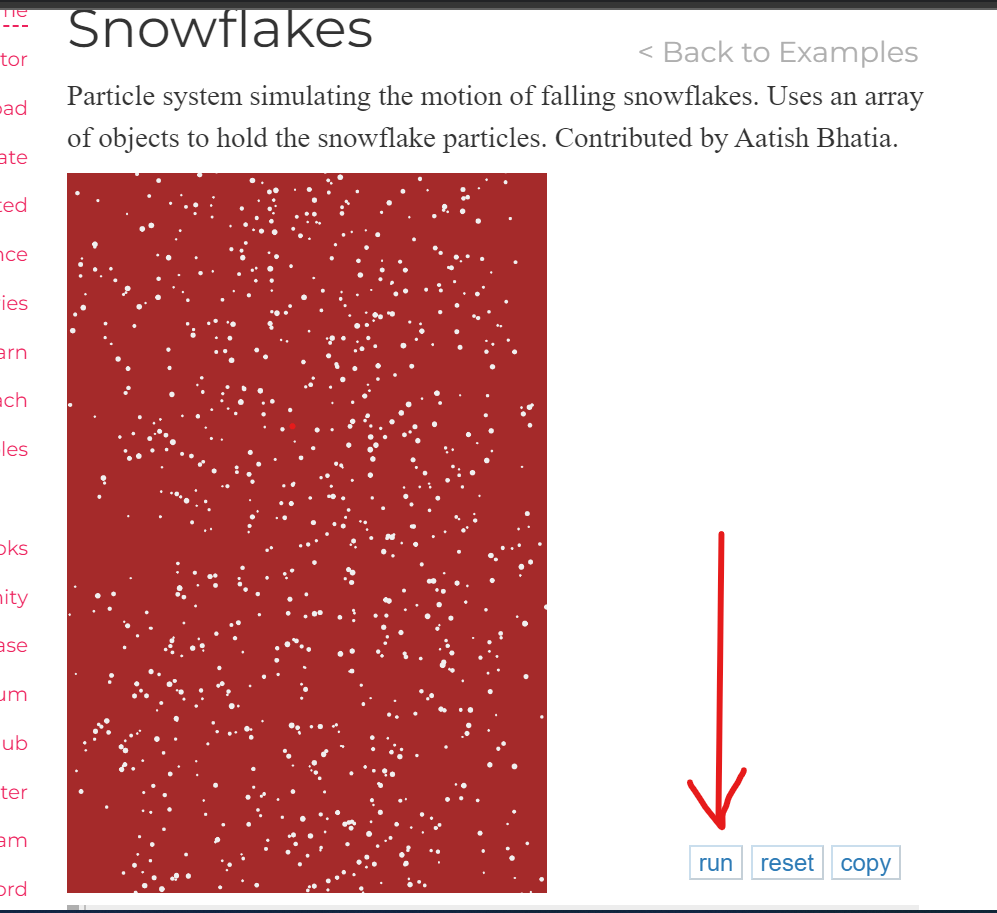
You can see that the canvas width is too small but I don't think we need to change anything here as everything looks fine here.
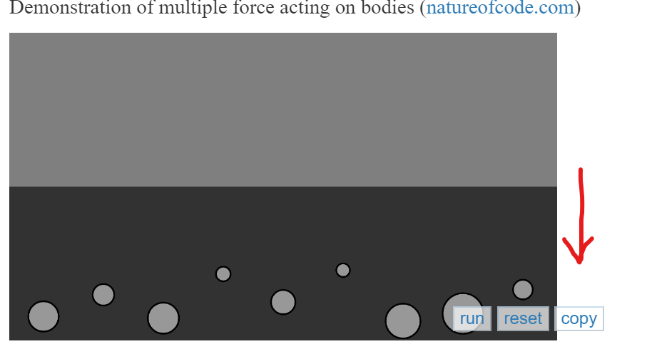
- But if we take a look at the Forces example(https://p5js.org/examples/simulate-forces.html) 👇👇, the canvas and the buttons are overlapping each other and it looks a bit odd.
- Only a few of the examples had overlapping issues, so I made the pr regarding that.
I don't think it is necessary to modify the structure of the example page as only a few of them need some changes.
I have checked the existing samples and example_template.ejs and have concluded that all samples should have the same size.
For example, it is possible to enlarge the width when it is too short, like Snowflake, or limit the width when it is too long. Still, I thought that if resizing is done on the website this way, beginners may be confused when they copy the sample, and the rendering is not the same as on the website.
Therefore, I decided that it would be best to standardize the size of all samples once and add the size required to the guidelines(contributor_docs/Adding_examples.md) for future sample acceptance rather than fix the structure.
This will be useful in the future and is a major point that can be improved upon now.
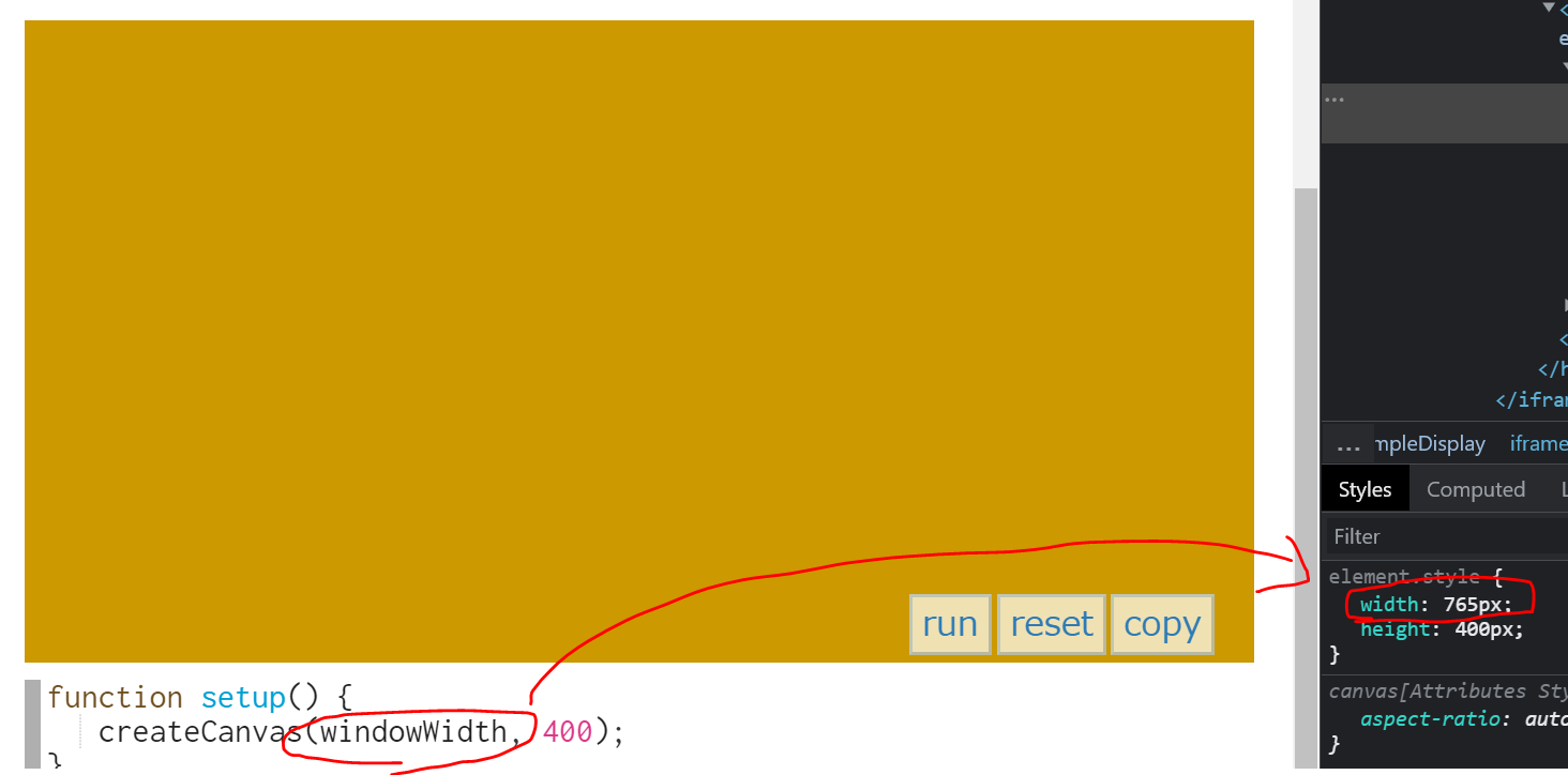
I think the ideal width of the canvas should be set to 740px. What do you think @3ru?
@adarrssh Frankly, I am not confident that 740px is ideal. One reason is that the width of the editor below is 710px. I suspect that is also why many samples are currently at 710px. https://github.com/processing/p5.js-website/blob/3677af8567735777bf7c6b60ce9ecf9e5d4d7262/src/assets/css/main.css#L1027
But of course, this does not fit the button.
Conversely, if the width is to match the upper element, it would be 36em.
https://github.com/processing/p5.js-website/blob/3677af8567735777bf7c6b60ce9ecf9e5d4d7262/src/assets/css/main.css#L966
In conclusion, I believe that all sample sizes should be standardized, but width sizes need to be discussed more concerning other components such as editors and buttons.
What are your thoughts @Malayvasa, @tyler-yin currently working on sample pages at GSoC?
Hello,
Thank you for looping me into this discussion! Happy to chime in here.
Therefore, I suggest that instead of modifying each sample one by one, the structure of this sample page itself should be modified.
I agree that a structural change makes more sense than making individual edits for each example.
Unless I am mistaken, I feel that this issue is more about button positioning than canvas width. I would propose changing the buttons so that they align to the left by default (which reflects the behavior on mobile & narrower media queries). This should address the first point @adarrssh brings up in the thread.
As @3ru points out, It seems like the button positioning needs to be fixed across most (if not all) sketches for mobile & narrow media queries anyway, so that they are evenly spaced and contained within the sketch.
I would suggest the following changes as a way to start resolving the button spacing & overlapping issues.
https://github.com/processing/p5.js-website/blob/3677af8567735777bf7c6b60ce9ecf9e5d4d7262/src/assets/css/main.css#L1015
#exampleDisplay .edit_space {
    position: relative;
    order: 3;

    top: -2.5em;
    display: flex;
    flex-direction: row;
}
https://github.com/processing/p5.js-website/blob/3677af8567735777bf7c6b60ce9ecf9e5d4d7262/src/assets/css/main.css#L985
#exampleDisplay button {
    color: #2d7bb6;
    border-color: rgba(45,123,182,.25);
    margin: 0.5em 0 -2em 0.5em;
    background: hsla(0,0%,100%,.7);
    z-index: 2;
}
Please let me know what you all think!
@tyler-yin I think the perfect solution will be to change the button positioning.
Thanks for sharing the suggestion! Changing the button position sounds like a promising solution. Would @Malayvasa explore this potential approach in this year's GSoC project, @tyler-yin? If not, we can keep this issue open and assign other folks to work on it.
@Qianqianye I believe @Malayvasa is working on a redesign solution that would be more of a long-term vision, so I think it makes sense to keep this issue open and work on it in the ways we are discussing here.