date-picker-svelte
 date-picker-svelte copied to clipboard
Published
20 hours ago •
 probablykasper
probablykasper
Add Icon
Not supported at the moment. It is technically possible to create a custom input and use the DatePicker component instead of DateInput
@sciefylab or anyone that might be looking for this. I did this way
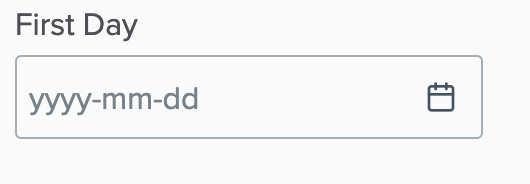
<div class="date-wrapper">
        <DateInput bind:value format="yyyy-MM-dd" placeholder="yyyy-mm-dd" />
</div>

<style>
	.date-wrapper {
		--icon-position: 0.75rem;
		--icon-width: 1rem;
		--icon-date: url("data:image/svg+xml,%3Csvg xmlns='http://www.w3.org/2000/svg' width='24' height='24' viewBox='0 0 24 24' fill='none' stroke='rgb(65, 84, 98)' stroke-width='2' stroke-linecap='round' stroke-linejoin='round'%3E%3Crect x='3' y='4' width='18' height='18' rx='2' ry='2'%3E%3C/rect%3E%3Cline x1='16' y1='2' x2='16' y2='6'%3E%3C/line%3E%3Cline x1='8' y1='2' x2='8' y2='6'%3E%3C/line%3E%3Cline x1='3' y1='10' x2='21' y2='10'%3E%3C/line%3E%3C/svg%3E");
	}
	.date-wrapper :global(.date-time-field input[type="text"]) {
		padding-right: calc(var(--icon-width) + var(--icon-position));
		background-image: var(--icon-date);
		background-position: center right var(--icon-position);
		background-size: var(--icon-width) auto;
		background-repeat: no-repeat;
	}
</style>