 primer
UnderlineNav overflow behaviour implementation
Closes #1251
This PR addresses the overflow behaviour implementation that is described in the design issue.
TODO:
- [x] Auto hide the icons when overflow occurs
- [x] Update
Moremenu button styles - [x] Implement scroll behaviour for coarse pointer devices
- [x] Enhanced scroll styling
- [x] fading affect for showing/hiding the arrow buttons
- [x] Blur effect to indicate there are more items on the scroll
- [x] Scroll selected item into the view
Current built on storybook: https://primer-463f4c80a3-13348165.drafts.github.io/storybook/?path=/story/layout-underlinenav-examples--internal-responsive-nav
Current built on docs: https://primer-463f4c80a3-13348165.drafts.github.io/drafts/UnderlineNav2
Light Theme
More Menu

Scroll

Dark Theme (Dimmed)
More Menu

Merge checklist
- [x] Added/updated tests
- [x] Added/updated documentation
- [x] Tested in Chrome
- [x] Tested in Firefox
- [x] Tested in Safari
- [x] Tested in Edge
Take a look at the What we look for in reviews section of the contributing guidelines for more information on how we review PRs.
🦋 Changeset detected
Latest commit: 80e52e3a1695c5767d95f4f806ff86a74a264b90
The changes in this PR will be included in the next version bump.
This PR includes changesets to release 1 package
| Name | Type |
|---|---|
| @primer/react | Minor |
Not sure what this means? Click here to learn what changesets are.
Click here if you're a maintainer who wants to add another changeset to this PR
![changeset-bot[bot] avatar](https://avatars.githubusercontent.com/in/28616?v=4 "Published by a pub.dev verified publisher")
size-limit report 📦
| Path | Size |
|---|---|
| dist/browser.esm.js | 77.1 KB (0%) |
| dist/browser.umd.js | 77.71 KB (0%) |
![github-actions[bot] avatar](https://avatars.githubusercontent.com/in/15368?v=4 "Published by a pub.dev verified publisher")
Adding skip changeset label just to avoid running changeset while keeping the PR draft. I'll remove it and add changeset when it is ready for review.
Thank you @broccolinisoup, this is great!
A few things I've spotted:
Overflow menu
The responsive behavior that hides icons and then shows the More menu seems to trigger a bit too early when there's still room to show the items fully. Also happens when the More menu is visible.
https://user-images.githubusercontent.com/175638/190130975-1b17cd86-30d8-4387-9d3d-9cf65ddc6a0a.mp4
There are situations where the resizing isn't triggering correctly and the menu items overflow the container.
https://user-images.githubusercontent.com/175638/190131010-51459c1a-802a-4bc9-ab81-4e66da10d8b6.mp4
Overflow scroll
When overflow occurs, the component first hides icons if present to optimize for space and show as many items as possible. If there is still overflow, the component will behave depending on the pointer. Please see below to see these behaviours.
From this description, I understand that the behavior is only triggered when there are overflowing items, meaning that if all items fit on the screen on coarse pointer devices, the icons won't be hidden. But we should hide icons by default on those devices, independently of whether there are overflowing items or not.
The overflow scroll button width doesn't meet our minimum touch target area, and the icon is touching the component's borders which makes it harder to tap.
To solve this problem, I think we could do something similar to this prototype where the fade area and arrow button are sliding in/out as we start scrolling the container. This allows us to use more real estate for the the button while keeping the original padding when the container is not scrolled.
https://user-images.githubusercontent.com/175638/184420306-0de4b29f-895f-4851-8f0e-cf634968d230.mp4
Keyboard nav
I'm struggling with using the keyboard to navigate the component. I expected I could tab into each nav item, but instead the whole nav element receives focus, and I have to use left/right arrow keys to select each item. Is this the expected behavior or something that needs to be worked on with @hectahertz?
States
When tapping an item on mobile, the hover/active state remains visible.
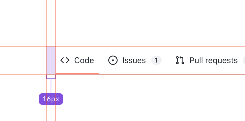
Spacing and sizing
The UnderlineNav container needs 16px of inline padding instead of 8px.
Other
These are probably for another PR, but I wanted to share them so we have them on our radars:
- We need to remove the
alignandvariant(size) props as we won't have those options in the final component. - In the API design proposal we named the prop for the icon just
iconinstead ofleadingIcon. I'm not sure we have it documented somewhere, but from what I see in other components we useleadingIconwhen we have atrailingIconcounterpart and useiconalone when the position is handled by the component.
@danielguillan Thank you so much for your comprehensive review 🙏🏼 Please see my answers below.
Overflow menu
- I wasn't sure when would be the ideal to start popping them in the menu so used 0.8 of the viewport but should we do (viewport - (widthOfTheMoreBtn) - (someMargin)) ?
- I'll fix the issue where menu items overflow the container 👍🏼
Overflow scroll
- Eric left a comment on the design issue and I am not sure how this will affect the scroll behaviour?
Keyboard nav
Sorry I should have mentioned in the description of the PR that it is still a very much WIP, mostly due to not being clear about the aria roles and how to navigate through the items i.e. tab through or arrow buttons. @hectahertz is working on getting some recommendations for it.
States
Thanks for pointing this out, I'll fix it!
Spacing and sizing
I'll fix it too 😊
Other
- Re the
alignandvariant, sorry, we thought it would be good not to delete the code in case any change occurs in the future but I shouldn't have left them exposed as props. I'll remove them from being prop. - Re the
icon, thanks for pointing this out! I totally missed that. It makes so much sense to make iticon. I'll fix it.
@joshblack thank you so much for testing out 🙏🏼
Sorry, I should have mentioned on my PR that accessibility is still very much in progress but I still really appreciate your feedback as some were concerns for me and wasn't sure what would help to solve. So thank you in advance 🙏🏼 😊
- The way we navigating through the list items are still super unclear. This is why I haven't given much attention to it yet. There are a few recommendations so far and thank you for sharing your feedback of how you expect it to work with tabs (as same as Dani). I'll leave it to Hector to finalise it with our accessibility consultant 🙏🏼
- That was one of the concerns I had and hadn't started thinking of how to solve it, so thank you so much for your recommendation. I'll try that.
- I agree. The order is misleading. I haven't worked on that part yet. Also, there is another feature that I haven't started implementing is that the selected item will always be visible.
- Thank you for that, I'll look into that one too 🙂
I hope when I start properly implement the accessibility which is I am starting very soon, I'll address each issue you mentioned. Thank you again for your review! 🥳
@broccolinisoup
I wasn't sure when would be the ideal to start popping them in the menu so used 0.8 of the viewport but should we do (viewport - (widthOfTheMoreBtn) - (someMargin)) ?
Yes, I believe that could work better as our goal is to avoid hiding icons/collapsing items as much as possible.
Eric left a comment on the design issue and I am not sure how this will affect the scroll behaviour?
Given that we've been going back and forth with this specific behavior and @ericwbailey's strong advocacy for the more button behavior on coarse pointer devices too, I think we should probably discard the overflow behavior for now.
This is looking great @broccolinisoup!
My only concern, as you've mentioned in the recording, is that the "more" menu behavior on coarse pointer devices is problematic on small viewports. I don't think it's a good pattern to solve this problem on mobile devices. I've added a comment on the design issue to see if we can find alternatives.
Awesome! @danielguillan We have the scroll behaviour in the commit, so we can always bring it back. I am keeping an eye on the design issue to see what our next step is.
@danielguillan I reverted the commit to bring the scroll behaviour back and addressed your feedback around it as well. The only thing I would say is that the slide-in and out animated effect is a bit tricky to do with react. I understand about giving us more real estate. I played with it a little bit more to give more space to click while maintaining the padding etc. Do you think we can go with the current implementation for now and merge this PR if all other concerns are address? It became quite big and I have another PR coming up (making selected item always visible) so would be great to merge this to avoid conflicts and make it available under the drafts?
In the meantime, I'll try to get some support for css & react animation to achieve slide in and out behaviour.