 primer
ActionMenu: Inline label
- Based on https://github.com/github/primer/discussions/696
- Fixes https://github.com/github/primer/issues/994
- Fixes https://github.com/github/primer/issues/995
- Fixes https://github.com/github/primer/issues/993
.
Open questions:
- Is the prop
labeltoo similar toaria-label, can that cause confusion? Should we call itinlineLabelinstead to add some weight? - Is there something we can do to simplify the a11y needs with an external label as well? Right now, we defer this responsibility to the user. For example, we could split the
labelprop intolabel&showLabel.labelwould be used to createaria-labelon button andaria-labelledbyfor action list. it will only be shown visually ifshowLabelorwithInlineLabelis passed.
Explanation
Goal:
For menus with selection, it's common to show the selected value inside the button. To give context, it's important to show purpose of the menu as well. Visually, this can be an external label above the button or an inline label inside the button (new!)
In both cases, the label for screen readers (with aria-label or aria-labelledby) should have both purpose and value, example: "Field type: Number".
We want to add the option to add an inline number (left) as an alternative to external label (right)
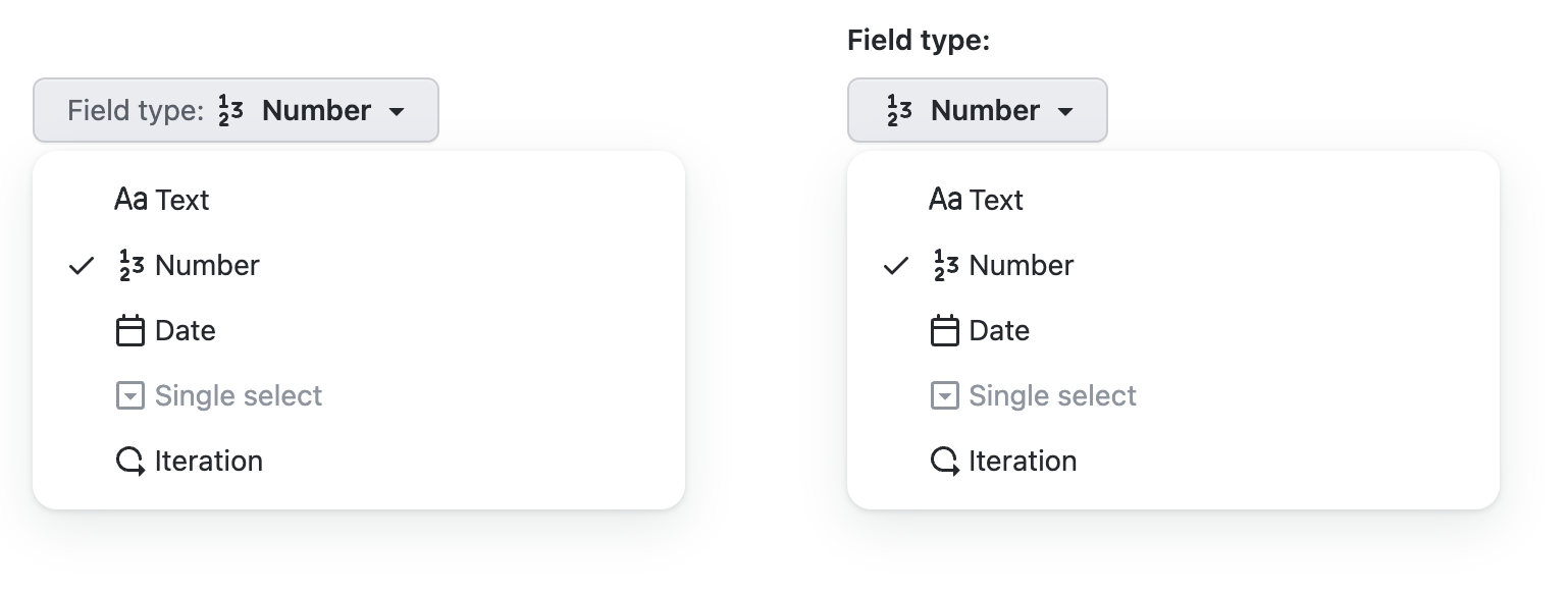
a11y tree:
► combobox "Field type: Number"
► menu "Field type"
To achieve this today, users have to write something like this:
<ActionMenu>
  <ActionMenu.Button
    aria-label={'Field type: ' + selectedOption.name}
    leadingIcon={selectedOption.value}
  >
    <Text sx={{ color: 'fg.muted' }}>Field type:</Text>
    {selectedOption.name}
  </ActionMenu.Button>
  <ActionList
    selectionVariant="single"
    aria-label="Field type"
   >
    ...
   </ActionList>
</ActionMenu>
Suggested API in this pull request:
- use
labelinstead ofaria-labelonActionMenu.Button - labels for button and menu are created automatically
<ActionMenu>
  <ActionMenu.Button
-   aria-label={'Field type: ' + selectedOption.name}
+   label="Field type"
    leadingIcon={selectedOption.value}
  >
-   <Text sx={{ color: 'fg.muted' }}>Field type:</Text>
    {selectedOption.name}
  </ActionMenu.Button>
  <ActionList
    selectionVariant="single"
-   aria-label="Field type"
   >
    ...
   </ActionList>
</ActionMenu>
html output:
<button aria-labelledby="purpose divider value">
  <span id="purpose">Field type</span><span id="divider">:</span>
  <svg aria-hidden="true"></svg>
  <span id="value">Iteration</span>
<button>
<div role="menu" aria-labelledby="purpose"></div>
a11y tree:
► combobox "Field type : Number"
► menu "Field type"
🦋 Changeset detected
Latest commit: acb7ee535e41aa78a06ee10b240a4d9e86d9b032
The changes in this PR will be included in the next version bump.
This PR includes changesets to release 1 package
| Name | Type |
|---|---|
| @primer/react | Minor |
Not sure what this means? Click here to learn what changesets are.
Click here if you're a maintainer who wants to add another changeset to this PR
![changeset-bot[bot] avatar](https://avatars.githubusercontent.com/in/28616?v=4 "Published by a pub.dev verified publisher")
size-limit report 📦
| Path | Size |
|---|---|
| dist/browser.esm.js | 66.07 KB (+0.28% 🔺) |
| dist/browser.umd.js | 66.41 KB (+0.27% 🔺) |
![github-actions[bot] avatar](https://avatars.githubusercontent.com/in/15368?v=4 "Published by a pub.dev verified publisher")
Hi! This pull request has been marked as stale because it has been open with no activity for 60 days. You can comment on the pull request or remove the stale label to keep it open. If you do nothing, this pull request will be closed in 7 days.

Hi! This pull request has been marked as stale because it has been open with no activity for 60 days. You can comment on the pull request or remove the stale label to keep it open. If you do nothing, this pull request will be closed in 7 days.
👋🏻 @siddharthkp anything I can do to help get this one over the line? Were you waiting on an accessibility specialist to review?
Hi! This pull request has been marked as stale because it has been open with no activity for 60 days. You can comment on the pull request or remove the stale label to keep it open. If you do nothing, this pull request will be closed in 7 days.