Flash alert issues
While starting to migrate the .flash alerts to use ViewComponents we discovered a few issues.
1. Pushes down the dismiss/close button

Reported in https://github.com/github/github/pull/151639#pullrequestreview-467139518.
2. Doesn't wrap when a single word.

Reported in https://github.com/github/github/issues/152803
3. Doesn't support multiple flash actions.

That can be used more like a toolbar. Reported in https://github.com/github/github/pull/151482#issuecomment-670181616.
Currently these problems get worked around by adding utility classes or custom styles, but it would be better if it gets fixed by the CSS component.
Not sure if we should support the last one, since it's currently a one off used for the notifications alert? 🤔
Hey there, I am tackling a case of this in a notifications strip that we're exploring. I need a responsive version of an alert for a sign in prompt in a tight space:

Current alerts don't wrap well when have a button and when they are dismissible:

Let me folks know if you plan to fix it ✨ cc @simurai
👋🏻 @keithballinger and I ran into the same issue as @killnicole when working on https://github.com/github/github/pull/175858.
When having a button on the right, it's necessary to add flex-1 (or use another approach) to make the flash component more responsive. Ideally, that shouldn't be needed. See https://github.com/github/github/pull/191112#discussion_r700540770

Some more issues reported by @edokoa:
- The banner seems tall, but that’s default flash flash-error (I also agree that the top and bottom margins look big, but they’re also big in the documentation. Is this the expected behavior?)
- Had to add
d-flex flex-items-centerto it, the primer docs say it should work without that?
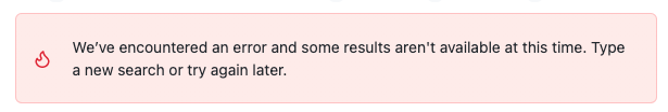
Currently notifications use a customized flash alert:

Maybe one of the reasons that it needs to be customized is that the spacing of multiple flash-action buttons has a too big gap:

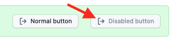
Another problem is that the icon in disabled buttons doesn't use the disabled color to match the text:

Most, if not all, of these issues are fixed by https://github.com/primer/css/pull/1979.

The text wrapping on this specific flash alert looks off. This can be found under Org settings/Billing and plans
Hi! This issue has been marked as stale because it has been open with no activity for 180 days. You can comment on the issue or remove the stale label to keep it open. If you do nothing, this issue will be closed in 7 days.
Hi! This issue has been marked as stale because it has been open with no activity for 180 days. You can comment on the issue or remove the stale label to keep it open. If you do nothing, this issue will be closed in 7 days.