dark theme for contributions
#41 was discuss this feature. Using darker color present less contributions is confusing some of developers. So I keep it on original style. But I still open on this issue.
I know there's been a lot of flip-flopping for the order the scale should go. The screenshot above starts dark then goes light to dark. IMO, it should entirely go from dark to light. Or more accurately it goes from least contrast to the background to highest contrast which is consistent when viewing in the normal light mode.
$contrib-color: #103605;
$contrib-color-1: $block-bg;
$contrib-color-2: $contrib-color;
$contrib-color-3: lighten($contrib-color, 15%);
$contrib-color-4: lighten($contrib-color, 30%);
$contrib-color-5: lighten($contrib-color, 50%);
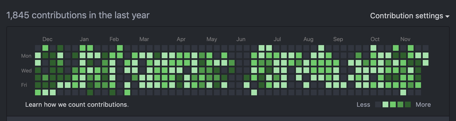
I like this color scheme! And I don't think it's confusing, but I wasn't confused the first time around either :) There is a legend in the bottom right that shows Less to More.
I think we should re-implement this, since it's one of the last places that is not inverted.
add dark theme for contributions like this color code here is #404751
Definitely prefer this color over the others suggested. Contrasts with all of the >0 contribution days while still maintaining contrast with the background.
Any updates on this issue? I'd like to see the color scheme in the screenshot being implemented.
I want to end this series of discussions with this color #31363f shows below. This color is block background color of this theme. I think it makes sense for the color set of this theme. And also keep original green contribution color to let no people confusing.
If you support this adjust, please thumb this up. I'll merge this into master when getting 10 thumbs. Thank you!