Minor issues / suggestions
I think some minor UI updates could be in order. These are my minor suggestions / complaints.
It may also help (in my opinion) to add a few <hr> tags in these places
Why isn't the author and plugin name on the same line?
~~What is going on here? The highlighted text is bigger than the text below it when it shouldnt be~~ Nevermind, i assume the first category is bigger because it is the main one
This doesnt fit that well either
Updates
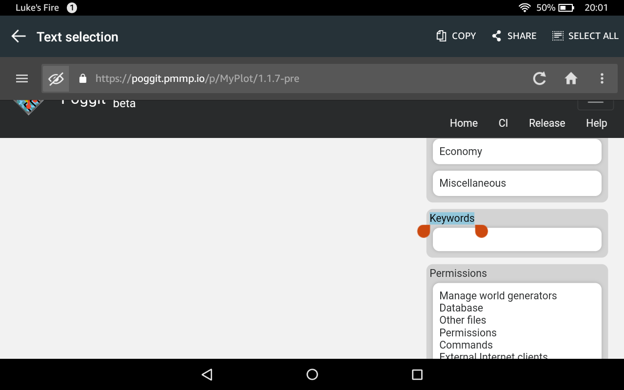
There are no keywords, yet there is a keywords box. Hmm.
And finally, i believe a slightly thinner font would look nicer for the headings
Wow you guys were so quick at fixing the majority of issues here! I removed the ones which were fixed already, and added some more
Fixed 1, 2, 4. For 3, I'm not a fan of <hr> but why not... they used to be there and I deleted them because to me they are the best way to make any site look 10 years old, along with frames, tables and flashing buttons. For 5, it's hard making sure Poggit displays perfectly on mobile, tablet and desktop, not forgetting all the different browsers... so I think that's forgiveable. And the last one brings me back to tables... which I'm replacing gradually with responsive alternatives.
For 6, it's because @Awzaw copied everything from the old submit form HTML, made the controls disabled and filled the values. It's actually not designed well for displaying.
We could consider adjusting the minimum screen width to use two horizontal divs ("desktop" view) rather than a straight long line ("mobile" view).
@sofe exactly, which reminds me that the non responsive table issue is still a problem in the new submit page, for dependencies, manual setup and supported APIs.
A few other issues, that aren't all related to the UI but aren't life changing so dont deserve another issue
- [x] The API Documentation link on the developer dashboard is broken (https://poggit.pmmp.io/help.api returns 404)
- [x] The PQRS link on the plugin edit page links to the homepage
- [ ] ~~The authorizations page table is not bordered. Was this intended?~~
Plugin page
- [ ] ~~Maybe seperate the permissions box into seperate sub-boxes like the categories box?~~
- [x] The "How to install?" text is not clearly a link. It could be made into one or made a button instead
Dialogs
- [ ] Make the dialog boxes slightly wider to support longer plugin titles or make them stretch to fit ( image)
- [ ] Possibly make the background slightly darker than you already make it when dialog is open (to make sure the users' full attention is on the dialog)
- [x] The highlighted text is uppercase, whereas the button text is lowercase and in the Accept dialog the text is not uppercase (image)
- [x] No virions used, so why show the text and make it look cluttered?
85deeab4 fixes help.api link 5858d809 fixes PQRS link
The authorizations page table is not bordered. Was this intended?
Yes, but it should be responsified too.
Maybe seperate the permissions box into seperate sub-boxes like the categories box?
Aiming for fewer boxes, not more, so probably not.
The "How to install?" text is not clearly a link. It could be made into one or made a button instead
It looks pretty obvious to me... Again, I think the fewer buttons, the better; and since this is only an informational popup it doesn't really deserve its own button.
For Dialogs, I've allowed word-break in accept/reject, and removed the caps, but there will probably still be some popup size issues...
73efad91 hides Virion display when none are used
That "How to install?" text does looks very much like the "Switch version" text (which is a label, and not a link).
And is there a reason i'm not seeing the voting buttons? @Awzaw
Yes, only 'checked' plugins can be upvoted for community approval - approved plugins don't need to be.
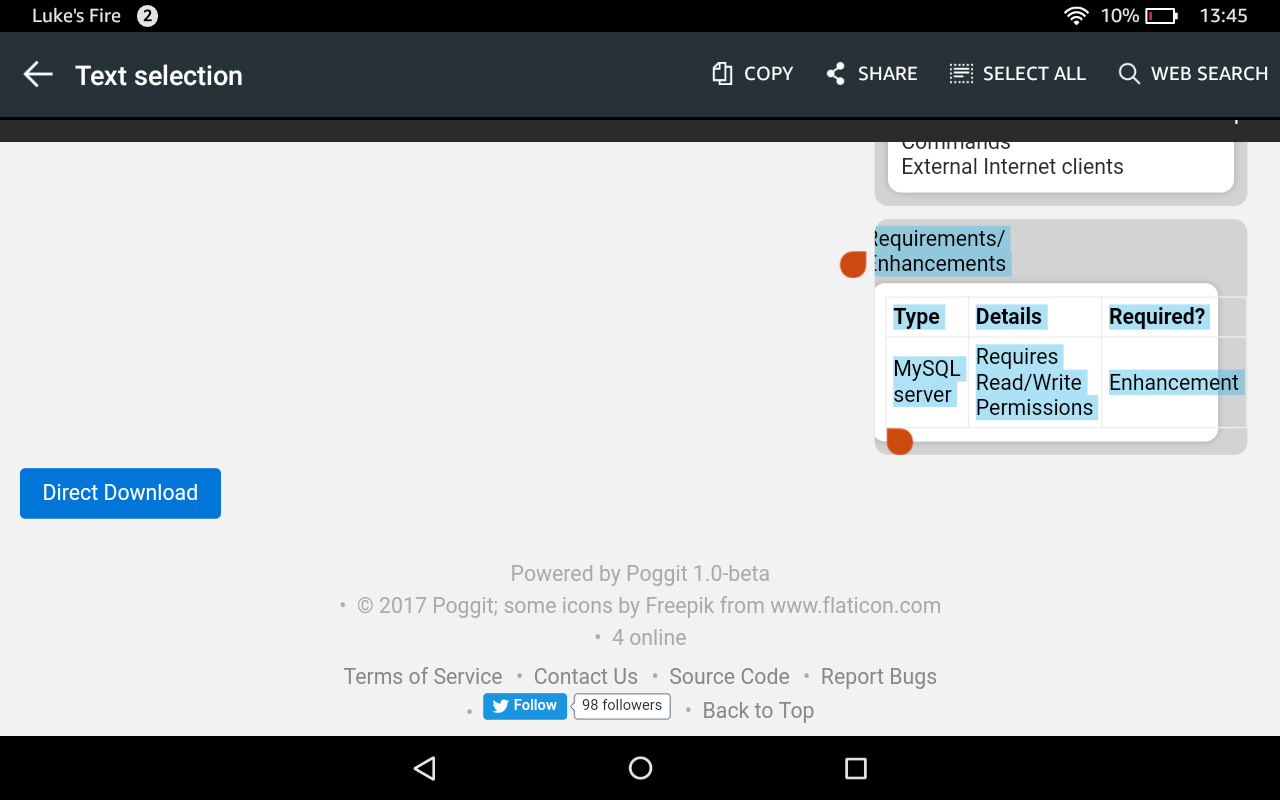
Responsified Requirements/Enhancements in a610a5233. Keywords were required before but not any more, so now hidden if empty, and I've cleaned up 'Producers' section.
Tablet display isn't a priority I'm afraid: there will always be someone with a screen size on which some things don't look great, and the same goes for most websites. That said, I've added a max-width to that box.
Guessing this wasnt intended... Can anyone reproduce this? I'm using iOS 9.

@Awzaw i could be wrong but i don't think i've ever visited poggit from my iPod before.
It only breaks on the releases page as well, on the dev page the footer is in the correct place
I can't reproduce this on xcode simulator and don't have iOS devices to test on, can anyone confirm?
These are my mobile devices, two of them are iOS. @Awzaw
iPad Air 2: https://photos.app.goo.gl/AMxmh0fkCMcj4ly13 iPod Touch (Sixth Generation): https://photos.app.goo.gl/0Pb6eVJ8FV08dQ1l1 Samsung Galaxy J1 (Sixth Generation): https://photos.app.goo.gl/3aShuUoqMhs37AI22
Some blocks disappear immediately when you place them. for example beacons, end portals and nether portals
Poggit is not PocketMine. For your 'issue', these blocks are simply unimplemented in PocketMine. For questions and discussion, please join the PocketMine discord server instead.
And this would be the wrong issue anyway. This is just for me to bitch about how i dont like the UI for poggit.
massive issue with way too many issues to keep track of now, if any are persistent please open an issue for each now