 pmndrs
Ideas
- [ ] reset
- [ ] undo / redo
- [ ] presets
- [ ] better step management
- [ ] Dynamically adjust number padding
- [ ] custom equality function per input to replace dequal
- [x] hints on hover
- [x] icon instead of label
- [ ] flash input in case of invalid value
- [x] allow math calculation in number field
- [ ] button icons
Hi, thanks for creating this wonderful project, I love it so much. Here are some feedbacks and ideas on improvements.
-
Allow users to customize how options are rendered. It can be useful if users want to add a prefix or suffix to each option. My idea is to add an
onRenderOptioncallback to the configuration, and call this function whenever the options are rendered. -
Currently, users can only input a short text for a string type. I think it is a good idea to also support long text input, and this can be easily done by substituting the
<input>element with<textarea>.
Thanks again for your great work.
@yuzuz thanks for the suggestions, the text area should be easy to implement!
I'm not sure I understand the first idea though, can you elaborate a bit?
@yuzuz thanks for the suggestions, the text area should be easy to implement!
I'm not sure I understand the first idea though, can you elaborate a bit?
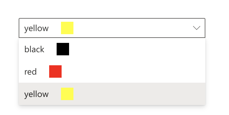
Okay, here is a simplified scenario. I have a set of color names for people to choose. And I want to give a preview of the color for each options, as shown in the picture. This requires customization of how options are rendered. So I suggested the api of onRenderOption, with which we can do something like this
{
    options: ["black", "red", "yellow"],
    value: "black",
    onRenderOption(val) {
      return (
        <span>
          {val} <span style={{ background: val, width: 10, height: 10 }}></span>
        </span>
      );
    }
}
@yuzuz oh right! That would require a custom select UI (which wouldn't show on mobile I guess), but that can be done indeed.
how about a custom name field for the options to display when using an object for option drop down values.
ie: right now the object keys are used, but it would be nice if it could read the label:
options: {
    optionWithWeirdKeyName: {
        label: "Option 1",
        ...
    },
    anotherOption: {
        label: "Option 2",
        ...
    },
    ...
}
I would love to just add a +1 to the <textarea> instead of single input. Currently doing a bit of a dodgy work around by having a dedicated input field per 'line' of text, but this has a few issues and isn't fab. Unfortunately making it myself is a little out of my skillset!
@mylespalmer It's now possible!
useControls({
  string: { value: 'long text', rows: true })
})
Hi, thanks for creating this wonderful project, I love it so much. Here are some feedbacks and ideas on improvements.
- Allow users to customize how options are rendered. It can be useful if users want to add a prefix or suffix to each option. My idea is to add an
onRenderOptioncallback to the configuration, and call this function whenever the options are rendered.- Currently, users can only input a short text for a string type. I think it is a good idea to also support long text input, and this can be easily done by substituting the
<input>element with<textarea>.Thanks again for your great work.
I think this could be supported by allowing a control / component prop in the schema and then in the control input, checking for it and displaying it or else falling back to the component from Plugin
I have patched leva on my side to achieve the same thing, serving me well till now