X-Axis proportionally distributed
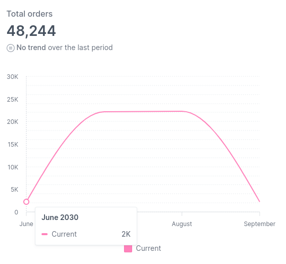
It's pretty common for time-series data to have partial periods, e.g., selecting a period from June 15 to September 15. Nivo currently distributes the ticks equally, so you have no way to understand whether a period is partial or not visually.
Describe the solution you'd like
As most viz tools work (Google Analytics, for example), these ticks should be proportionally spread along the x-axis so that the distance from June to July and August to September should be half of the space from July to August.
Is there some way to implement that behavior currently?
This issue has been automatically marked as stale. If this issue is still affecting you, please leave any comment (for example, "bump"), and we'll keep it open. We are sorry that we haven't been able to prioritize it yet. If you have any new additional information, please include it with your comment!
This issue has been automatically marked as stale. If this issue is still affecting you, please leave any comment (for example, "bump"), and we'll keep it open. We are sorry that we haven't been able to prioritize it yet. If you have any new additional information, please include it with your comment!
This issue has been automatically marked as stale. If this issue is still affecting you, please leave any comment (for example, "bump"), and we'll keep it open. We are sorry that we haven't been able to prioritize it yet. If you have any new additional information, please include it with your comment!
This issue has been automatically marked as stale. If this issue is still affecting you, please leave any comment (for example, "bump"), and we'll keep it open. We are sorry that we haven't been able to prioritize it yet. If you have any new additional information, please include it with your comment!
Closing this issue after a prolonged period of inactivity. If this issue is still present in the latest release, please create a new issue with up-to-date information. Thank you!