plotly.py
 plotly.py copied to clipboard
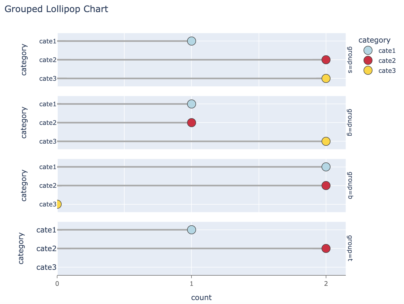
**shapes** covered by **gridlines**
Shapes would be covered by gridlines of existing figure if layer='below' is used in fig.add_shape(). And updating axis with layer='below traces' cannot make the gridlines down to the bottom layer of a plot. It's confusing that gridlines are not below all the other layers in a plot. (I was attempting to add lines in a facet-scatter plot to create a lollipop chart).
 As you can see from the figure above, grey lines(shapes) are covered by white gridlines. Is it that shapes are not traces and gridlines are sort of
 traces?
Full code to reproduce:
import plotly.express as px
import pandas as pd

df_grouped = pd.DataFrame({
    'group': ['s', 's', 's', 'g', 'g', 'g', 'b', 'b', 'b', 't', 't'],
    'category': ['cate1', 'cate2', 'cate3', 'cate1', 'cate2', 'cate3', 'cate1', 'cate2', 'cate3', 'cate1', 'cate2'],
    'count': [1, 2, 2, 1, 1, 2, 2, 2, 0, 1, 2]
})
color_dict = {'cate1': 'lightblue', 'cate2': 'crimson', 'cate3': 'gold'}

# create facet scatter plot
fig = px.scatter(
    df_grouped,
    x="count", y='category', color='category',
    facet_col_wrap=1, facet_row='group',
    facet_row_spacing=0.04,
    width=800, height=600, color_discrete_map=color_dict
)
# update scatter markers in facets
fig.update_traces(
    selector=dict(type='scatter'),
    mode='markers',
    marker=dict(line_width=1, size=16)
)

# add shapes(lines) onto each facet
facet_annotations = [i['text'].replace(f'group=', '') for i in fig.select_annotations()]
for i in range(0, len(facet_annotations)):
    facet_text = facet_annotations[i]
    y_value = df_grouped.query(f'group == "{facet_text}"')['category'].tolist()
    x_value = df_grouped.query(f'group == "{facet_text}"')['count'].tolist()
    for j in range(len(x_value)):
        fig.add_shape(
            type='line',
            x0=0, y0=y_value[j],
            x1=x_value[j],
            y1=y_value[j],
            line=dict(color='darkgrey', width=3),
            row=i + 1, col=1,
            layer='below'  # it will make shapes laid blow all the traces, including gridlines
        )

fig.update_layout(
    title="Grouped Lollipop Chart",
    margin=dict(l=140, r=40, b=50, t=80),
    xaxis=dict(
        showline=True,
        range=[0, df_grouped['count'].max() * 1.1],
        ticklabelstep=1, showticklabels=True,
        dtick=1, ticks='outside',
        linecolor='rgb(102, 102, 102)',
        tickcolor='rgb(102, 102, 102)', tickfont_color='rgb(102, 102, 102)',
        layer='below traces'
    ),
    yaxis=dict(
        tickfont_size=14,
        layer='below traces'
    ),
)
fig.show()
axis.layer controls the ordering of the axis line, tick marks, and tick labels, but not the gridlines as these are drawn inside the plotting area, below some traces but above others (heatmaps and images go behind the gridlines).
We could certainly add finer control over shape ordering within this hierarchy, but a better way (as long as we're in the business of hacking around this rather than adding real lollipop stems to scatter traces) might be to make them with error bars, since these are already meant to be part of the scatter trace. (note also rangemode: "tozero" rather than explicitly calculating the range). @nicolaskruchten is there a better way to get negative-only errorbars than explicitly adding a series of zeros to the df for the positive side?
import plotly.express as px
import pandas as pd

df_grouped = pd.DataFrame({
    'group': ['s', 's', 's', 'g', 'g', 'g', 'b', 'b', 'b', 't', 't'],
    'category': ['cate1', 'cate2', 'cate3', 'cate1', 'cate2', 'cate3', 'cate1', 'cate2', 'cate3', 'cate1', 'cate2'],
    'count': [1, 2, 2, 1, 1, 2, 2, 2, 0, 1, 2],
    'zeros': [0, 0, 0, 0, 0, 0, 0, 0, 0, 0, 0],
})
color_dict = {'cate1': 'lightblue', 'cate2': 'crimson', 'cate3': 'gold'}

# create facet scatter plot
fig = px.scatter(
    df_grouped,
    x="count", y='category', color='category',
    facet_col_wrap=1, facet_row='group',
    facet_row_spacing=0.04,
    width=800, height=600, color_discrete_map=color_dict,
    error_x="zeros",
    error_x_minus="count"
)
# update scatter markers in facets
fig.update_traces(
    selector=dict(type='scatter'),
    error_x_width=0,
    error_x_color="darkgrey",
    error_x_thickness=3,
    mode='markers',
    marker=dict(line_width=1, size=16)
)

fig.update_layout(
    title="Grouped Lollipop Chart",
    margin=dict(l=140, r=40, b=50, t=80),
    xaxis=dict(
        showline=True,
        rangemode="tozero",
        ticklabelstep=1, showticklabels=True,
        dtick=1, ticks='outside',
        linecolor='rgb(102, 102, 102)',
        tickcolor='rgb(102, 102, 102)', tickfont_color='rgb(102, 102, 102)',
    ),
    yaxis=dict(
        tickfont_size=14,
    ),
)
fig.show()
This is a better work around the hierarchy of layers.
What confused me about arranging layers is that layer property is not shared by axes and grid lines while styles of axes, ticks and grid lines are controlled by layout.xaxis altogether.