Plotly.NET
 Plotly.NET copied to clipboard
Dumbbell plot
Description
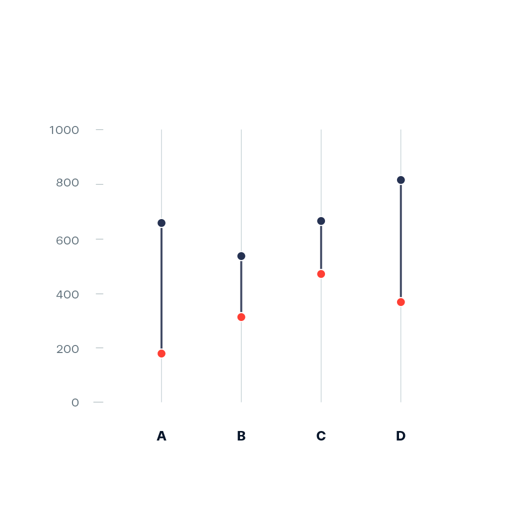
Dumbbell plot [1] (also known as Dumbbell chart, Connected dot plot) is great for displaying changes between two points in time, two conditions or differences between two groups.
Example:
Pointers
- Ideally, you start prototyping in a scripting or notebook environment where you can iterate fast. installation instructions can be found here: https://plotly.net/#Installation
- Charts like this that are using baseline trace types to create a new chart type should only be implemented in the top-level Chart API. An example where this is already done is the Range chart that combines a set of differently styled line charts.
- When possible, use
#IConvertiblefor data input, as this allows forstrings, number types such asintandfloat, andDateTime.
References
- [1] https://datavizproject.com/data-type/dumbbell-plot/
Hints (click to expand if you need additional pointers)
- The most suitable base chart for this is a set of line charts that each connect the two data points by a line
- The high-level function should look quite similar to the base implementation of
Chart.Range
Hey @Lewiszz. Are you still planning to finish this? If not, I would greatly appreciate if you could link what you ended up with during the hackathon (e.g. a script or notebook you worked in) so others can use it as a foundation to tackle this chart. If also do not have anything to link, no worries, please just tell me that this issue is up-for-grabs again. Thanks ❤️
Hey @kMutagene! Sorry, forgot to post it here, but I didn't get anywhere worth sharing and I also think there are other libraries (or issues) where I can contribute in a more productive way. This was a bit too far out of my comfort zone :)
So yes, open for anyone to pick up!
Thanks for giving me the opportunity to try though.
This is either achievable by creating one trace per pair, or one trace per group. I settled in implementing one trace per group, as that enables way more useful legends. However, now the lines have to been drawn as shapes, and correct shape layer between is just recently implemented in plotly.js 2.31.0, so it makes sense to move this to v6 as v5 will only target < v2.28.0.
Meanwhile, here is simple way to achieve this:
 let group1 = [1; 2; 3; 6]

let group2 = [3; 1; 4; 1]

let labels = ["A"; "B"; "C"; "D"]

[
    Chart.Point(
        labels,
        group1,
        Name = "Group 1",
        Marker = Marker.init(Size = 20)
    )
    Chart.Point(
        labels,
        group2,
        Name = "Group 2",
        Marker = Marker.init(Size = 20, Color = Color.fromString "red")
    )

]
|> Chart.combine
|> Chart.withShapes (
    Seq.zip3 labels group1 group2
    |> Seq.map (fun (label, y1, y2) ->
        Shape.init(
            ShapeType = StyleParam.ShapeType.Line,
            X0 = label,
            X1 = label,
            Y0 = y1,
            Y1 = y2
        )
    )
)
note that there is no way to place the markers above the lines pre 2.31.