obsidian-linter
 obsidian-linter copied to clipboard
Several Minor Suggestions as the number of rules grows
Now that the number of rules is slowly growing (🥳), I think some small changes might be appropriate to keep it overseeable:
-
the rules on the front page readme should be sorted by rule-category
-
rules could get numbers as aliases, as many linters have, e.g. Markdownlint
-
break up the "Spacing" Rule-Category into "Spaces" and "Line Breaks", as the category is otherwise quite big in comparison to the others
-
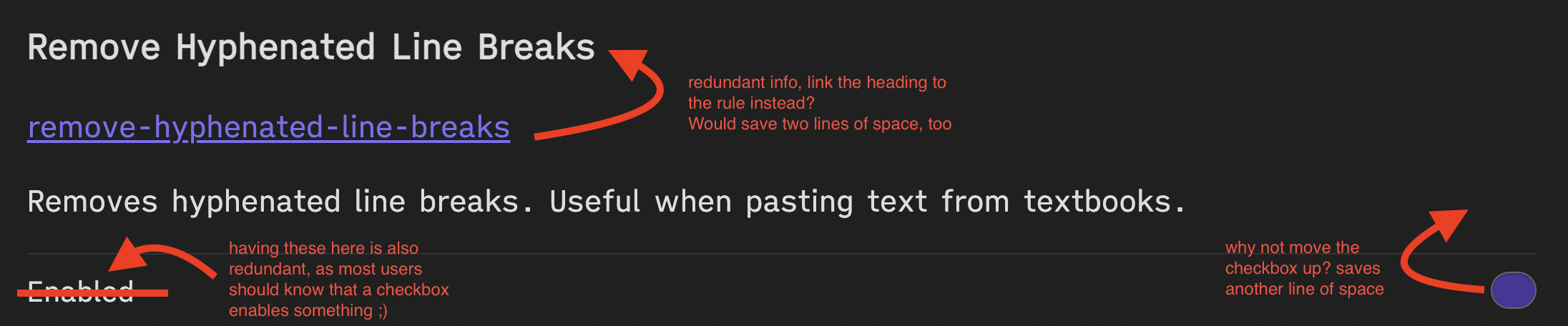
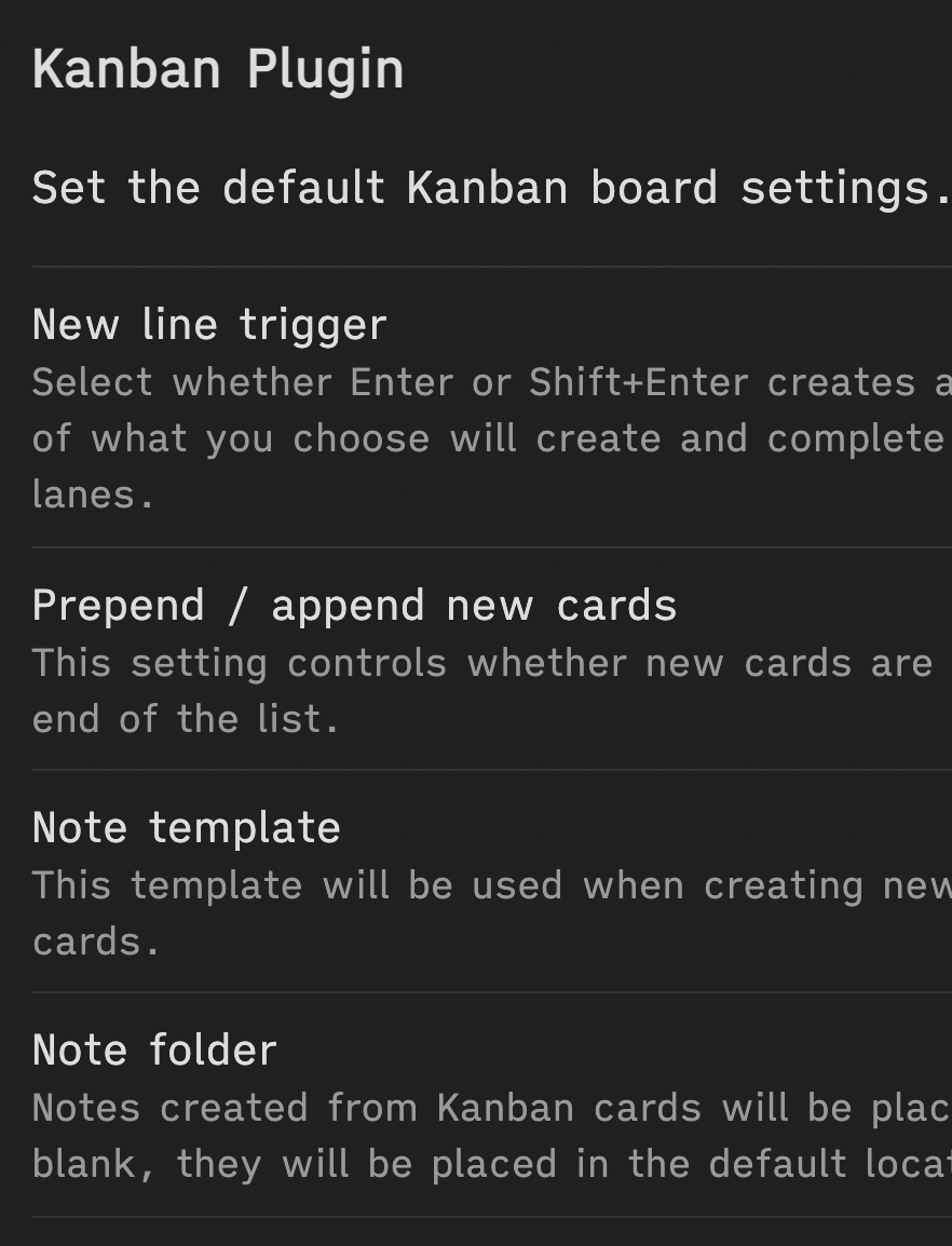
condense the display settings, since you have to scroll quite a bit by now. Here a suggestion how I would condense it:
-
edit: also, you might consider move the rules section of the readme up to be the first heading – right now, they come after contributing and explanations how to disable rules. However, as the rules are the core of the linter, I think the order of sections in the readme should be rules → usage → contribution
Great suggestions! Will probably implement most of them. I'm not sure what the benefit of having numbers as aliases is.
One benefit of using the same numbers as Markdownlint and custom ones for other features would be that it would be easy to get an impression of which rules from Markdownlint are already implemented.
The number/ID could be displayed after the title of each rule (where the upper arrow of the @chrisgrieser's lovely diagram is pointing)
The numbering is simply a method of shortening communication. You could think of them as abbreviations rather than aliases, maybe.
It's not only useful for contributors/devs like us, it would also enable more user feedback for future features of the linter. For example, the notification after linting could display in a concise way which rules have been applied.
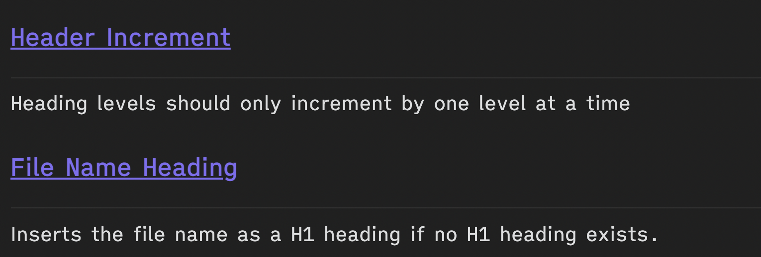
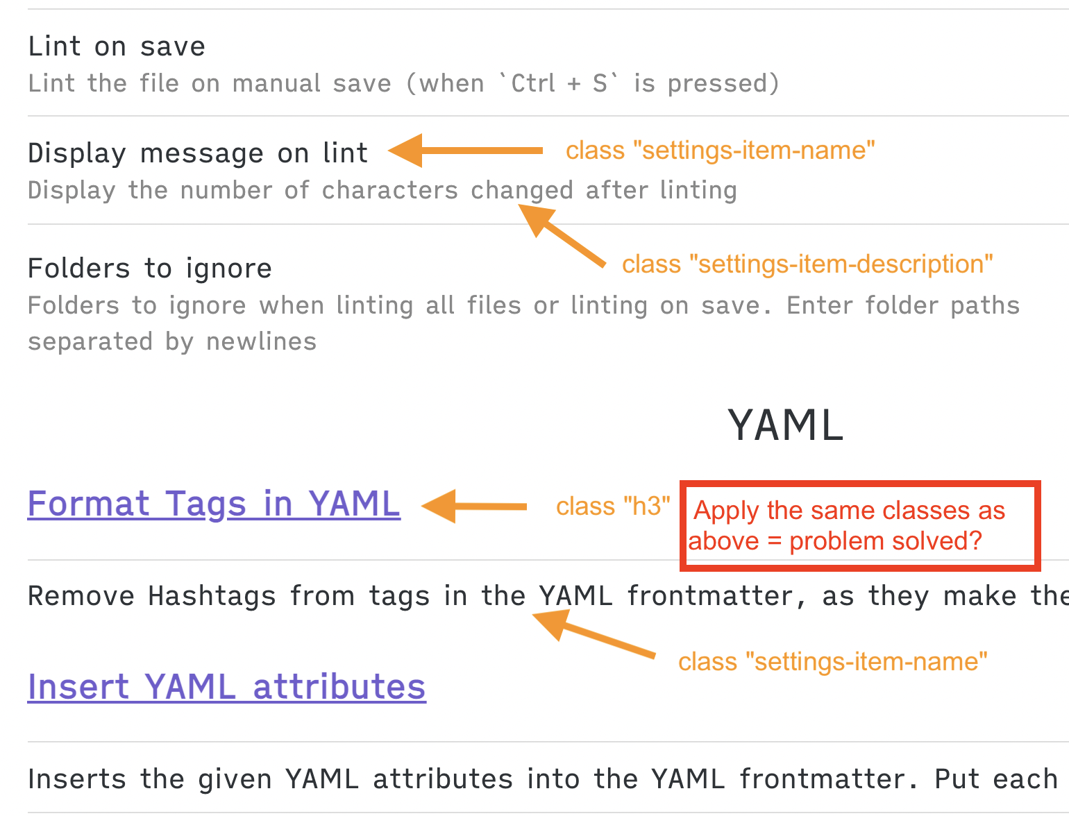
Thanks for implementing the improved settings menu so quickly already, looks much better! Now with the more condensed design, I noticed a new small issue: the hr is visually a bit confusing. You are using hr as underline of the headers, while I however, instinctively see things between two hr as one unit. So in this case, for example, visually, the close succession of hrs tells me that the sentence "header levels should only increment by one level at a time" belongs together with "file name heading".
I would suggest to simply remove the hr, which would remove the visual confusion that at least some people like me get. This has the bonus benefit of saving yet another line of space, making the settings menu even more condensed. :)
the hr is added by obsidian to all options. I don't think I can change that :/
@platers
I think not? Like I just checked a bunch of plugins and most of them have hrs, where heading and description are between hrs, instead of having a hr between them.
I think the issue arises as the rule names get h3 as class and the descriptions get setting-item-name. What you could do is to give rule names the class setting-item-name and assign setting-item-description to the rule descriptions. This will most likely place the hrs correctly. And as a side benefit, the litner settings would be more consistent with how the other plugin settings are styled.
hmm I played around a little bit and couldn't get it working. Feel free to try :)
If you explain to me where the settings are set in this plugin, I can give it a look?
But it's weird that its not working when you try it, since you literally did get it to work a few lines above?!
https://github.com/platers/obsidian-linter/blob/e56bb2618b23e4c1f0008b61570e768e4841459b/src/main.ts#L330 Here is where the settings are generated. I'm not sure what Obsidian does under the hood to decide when to place a line.
@chrisgrieser , looks like it was added by setting-item. I was able to add some logic to remove the border at the top of the element which was displaying like an hr. I am adding a PR for this and should have it merged today.