activeadmin_addons
 activeadmin_addons copied to clipboard
Allow range_select to work with date_time_picker
I would like to see date_time_picker in my date range filters (such as created_at attribute). Is there a way of doing this?
@fabrouy I already have a branch with a functional approach to this (range date time picker branch).
It works as a standard filter:
filter :created_at, as: :range_date_time_picker
@ldlsegovia I have been working on this during the weekend and I could notice some details:
- range_select_input has a width of
96pxand the standard width of range in active admin is98px. I don't know which width use. Can we move to98pxand fix that in this branch too? - Do we want to use
'min'&'max'placeholder as inrange_select?. Because it's not used by ActiveAdmin - Do we want to use a friendly calendar icon in the input (as ActiveAdmin default)?
- I don't know if you have some specifications for the PR or code? Or just let hound do its work?
@joseglego
- Yes, you can change it.
- It's ok without
minandmaxplaceholders. - It would be nice. Maybe a 🕙 icon instead of a 📆 icon.
- Poorly described in the README of this gem 😞 ... But, in Platanus we follow these style rules and would be nice to see some green tests for this new feature.
@ldlsegovia
-
[done] Yes, you can change it.
-
[done] It's ok without min and max placeholders.
-
It would be nice. Maybe a 🕙 icon instead of a 📆 icon. I'm having troubles with this one. In fact, are 2 problems:
-
I don't know where the ActiveAdmin images are, I found this reference icon page for ActiveAdmin but I couldn't find on the repo. I will continue with this today
-
When you select the date its longer than the date in the ActiveAdmin input, so the text is over the icon. I'm testing it with the calendar and working in based on placeholder with css. Is this ok?
-
-
Poorly described in the README of this gem 😞 ... But, in Platanus we follow these style rules and would be nice to seesome green tests for this new feature.
- Style rules. I couldn't test local (yet). But they are not SO different to mines. I think I wouldn't have so much problems with them and hound.
- [done] Green tests. I had worked on filters test. Because I'm working based on the datepicker class made before.
@joseglego
I don't know where the ActiveAdmin images are, I found this reference icon page for ActiveAdmin but I couldn't find on the repo. I will continue with this today.
You can try a little bit more if you want, but I think it looks great with the calendar too.
Style rules. I couldn't test local (yet). But they are not SO different to mines. I think I wouldn't have so much problems with them and hound.
Ok, but if there is an error at the time of the pull request, please fix it.
One last thing I forgot... Can you add this new functionality to the README? 🙂
#134 is smelling good. There's a tiny detail though:
 The control is not looking that great because there's a lot of info to show. Perhaps @alinavioleta you can help us define a better design for a DateTime control?
Some inspiration:

Context:

What do you say @alinavioleta ?
@ldlsegovia
-
I know this can be something weird at this moment. But I can't find the file:
.scss-lint.yml. Where can I find it? I wanna fix all the problems related to it (SCSS) in my PR. But I don't know where are the rules? -
I already fixed all the README.md comments and test it with preview. I have something weird with my gif. I will build one new.
-
I had one issue with rubocop and I already fixed it. Because I'm using hound in local :D
@agustinf
I think it looks awesome. But, It looks so different to ActiveAdmin. Maybe we can find something which can look as cool as your proposal but in the old fashion activeadmin way. What do you think?
It looks like we are almost ready! Let me know what I can do!
Maybe a nice solution would be one of this 2 versions, a happy one and a sad one.

@alinavioleta on the sad design, on the created-at example, you left some space for the calendar icon but you didn't put it. Did you do that on purpose? Would you add it to the design so we can see how it looks?
The design suggested by @alinavioleta is awesome. I'm working on it. But I have some doubts:
-
We will change the datetimepicker string format for the date? Right now we are using:
'Y-m-d'and the proposal suggest:'dd MMM, YYYY \n HH:mm a'. -
We wanna use simple HTML or we will use Magic CSS. I do this question because, by default, a HTML
input[type=text]can't have multiple lines. So, we have to use atextarea. BUT atextareacan't have different style in each line. So, we should use adivwhich shows its self as a forminputbut has the data represented with richer styles. And we have a hideinputwhich update every time thedivinformation is updated and which submit the information.
I don't know if we wanna use magic css, or if you have another suggestion. So, with simple html and few CSS it looks like:

I'm still working on it (on standards and format integration between ruby and js) but visually this is the best approach without a fake input.
@joseglego
-
The format of the date should depend on the locale of the system. But as this is for admin purposes I think we can simplify the format, and use a standard style (
MMM dd, YYY) -
If you can do it with only HTML and CSS it would be great, try with font-size: 15px for the input text.
@alinavioleta
-
About the icon: Could you upload the datetimepicker icon to include it? I think it would look great if we show the icon to represent the datetimepicker icon in general, for datetimepicker and range datetimepicker. And it looks different than the general icon of ActiveAdmin
-
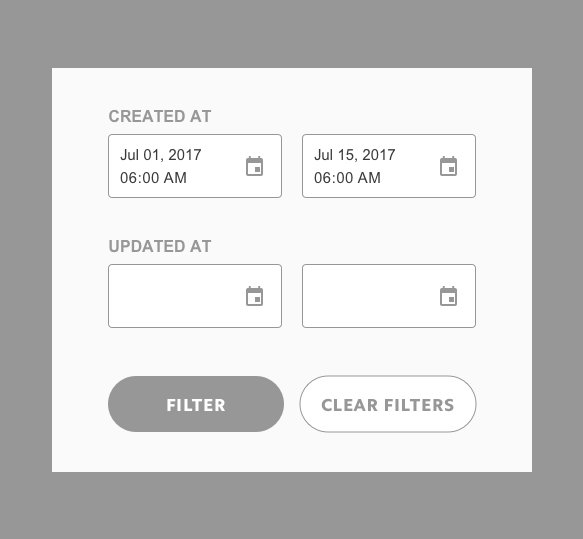
About the txt: The whole form is using 11px as font-size and black as default color. I'm uploading a picture the custom date-time-picker with 11px and with 12 px with the complete form as context.

P.S.: Created at is the modified input. Updated at is a basic input of ActivAdmin and it's used just as reference.
-
About the datetimepicker I think I have the shape or I already ask you about. Can u tell me if I'm missing something else?
-
Extra: I'm working in a BIG form and I can't change the buttons as you show. They look good, If the team want we can do it in another issue/PR (same with font-size and color). What do you think ( @alinavioleta , @agustinf , @ldlsegovia ) ?
@joseglego @alinavioleta I too think the flat buttons look nice, but we are working with ActiveAdmin here, so changing button styles is completely out of scope. BTW: I would stick to 11px
- What Agustin says, it's not that ugly tho.
- About the font, it's really good at 12px.
- The shape is good too!
- Maybe for now, those buttons are ok :)
@alinavioleta I think you missed the icon :). Please upload when you can
For now, I have to work in some details about communication between ruby and js. So, it's not required soon. But keep that in mind please. I think your date-time-picker icon looks better and we can/should use it.
@joseglego My bad, here is it. You should bookmark this site :) https://materialdesignicons.com/

I think this is a short question:
- The introduction of this new style (2 lines, and fomart) will apply only in
range date time pickeror we will apply it indate time pickertoo?
@ldlsegovia @agustinf
(Why? Because if we have 2 inputs which do the same but have different default input looks weird, plus, we have to manage in different ways because each of them has a way to write min_date or max_date, mattr accessor among others)
My grain of salt: I say we shouldn't mess with ActiveAdmin's general design on this PR. "harina de otro costal" . I would suggest we leave the ugly icons for now.
On Sat, Jul 29, 2017, 9:18 AM Jose Lezama [email protected] wrote:
I think this is a short question:
- The introduction of this new style (2 lines, and fomart) will apply only in range date time picker or we will apply it in date time picker too?
@ldlsegovia https://github.com/ldlsegovia @agustinf https://github.com/agustinf
— You are receiving this because you were mentioned.
Reply to this email directly, view it on GitHub https://github.com/platanus/activeadmin_addons/issues/112#issuecomment-318830726, or mute the thread https://github.com/notifications/unsubscribe-auth/AATJlj5be0F_ZD0sOBI02U9f5LwuMNdEks5sSzE2gaJpZM4Mi63z .
@joseglego I think it's ok to have 2 different inputs. The date picker is different on filters panel and form too.
About the filter, it looks great but there's a little issue:

could you fix that?
@ldlsegovia I'll be working on it. As you can see in the code, this error is my fault because I'm fixing this with CSS and not with format as the lib says it can do. And you can ask why? Why I'm not using the correct way to do, because it's not safe.
Let me explain you: I will try with format, and if it works perfect it's ok. But, with the previous suggested format, while I was trying different formats I found something weird. So, I read documentation of this lib, and of the datepicker too. I went further and read in their issues. Some issues related to the format were found in the jquery lib. If you go to their Issues section you can find that 95 format issues of the 300+ issues of the lib are related to the format.
So, I will try with format and I hope we can use it. But, if format gives problems as other formats, I'd rather offer you a solution based on just CSS, and NOT using the standard format. What do you think?
P.S. The %n of rails communicate cool with \n of javascript, the problems are related just to javascript side.
@joseglego The problem I see (maybe I'm wrong), is not related with the format. Editing the input manually will break "the input style" regardless of the format. Maybe, a good idea would be to have hidden inputs to store clean date times and, to handle the visual part, divs and css.
I can't work during this week. I'll be working on this way, during weekend:
- Format
- Basic CSS
- Your option (I talk about this as Magic CSS option the first time I saw the design)
It's ok!
@ldlsegovia about my weekend:
- [tested] Format, result: Doesn't work. So, you were right.
-
[check] Basic CSS, result: Works. Why did I prefer this one? Basic, It's readable, shorter and elegant. Why elegant? Because we are using
cssto modify style. Simple. -
[Not tested] Magic CSS (Virtual Div + CSS + Hidden input): I think it can be the MOST friendly of all the options, and I like that. But, I don't know if we wanna use it now. Because it requires a
watchto check the keyboard when you are on thedivand manage all the information related, even the format, apply different styles (It would be awesome). But we were using something different than an input. So, basically we were implementing a new tool and I think it could be more than what we need right now or maybe it could be a new branch? It sounds like medium ~ advanced HTML + Js + CSS, and I like that. If you want to work on it I would be in. But is that part of this branch? (In fact, we have the alina's design as reference)
Feel free to let me know which would be next step or what do you think about?
@joseglego I can't see the difference between "Basic CSS" and "Magic CSS". However, If you think "Basic CSS" is the best choice right now, let's do that.
Hello guys! after 1 rush month on my job. I'm back 😎
I want to continue with this, because I have free time and I can enjoy it and learn from it. What do you think @ldlsegovia, @agustinf ?
well, we have more time now. So, I was testing @ldlsegovia suggestion about a div to show the information and the input continue clean. But there are the points which I think can be harder to face:
- With the hidden input and showing the information in a div. It will be the best for a better interface (more beautiful) BUT the problem will be the user experience. Why? Because we have to bind all the short-cut keys, we have to show when you select multiple elements on the "input" or where is the caret? This is my first opinion.
- How can you edit / "write" in the div? .
After tried I found It happened. It could be hard, but if we wanna follow this path for a better interface, lets work on it. (This was my first thought when I saw the suggested interface. So, with little help and hints I think we can do it)
But, I found more, the jquery datetimepicker plugin has some details I didn't think before. I read the documentation and I found we can use onChangeDateTime to set the visible value on our div (or when the user press a button)
But the problem here is the parser, It would return false and show nothing in the div.
I wrote a lot, and I don't know if you can get my ideas. So, as a coder who I read says: Talk is cheap, show the code:
-
You can check https://html-date-mask.firebaseapp.com/ . Also, play with the input, you will see what happen with the input without process and the input with processing.
-
You can read the code: https://github.com/joseglego/html-date-mask (on
developbranch)
I did this because is better to understand and check ideas, compare, and stuff. Withou pushing so many times the PR
I know it needs A LOT of work, like use a processing format and stuff. But, step by step. I just wanna introduce the problem and test it.
In my humble opinion, this a bunch of work (and we should do it). But it's totally different to the main reason of this thread. So, we can close one first and then the other. Maybe, work on this thread first could be cool because it adds a new feature which we don't have. And after that hands on the interface.
P.S.: I already include the platanus' eslintrc and I'm still working on fix the issues. I will include the stylelint too.
@joseglego welcome back! with the div and hidden input approach I think:
1 - You should have one div per picker. 2 - The div shouldn't be editable. 3 - To open the date time picker, you should be able to click on any place in the div.
A more complicated but still possible option, would be to use four inputs. The date time picker can be used as a date picker, time picker or date time picker with proper settings.
https://github.com/xdan/datetimepicker

with css you could get something like this:
 but using separated inputs to hold dates and times.
A hidden input could store the formatted date times to use in the filter.
but using separated inputs to hold dates and times.
A hidden input could store the formatted date times to use in the filter.
Hello @ldlsegovia
I updated the web page And the code too.
Feel free to try it and give me comments. For example, I think are necessary two buttons:
- Clear: Clear data when you click by mistake.
- Toggle View: To change to a normal input when you wanna write.
About your suggestion:
1 - You should have one div per picker.
Check
2 - The div shouldn't be editable.
Check
3 - To open the date time picker, you should be able to click on any place in the div.
Check
About my Ideas:
1 - Clear: Clear data when you click by mistake.
Check
- Toggle View: To change to a normal input when you wanna write.
Check
Now, I think we should add something like:visualFormat & standardFormat for this! So, we can have a functional customizable format and a visual customizable format?
What do you think? I'll be aware and waiting for your feedback!