Tap target to edit bio is too small on iPad
When editing your bio on the iPad, the tap target to get the keyboard to present is way to small. This has led multiple users to think that it is broken and they can't edit their bio at all. We should expand it to fill all the whitespace.
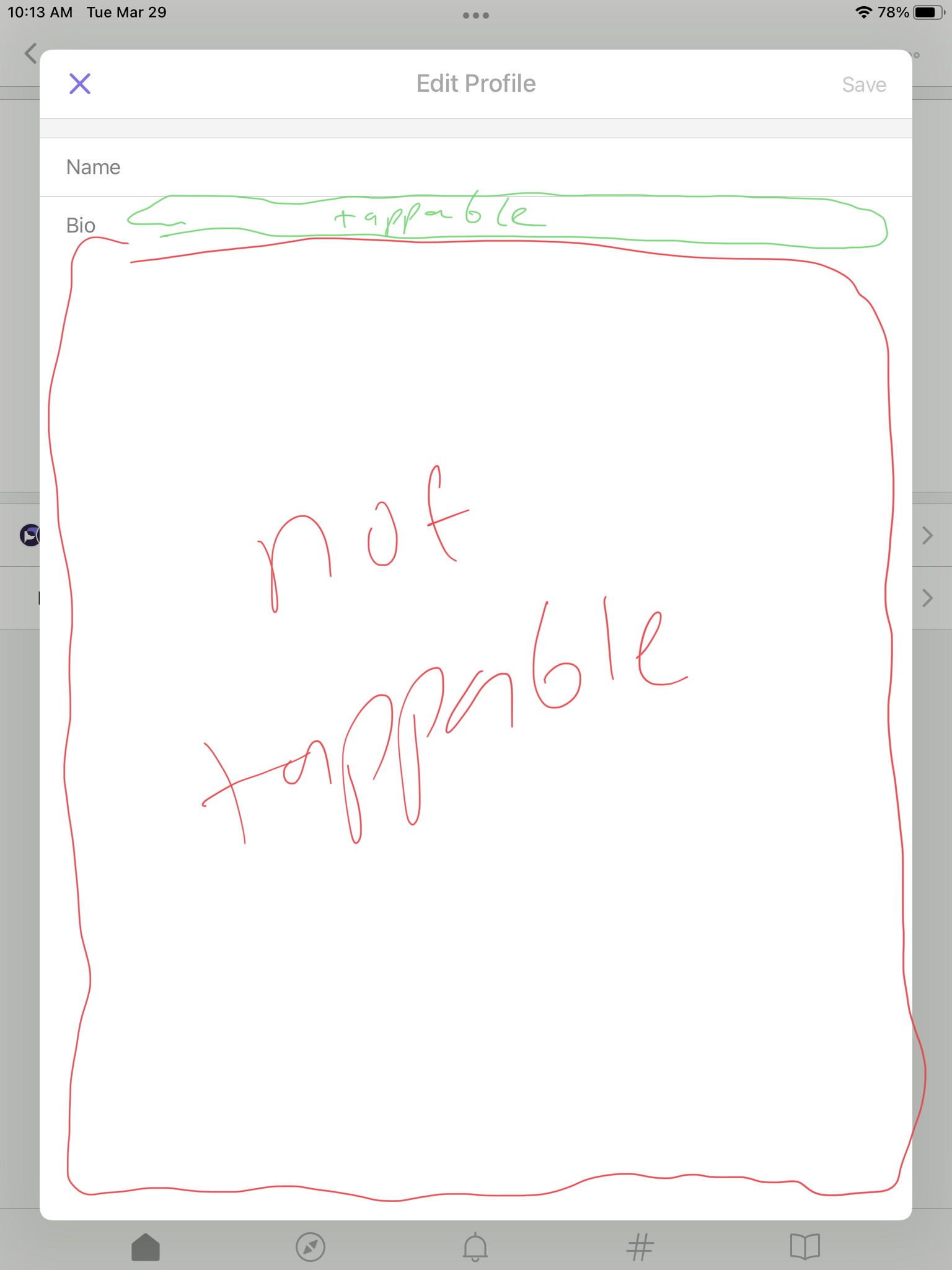
I noticed that this view is shared between iPhone and iPad, so this bug is on both. If the goal is to have the tap area be the entire bottom empty area, then should the text view be below the "Bio" label? Or any thoughts or direction how the tap area and label placements should be?
 |
 |
@czuria1 hm good question. My first instinct is to say that maybe "Bio" should just be placeholder text in the textbox. If we did that we might want to do the same for Name too so it's easy to keep the labels lined up? What do you think @Chardot?
Another option might be to leave the layout as-is but slap a big UITapGestureRecognizer over the whole bottom area, and when it is tapped it would call becomeFirstResponder() on the the "bio" text field to give it focus.
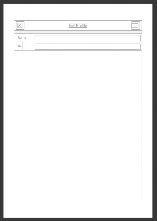
@czuria1 @mplorentz I also think the text area for the bio should occupy the entire bottom area. Additionally, it would be great if both fields were 100%-width block elements that sit right below their labels as shown in the picture:
To make the interactive area more noticeable, their border could be the same style (width and color) as the current separator line between them, for both light and dark modes. In the example I also used a 4px corner radius.
Thank you for the input and feedback @mplorentz @Chardot! I agree on the gray border and be consistent on the styling for both 🙂 I'll work on updating that component!