Improve Service Graph UX
Is your feature request related to a problem? Please describe.
The Service Graph is a super powerful visualization in Pixie, however, it takes some time to comprehend exactly what it is showing.
Describe the solution you'd like
Item 1:
When loading the Service Graph, initially I see green arrows indicating service communication. There are icons in the lower right which allow me to toggle to alternate views. I hover over the exclamation point icon and I see Colored by Error Rate.
Does this mean the current view is Colored by Error Rate, or when I click, it will be colored by Error Rate? Please provide a clearer indication of what the user is currently viewing vs. what the user will be taken to when toggling. A simple note in the upper right of the view that says something like "You're currently viewing Service communication colored by Error Rate" would be very helpful.
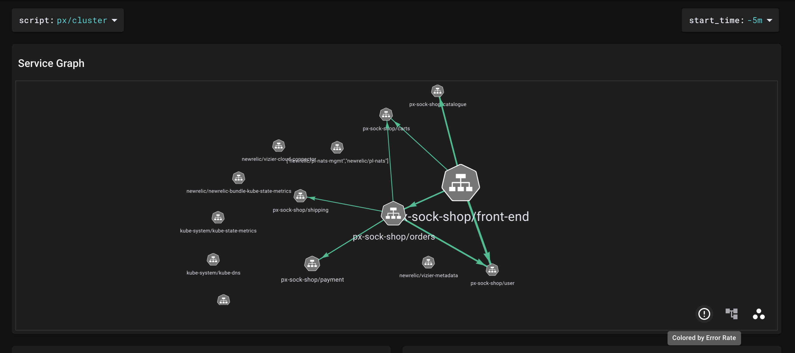
Item 2:
It's my understanding that the metric used to determine the weight of the arrows is bytes/s in both modes (Latency and Error Rate). It would be helpful if there was something that indicated this in the UI. Otherwise, the user hovers over an arrow, sees multiple metrics, and has to guess at which metric is correlated to the arrow weight.
Item 3:
Provide a legend that shows the possible colors (is it only green and red, or are there others?) and the associated thresholds (e.g. when does the arrow turn from green to red?).