android-reactions
 android-reactions copied to clipboard
Published
20 hours ago •
 pgreze
pgreze
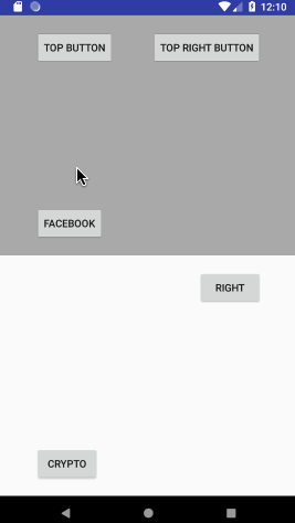
Facebook like reaction picker for Android
Android reactions 

An open source and fully customizable implementation of the Facebook reactions pattern.
⚠️ Disclaimer: this library is in a maintenance mode (I'm not using it anymore) and maybe lacks some features you may want (design UI libraries is hard). Feel free to fork it and add your own features, and hopefully open a PR to give back to the community.
Alternatives:
- https://github.com/amrdeveloper/ReactButton
Installation 
repositories {
    mavenCentral()
}

dependencies {
    // Check the 🔝 maven central badge 🔝 for latest $version
    implementation "com.github.pgreze:android-reactions:$version"
}
Usage 
See Java or Kotlin samples.
- Popup creation:
Kotlin DSL:
val config = reactionConfig(context) {
    reactions {
        resId    { R.drawable.ic_fb_like }
        resId    { R.drawable.ic_fb_love }
        resId    { R.drawable.ic_fb_laugh }
        reaction { R.drawable.ic_fb_wow scale ImageView.ScaleType.FIT_XY }
        reaction { R.drawable.ic_fb_sad scale ImageView.ScaleType.FIT_XY }
        reaction { R.drawable.ic_fb_angry scale ImageView.ScaleType.FIT_XY }
    }
}

val popup = ReactionPopup(context, config) { position -> true.also {
    // position = -1 if no selection
} }
Java:
ReactionsConfig config = new ReactionsConfigBuilder(context)
    .withReactions(new int[]{
        R.drawable.ic_fb_like,
        R.drawable.ic_fb_love,
        R.drawable.ic_fb_laugh,
        R.drawable.ic_fb_wow,
        R.drawable.ic_fb_sad,
        R.drawable.ic_fb_angry
    })
    .build()

ReactionPopup popup = new ReactionPopup(context, config, (position) -> {
    return true; // true is closing popup, false is requesting a new selection
});
- Bind popup with a button/view:
View reactionButton = findViewById(R.id.reaction_button);
reactionButton.setOnTouchListener(popup);
Notice: if button is inside a scroll view, you need to temporarily disable it:
reactionButton.setOnTouchListener { v, event ->
    // Avoid scroll view to consume events
    scrollView.requestDisallowInterceptTouchEvent(true)
    // Resolve reactions selection
    popup.onTouch(v, event)
}
- Additional config:
Kotlin:
val popup = reactionPopup(this, ::onReactionSelected) {
    // Reaction DSL
    reactions(scaleType = ImageView.ScaleType.FIT_XY) {
        resId    { R.drawable.img1 }
        drawable { Drawable(...) }
        reaction { R.drawable.img3 scale ImageView.ScaleType.FIT_CENTER }
        reaction { Drawable(...) scale ImageView.ScaleType.FIT_CENTER }
    }
    // Alternative with drawable resource id array
    reactionsIds = intArrayOf(R.drawable.img1, R.drawable.img2, R.drawable.img3)

    // Optional popup style
    popupGravity = PopupGravity.DEFAULT
    popupMargin = resources.getDimensionPixelSize(R.dimen.horizontal_margin)
    popupCornerRadius = TypedValue.applyDimension(COMPLEX_UNIT_DIP, cornerSizeInDp.toFloat(), resources.displayMetrics)
    popupColor = Color.WHITE
    popupAlphaValue = 230

    // Optional item style
    reactionSize = resources.getDimensionPixelSize(R.dimen.item_size)
    horizontalMargin = resources.getDimensionPixelSize(R.dimen.item_margin)
    verticalMargin = resources.getDimensionPixelSize(R.dimen.item_margin)

    // Text provider
    reactionTextProvider = { position -> "Item $position" }
    reactionTexts = R.array.descriptions
    // Text styles
    textBackground = ColorDrawable(Color.TRANSPARENT)
    textColor = Color.BLACK
    textHorizontalPadding = resources.getDimension(R.dimen.text_padding)
    textVerticalPadding = resources.getDimension(R.dimen.text_padding)
}
Java:
// With resources
.withReactions(new int[]{ R.drawable.ic_fb_like, R.drawable.ic_fb_love })
// With drawables
.withReactions(Arrays.asList(drawable1, drawable2))
// item size (default: 24dp)
.withReactionSize(getResources().getDimensionPixelSize(R.dimen.item_size))
// Horizontal margin (default: 8dp)
.withHorizontalReactionMargin(margin)
// Vertical margin (default: 8dp)
.withVerticalReactionMargin(margin / 2)
// Override popup gravity
.withPopupGravity(PopupGravity.PARENT_RIGHT)
// Margin between items (default: R.dimen.reactions_item_margin)
.withPopupMargin(margin)
// Popup corners radius (default: 90)
.withCornerRadius(getResources().getDimensionPixelSize(R.dimen.corner_radius))
// Change popup color (default: white)
.withPopupColor(Color.LTGRAY)
// Popup background alpha value between 0 (full transparent) and 255 (full opaque) (default: 230)
.withPopupAlphaValue(255)
// Item text provider / string array (default: no texts)
.withReactionTexts(position -> descriptions[position])
.withReactionTexts(R.array.descriptions)
// Text popup background (default: #44000000 circle)
.withTextBackground(new ColorDrawable(Color.TRANSPARENT))
// Text color (default: white)
.withTextColor(Color.BLACK)
// Text horizontal margin (default: 12dp)
.withTextHorizontalPadding(0)
// Text vertical margin (default: 4dp)
.withTextVerticalPadding(0)
// Text size (default: 8sp)
.withTextSize(getResources().getDimension(R.dimen.text_size))
 pgreze