 pento
pento
Design review
Let's get some feedback from the design team! Here's how TestPress looks currently.
| Screen | Light | Dark |
|---|---|---|
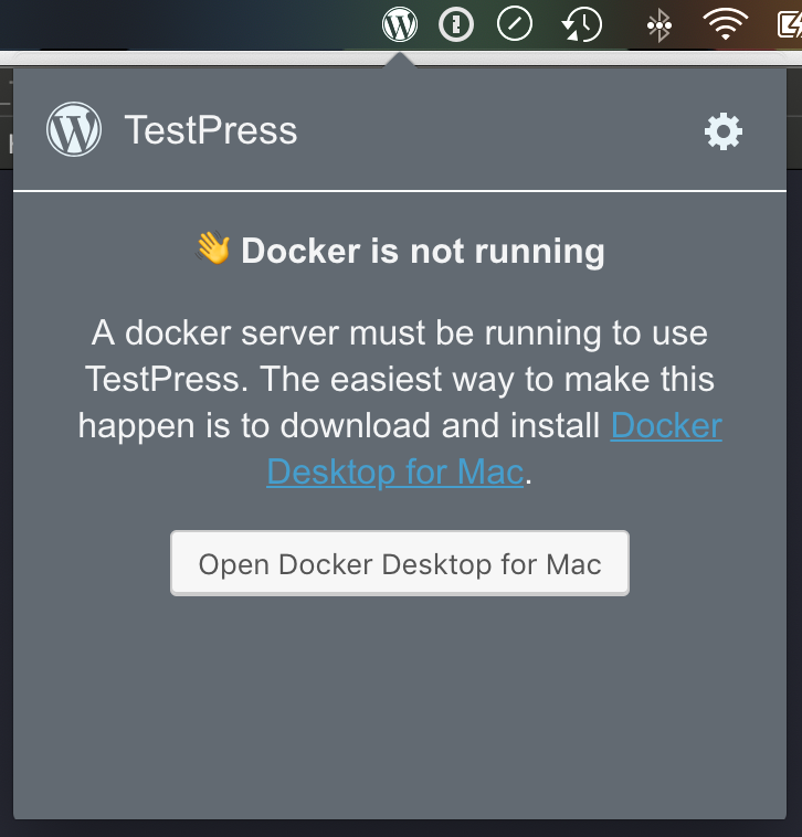
| Docker not running | 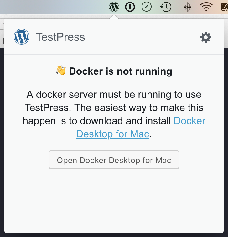 |
 |
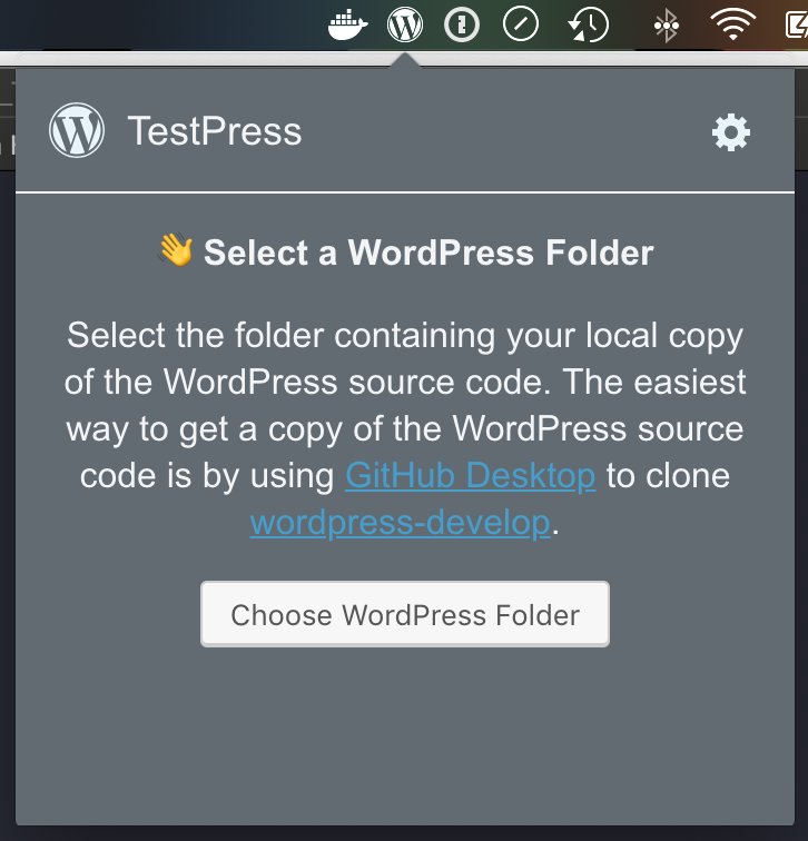
| No WordPress folder |  |
 |
| Getting ready |  |
 |
| Ready | 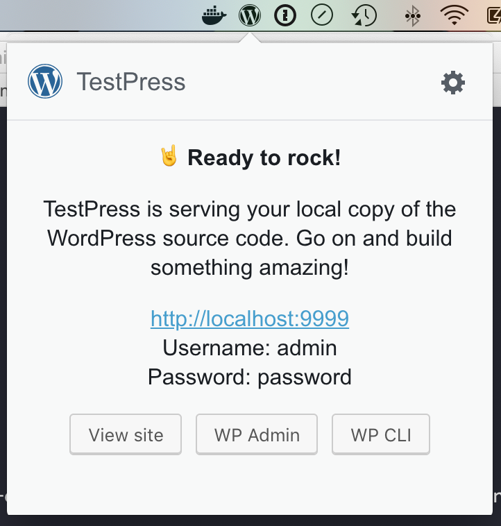 |
 |
| About |  |
 |
| Preferences |  |
 |
My own notes:
- ~In Light mode, the icon button in upper right should be dark grey as it is in Gutenberg~ https://github.com/pento/testpress/issues/116
- ~Link colour in Docker not running and No WordPress folder screens is too dark~ https://github.com/pento/testpress/issues/117
- ~All buttons (e.g. Choose WordPress Folder, View site, View debug log) in dark mode should be dark~ https://github.com/pento/testpress/issues/118
- Preferences screen should use WordPress components for buttons and tabs https://github.com/pento/testpress/issues/119
- There's a thin translucent bar that appears between the TestPress window and the menu bar #120
- ~In light mode, the border underneath the header is too dark. It should match Gutenberg~ https://github.com/pento/testpress/issues/123
I updated the screenshots now that https://github.com/pento/testpress/pull/121 is merged.
I have a PR (https://github.com/pento/testpress/pull/146) open for the preferences issue.
This feedback is based on the screenshots as running latest version seems not to reflect those. That in mind it really looks a high starting point.
Docker not running
- In dark mode, this colour of the link I don't think will pass a contrast check. It's an excellent point to ensure this is checked.
- I wonder if in dark mode the button couldn't change also?
- Dark mode background seems 'blue/grey' over being a proper dark one. Is that just the screenshot or could it be increased in darkness?
- While I understand the usage of the hand emoji, I am not sure it really helps here.
- I think the text hierarchy needs looking at for example to ensure the text such as 'Docker is not running' stands out.
- I also wonder if the amount of text is a good idea. How can that be distilled? It really needs to be instantly recognisable as to what state the screen is in. I'm not sure right now that's the case.
No WordPress folder
- This really shows my above point of by scanning not really seeing what state you are in. It would be great to think of those that won't read all the text and how they can be informed.
Getting ready
- I think bringing back here the traffic lights from the original work I did on TestPress could be a good idea. The tick is ok as a representation, but the dials are just too small and hard to work out what is going on in a dock position.
Ready
- Do we need all 3 buttons? That's a lot of the same buttons at equal importance. I would love to see something like a primary action and then identify what the secondary ones are.
About
- Similar to the waving hand, I am not sure about the use of the emoji here. I understand the intent but in this case, I think not using it would be better.
I'd be happy to do some sketches if you want, but I think most of my points can be made without. It's not that far off being able to release if these polishes are done.