Timeline Rewrite
QListWidget can support adding widgets to its items, like this:

So to me it seems like a good idea to replace the current timeline implementation with this qt-based implementation. Here are some advantages:
- Splits the timeline into logical components
- Uses qt widgets such as QCheckBox, QIcon, and QLabel instead of relying heavily on paint and mouse press events
- Easily extensible. If you want another layer icon for some property, you just add a widget
- Labels could easily be made editable on double click, eliminating the need for a popup dialog to change the layer name
- It can be styled very similar to the existing timeline if that is what you want
The only potential difficulty I can think of with switching over is going to be with the drag and drop. The issue is how to get both the layer and the track to drag when one of them begins dragging. I think the best solution to that would be to put a QSplitter inside each list item and then sync the sizes of all splitters with some signals and slots. Then drag could simply be enabled by setting the dragDropMode on the list widget. If anyone has a better way to do this, I'm all ears.
If this is something people are interested in, I can try to do it.
That sounds amazing @scribblemaniac ! It may move most of the UI logic to the QT side that we don't have to worry about nor to maintain.
If you think that you can achieve this without losing any features from the current timeline, then go for it!
Drag and drop is actually not working well at the moment and being able to edit track names without a popup would be amazing!
Thank you!
@scribblemaniac Anything that helps future coders to make their lives easier is great in my book! Let's also ask what @chchwy thinks about this proposal, but I think it's worth a shot.
The only thing that worries me is what happens with the frames. I've always thought they should be some kind of container for features like:
- Writing notes / comments per frame displayed as tooltips or something similar.
- Toggle showing thumbnails of the canvas content at a specific frame number, or display the waveform for sound layers
- Allowing the frames to be tinted upon user choice to differentiate keyframes, from regular frames, and empty frames from frames with drawings.
- etc,...
If this system allows for more flexibility in the future, I say go for it.
I agree with you @scribblemaniac. It's the right direction to make timeline more organized. Current timeline worth a total rewrite.
Only one thing I worry about is performance. Pure Qt Widget implementation might meet the performance issue because it's quite expensive to create hundreds of widgets on timeline.
I would recommend implementing timeline with Qt Graphics View. It's designed to handle a large amount of 2d elements. We can strike a balance between performance and structure.
@chchwy I am not very familiar with Qt Graphics View, but after looking through the docs, this does seem to be a better way to do this in terms of speed.
Thanks everyone for your feedback. I will try to do this when I get a chance.
Research
Toon Boom Harmony
ToonBoom Harmony Toon Boom Harmony is what I consider to be SOTA among the animation applications that professionals are using today. The timeline interface has a lot of functions, yet looks very professional and is visually pleasing to the eye.
TVPaint
TVPaint
 TVPaints timeline interface can be split into either X-sheet, classic timeline with thumbnails on/off.
Plastic Animation Paper (Concept)


Plastic Animation Paper (PAP) has always had a very straight forward approach to animating, just open the program and start animation, initially the old design (PAP 4.0) looks very simple and intuitive, but as you venture into the many buttons and menu's, you'll find out that it can be extremely complex and overwhelming. Because of that, it is merely here as a reference rather than design.
Adobe Animate
Adobe Animate
 As far as I know, Pencil2D was designed to be very Adobe Flash like at the time, which makes sense because Flash was the lead software back then... Animate hasn't gotten much further design wise though and while it's the most similar to Pencil2D, we shouldn't consider it something to look up to anymore because it's interface is clearly dated and can enhanced (look at Harmony).
Observations
- Colors in timeline: as icons and visual splitters
- pleasing to the eye and adds visual clarity
- Indent layers and groups
- organized workflow
- Ability to show/hide functions
- lets not make it complicated unless we have to
- Show keyframe thumbnails
- Clarity
- Note sheet either integrated or as a separate editor
- X-sheet
- Visual difference between keyframe and in-betweens
- geometrics (square, dot) or icons (key, no key)
- Zooming for more precise editing
- Layer locking
- Layer dependant onion skin control
When we implement the new timeline, all of above should be taken into consideration.
Before we get our hands dirty though, since we now have variety of things to consider, we should do some mockups. The mockup can be made of anything, cut-out, paper sketch or digital, it doesn't matter, the only thing that matters is that the design should be clear about what it wants to improve.
@CandyFace Great post Oliver! Indeed there are certain things that are worth adapting, however most of these programs are honestly very complex for an animator to just "open up and draw" which right now Is one of the main strengths of Pencil2D, and the only one among those listed who succeeded on that area was Adobe Flash / Animate. To me even PAP was confusing at first and so you had to go and read all the tutorials before understanding it's workflow.
I'll repost here the feature requests that I've collected on the document I've linked before, which pertain to the timeline and the layer management, which I think are indeed in need of an overhaul. Note the following should each have their own issue, some of these overlap what you have already noted, but I'll post it as so we can consider these into the overall roadmap for the timeline rewrite .
TIMELINE ENHANCEMENTS & FRAME EDITING
- ~~move animation controls to the middle of the timeline~~ https://github.com/pencil2d/pencil/issues/38 fixed via https://github.com/pencil2d/pencil/pull/656
- Allow to change the timeline frame size and frame count visually on the timeline, instead of the preferences. Just making a slider to handle this will work.
- Allow for the possibility to instantiate frames / modify exposure / visualize held frames: https://github.com/pencil2d/pencil/issues/389 Note: Pencil2D currently repeats a keyframe until it meets the next keyframe.
- Loop / Repeat selected frames function: https://github.com/pencil2d/pencil/issues/243 Note: this is akin to TVPaint's "Faux-Fixe" function.
- Improve keyframe insert or duplicate functionality (ongoing) https://github.com/pencil2d/pencil/issues/320 Note: Right now if you insert a keyframe, or duplicate it, it will be created on the next "free" frame it finds on the timeline. There should be a possibility to insert empty keyframe inbetween other keyframe containers while pushing them aside (usually only the keyframes that come after are moved)
- We need to fix the keyframe dragging. when you drag a keyframe it will displace others you hover over to the left, decreasing their position by -1.
- Ability to Select and move multiple keyframes / frames within individual layers and between layers // Move frames between layers of the same type. (What happens if we move a raster drawing to a vector layer by accident? Should we allow seamless conversion? Can it be done?)
- Need a way to insert or delete frames on all layers to change timing efficiently. Note: This could work in conjunction with the multiple layer onion skin feature that needs to be re-enabled, as we could have a similar function that happens when we select multiple layers and press the ADD FRAME button.
- We need an “reverse keyframes” function (Present in Flash and After Effects, this is a way to reverse the order of frames)
- Allow pencil2D to duplicate / copy multiple selected frames.
Frame Colour System
- Ability to assign custom colours to individual frames. This would work with current color changes. Currently we have the following:
- Empty frame = Outline square with layer colour
- Selected frame = Dark Grey Square
- Frame with content = saturated layer colour? // Not implemented
Frame Label System
A Frame Label could be used for for filtering the display of certain type of frames to visualize the animation during playback purposes (In a way this would complement the onion skin feature that allows to review adjacent or distant keyframes)
- Keyframe (key only)
- Breakdown (key + bd OR bd only)
- Inbetween (key + bd + inbetween OR inbtwn only [skip frame: 2's, 3's, 4's X's]
- Custom user state: i.e favor / cushion frame)
Timeline Marker / Layer Marker
- Text Markers are normally visible on the timeline (above frames) or on Layers. Use Cases:
- A text label or marker title: could contain text comments or annotation for other animators or production teammates that work in the same file (i.e colorists, clean-up artists, checkers, etc).
LAYER MANAGEMENT
- We need to fix the layer organization in the timeline, and make the current behavior of "layer replacement" optional. Right now the current behavior works like this: When you drag one layer to a place near another layer both switch places, which will work in some cases, but normally you want them to anchor below or above other layers, not to replace their stacking order.
- pencil2d krita-like layers via https://github.com/pencil2d/pencil/issues/359 Note: To be honest we shouldn't be willing to animate a lot of layers. If we had layer groups to organize multiple layers as well as layer filtering via labels + colors, it be more than enough.
- We need to re-enable the multilayer onion skin. This would allow to have onion skin affect multiple layers. There might be an issue to have a lot of layers turned on all the time, so we should also have to allow to turn on/off or opt out individual layers from this function
- Allow for layer grouping (i.e nest multiple layers inside parent holder) Note: This could work in sync with the label /color system.
- Custom layer colors or labels to categorize layers and permit group visibility.
- You can change layer focus between layers by using the up and down keys, but this functionality is reversed. (up is down and down goes up)
- We need a layer merge feature. this would improve also when layer ordering is enhanced.
Layer "Colour Tag" System With Colour Tag Filter Window
Allow the layers to pick any colour as their own, or a predefined set of colours determined by the colour palette. We need to also have a Tag assigned to the colour so we can filter each layer visibility through colour tag. Uses: Let's say we have several layers, some are for FX animation and others are for Character animation. We apply a coloured tag of custom name FX, and a coloured tag of custom name Character. When we need to see the FX layers we can press a filter checkbox to hide other layers. Filter window list will auto populate newly created color tags as checkboxes.
Layer Label Search Filtering
This would allow for animators to separate their layers / levels by virtue of their name. We could have a panel to customize naming rules and enforce the visibility of certain prefixes or suffixes, like when you use spreadhseets to filter specific cells with certain contents.
This is a complementary feature that can work along well with the color tag system, considering because you might want to view certain parts, characters or props while previewing the animation. Note that this is not intended to replace or overlap the visibility system for the layers, instead it would work for people with a lot of elements to browse for a particular set of layers that share a name.
For reference, Pascal Naidon’s vision document also talks a little about the timeline, though I think the most relevant bits have been posted above: http://www.pencil2d.org/2010/06/the-vision-for-pencil-by-pascal-naidon/#timeline While I’m at it, someone seems to have gained access to the blog and “enhanced” the entry with information about “cheap jerseys”, feng shui and other unrelated stuff.
@J5lx Thanks a lot! To be honest I had forgotten about that entirely! Also I cleaned the random hyperlink injection.
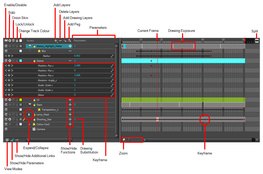
There are a lot of good ideas here, and some of these ideas will be added and issues will be fixed. Feel free to use this issue to discuss changes to the timeline, but for now the focus (at least for me) on this topic is the behind-the-scenes work to migrate the existing timeline to QGraphicsView, optimizing to take best advantage of its caching capabilities, and improving the code structure. This will allow new items to be added to the timeline far easier than before. You can see my progress on the timeline-rewrite branch of my fork, but bear in mind it is a work in progress. I'm probably only a days work away from making it on par with the current timeline, but I can't say exactly when I'll find the time for that.
Looking good @scribblemaniac do you accept PR's on your branch or would you rather complete it yourself?
@J5lx Ah yes Pascal also had a vision of the timeline (among other things), although somewhat dated it does point towards similar things. Thanks!
As for the mockups I was talking about, I've had some time play around with the look and in the process tried to work out some new icons too.
New or questionable additions has been labeled. I've taken into account some of the things which has been requested too, such as layer and color sorting but not everything listed or requested is here. The colouring is slightly darker but overall i've just build upon the old structure.
This is mockup 1:

Hopefully I should get some more time soon to make one with layer groups and with thumbnails.
@CandyFace I think this first mockup looks excellent. Certainly your research and observations are spot on. With this solution I feel the simplicity of Pencil2D has been retained and it does look more mature and professional.
I have a few small observations regarding the zoom feature and the keyframe / frame insert duality too. For zooming the UI suggests that you have to click several times to zoom in or out, but perhaps it might be better to adopt the slider functionality in similar fashion like toonboom, flash, after effects, etc. Not only because it's become sort of a standard, but Simply because it saves you from clicking a bit too much while dragging gives more fluidity during the interactive display of the timeline zoom.
On a more deeper level of discussion, the keyframe and frame icons don't look enormously different from a functionality perspective, I don't know If it would be more clear to just have a single "add paper / frame / drawing container" button instead of an "add keyframe" and "add frame" button mainly because the connotations of being a keyframe, or important frame, at the eyes of the developer is that such frame container class can have thumbnails, drawings and be moved along the timeline among other things, however to the eyes of the user / animator it should feel just like adding a new "sheet of paper", that will allow them to work further creating new drawings. That's where the idea of having a label system for individual frames originated at, as it would allow them to mark individual containers as their working keyframes, extremes, breakdowns and anything else they require.
This feels more like a philosophical statement to the workflow but If we create a new container / paper, it comes blank (empty frame state), if you fill it with content (drawn frame state) you can then either expose it, duplicate it non-sequentially, copy it, paste it, move it (timing), erase it (we should be able to delete single exposures, a range of exposed frames and the keyframe itself), so we are not creating a keyframe by itself, but rather a blank canvas that work in sequence.
Similar to toonboom, flash and tvpaint where you "hold" the keyframe by increasing it's exposure along the timeline, I also think the frame exposure should be draggable, like in TVPaint. This makes it more organic when playing with the timing of an animation, and would complement well the idea of adding X amount of frames after pressing the appropriate key binding. What do you think?
p.s. Thanks a LOT for taking the time to do all of these diagrams!
@Jose-Moreno Thanks! yes I think so too, just replacing all qt related buttons with actual images gives it a much more finished look. This is something I would like to do to all the standard UI elements at some point...
As for the zoom buttons, you are right. I do know that most of the mentioned softwares use a slider for zooming, I just didn't incorporate one in this mockup, i'll replace the buttons next time around.
~~Frames: you are perhaps right, maybe it is too much to differ between the two with individual buttons, I just feel that there should be some visual difference, but adding two frame types may not be the right way. I did also consider that it could be done automatically, so the first frame in a sequence (no space between frames), would be shown as a "keyframe" and the following would be shown as in-betweens. it would only be cosmetic though so maybe it's not worth the trouble.~~ Thinking about, if the animator doesn't benefit from it, then it's just visual noise, so i'll probably remove it. It's also true that it loses its meaning when the frames are turned into thumbnails.
I agree that dragging a frame to increase exposure time would be great and more organic, i'll add a handle in a revision or the next mockup.
@CandyFace I would like to complete the code for the initial rewrite (for feature parity with the original timeline) on my own so that the code structure is consistent with my vision. After I've laid that foundation though, I would gladly accept PRs for many of the new features recently discussed here. I will post something here when I get to that point. Since you are taking such an interest in this suddenly, and since I have next week off (sorta), I will try to do some work on this next week.


Thank you so much for your hard work @CandyFace ! Your mockups look great! I am used to Flash so I tend to prefer the first layout but I have to admit that the second one looks great as well. Do you plan to have an option to switch from one layout to the other?
If in some way I could manage to find the time and knowledge to complete the mypaint port, we would combine those great improvements and bring pencil2D to the next level.
Thanks @feeef Yes, the idea should be that the user can choose to use either of those layouts, possibly via a toggle button or something.
@CandyFace Is there a way you can incorporate this proposal to your timeline mockup?
https://discuss.pencil2d.org/t/feature-request-better-onion-skin-and-my-suggestion/452
It was the original proposal for the onion skin on timeline, and the reason why we have that onion skins button on the timeline, but not the rest. Basically what we can see there is that all the onion skin "preferences" were brought to the timeline. Of course this would happen once the timeline is rewritten.
By the way that button label should be changed to something like <Onion Skin Layering Type> as many people continue to confuse it's functionality.
@scribblemaniac incidentally I would like to ask about the status of the code for this if that's ok, just to know if there's been any progress or if you are ready to receive PR's as mentioned last year :slightly_smiling_face:
@Jose-Moreno I have updated the non thumbnail mockup now with the details you've requested.
Updates:
- slightly saner design from a programming perspective...
- Updated keyframe delete icon, rearranged timeline top bar items and cleared up some things
- Added onion skin visibility setting as per request.
- Selective (select x amount of frames
- Linear (behind and in front of current frame)
- Match frames (x frames are skinned no matter the distance)
Mockup update:

Changes:
- tweaked the thumbnail layer stack, Looks a tad more tight now
- New iteration of layer add and remove icons
- Less general or verbose.
This is most likely not the last iteration of the layer icons...

Quite a lot of things is going around in this mockup.
- Merging the frame with the widget
- thinning the timeline
- separating playback
- Icon tweaking
- new range slider
I've tried to take into consideration that the timeline shouldn't require so much horizontal space that the user can't see all buttons available and therefore played around with the idea of separating the timeline from playback and it's related functions. In the mockup the playback has been put into its own widget. The reason for this is that right now the timeline has to be a certain size to see all actions, this would still be the case with the new layout but removing the playback from the timeline allows a timeline that could potentially be ~300 pixels thinner.
I've removed labels in front of icons that has been given more visual context. This only focuses on the timeline, not the layer stack (even though it's the same thing currently) but the "layers" label could potentially also be removed.
Taking inspiration from blenders timeline, a new UI element has been added. Range sliders that are adjustable via dragging mouse left or right or clicking the arrow buttons.
The last interesting that I think is worth discussing is merging of the frame into the widget. The fact that a widget requires additionally ~20 pixels in height just to show a title and two buttons, annoys me greatly... I think that the mockup shows a potential in making the widgets frameless so we use that space more efficiently, at least for the timeline. There's a lot more horizontal screen than there's vertical, so let's not waste that with a frame.
This mockup was an experiment to see how thin I could get the timeline without sacrificing visual clarity.
@CandyFace Lookin' good 😄. Could you upload a copy of the source file (xcf/psd/etc.) so that others can tweak it if they want to?
The integrated title looks good. I noticed that there is a setTitleBarWidget function in QDockWidget. I'm not completely sure what this would do, but it may be good way to place the timeline controls section.
As far as width goes, here are some useful statistics. Since we are only targeting desktops/laptops, I would say that a width of at least 1024 is a fairly safe assumption. Anything smaller than that is usually interpreted as a mobile device by media queries on most big websites. Worst case scenario we could probably design it to split into two rows along one of the separators.
@scribblemaniac Ah yes of course, You can find the whole project as an svg below. Let me warn you though, the project structure is rather messy :3
Small update:
- Duplicate keyframe is back
- Dropdown menu
- Instance keyframe
- Duplicate keyframe
- Dropdown menu
- Scrubber visibility states
- "Hollow" when mouse hovers over scrubber making it easier to see and select frames underneath

Bonus: Timeline with time bending feature.
Another row has been added (can be toggled on/off), making it possible to now adjust time between frames. This shouldn't be confused with the fps. Frames can be squashed and stretched via the handles on the time bending row and the occurrence of frames within that area will be affected.
This is not meant to be a replacement for a more visual node editor but merely me playing around with the idea of having a simple way to allow more frames to be shown within a second...

A year later.. the same month as last year it seems o.o, here's another iteration of the timeline mockup.

- Use outline for icons to make them stand out more.
- All icons has been refined a bit
- Explicit draggable splitter that determines where the layer label ends.
- New opacity icon that is bound to the spinbox.
- Haven't determined what will happen when you press it... maybe some GUI could appear on the canvas to control the opacity more visually... otherwise it's just going to be a visual icon that will change depending on the spinbox value.
- Removal of unique colors and layer searcher.
- Layer rows now contain the same color as the tracks, making the timeline overall more colorful and making the track and layer look more connected.
- Range is a checkbox instead of an icon
- Playback time indicator added
- Simplified playback controls
- Currently there's no loop icon because making a new one but it's still supposed to be there.
- Layer type icons are gone, the colors determine the layer type now.
- FPS embedded into spinbox.