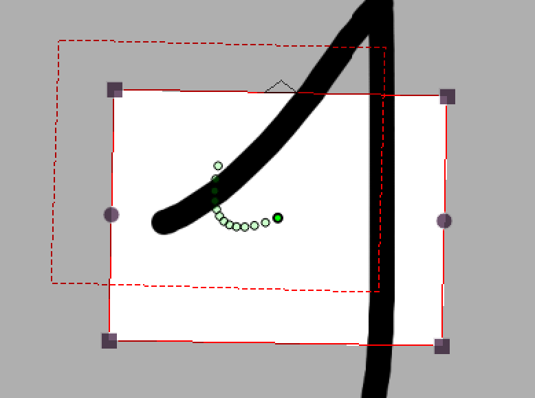
pencil
 pencil copied to clipboard
More intuitive work with camera movements. Camera rewrite (2)
This PR is premature, but it seemed to me like the best way to talk and discuss the development of the camera. The branch is based on the branch that is under review right now. I think that big changes should come gradually. The greatest change is that you can zoom on the camera layer, without changing your camera-field. You do that by dragging and scaling the field freely across the background. There is also a preview of the camera path... I'm looking forward to discuss this. closes #766 https://youtu.be/fkMOJ1c93r0
Just a small update on the new camera, and how I would like it to be. NB: This video is not made with the branch in this PR, but I intend to merge it into this branch, when I'm done testing it. The branch used for this video is called 'camera_rotation' https://youtu.be/YlOkEes3wtM Edit: The branch camera_rotation is now merged into the PR branch, and the video reflects the new features.
This is ready for review. It is built on camera_interpolation, and should wait for review until that PR is merged. I'll upload a new video tomorrow, to show the changes.
Here is the promised video (4:28) with the latest and hopefully, last improvements. https://youtu.be/fHr3DmXUrdk
I've decided that the decision to use QPainterPath to define the camera paths is wrong, and I have to refactor it. There are (at least) two reasons for this:
- For some reason, the QEasingCurve::LINEAR was no longer linear, when it was following the QPainterPath.
- Some of the interpolations in QEasingCurve have values that are not accepted by QPainterPath. This means that 8 of the QEasingCurves were invalidated by QPainterPath.
It shouldn't take long to refactor...
Camera (2) is now ready for review. It has been reworked, all QEasingCurves can now be used, and it is clearer what paths you're working on.
Currently working on this, fixing merge conflicts and cleaning up the code...
Thanks @MrStevns for your help, advice, guidance and coding for this PR. I'm certain that the users will embrace the changes, and I hope we'll have a second reviewer for the PR, within reasonable time... - but I know, that's what we all hope for, when we make a PR.
@MrStevns Thank you for the hard work! Ive been testing this branch and i'd like to comment on a few things that I feel still need to be addressed from a UI & UX perspective:
-
We can't reset the camera transforms anymore. One of the main reasons behind this change was to allow a way to parametrize the camera in a future enhancement, but without being able to restore the initial state, people will lose quality by leaving the camera in whatever zoom factor or position they can, so to avoid that:
- We should be able to maintain a sense of having a default transformation state so the camera
- We should always be able to go back either to the center of the canvas, the default startup position or [0,0] coordinates (whichever applies to the current system).
- We would need a reset command either as part of the view menu, create a new camera menu as David suggested at one point, or as part of the tool options (when selecting the camera layer) which could lead to having a set of options dedicated to transform the camera by specific units in the future (similar to Blender)
- I think the widgets should be rendered on top of the camera frame and not behind since it's very difficult to see and grab any of them.
- On the other hand I asked before to consider having mirrored widgets for each control i.e
- Scaling widget | all camera corners
- Rotation widget | all camera sides
- Translation Widget | This already appears by default when selecting the move tool, but the icon could be bigger at least so it's more obvious.
- Debug widgets | I know David added a drawing of a circle on the top left for certain scenarios. For UX purposes these graphics are not clear and unfortunately after some use the little circle looks like a non-obvious glitch.
- If we zoom in (make the camera smaller) we get a red circle. Maybe we should either make the entire border red? Should that apply also when we zoom out? Should the default state have a different color? Perhaps if they are dangerously away (25% or under where Pencil2D can lag and crash) we can activate it?
- If we rotate there's a blue circle on the same corner. What does this mean? If you rotate the camera beyond 90° degrees clockwise or counter-clockwise the blue circle will appear. It could be useful in case someone rotated the camera 180°'s similar to the vertical flip problem, so people drawing all the way with an incorrect setting can fix it before wasting too much effort.
- If we want some kind of warning let's make it explicit.
- Rotation should allow us to use the existing "discreet rotation" option pressing Shift, like when we transform. Very ussful and the code already exists.
- The safe areas text does not align with the rotation matrix nor does it scale with the zoom transform
Rotation
 Zoom
Zoom

I'd like to know what you think 👍
Hi @Jose-Moreno Thanks for your comments, but I'm afraid you're testing and old version. If you pull the last changes, you'll be surprised to see the changes. One comment: I have tried rotation handles on all four sides, but it couldn't be done. It has something to do with the way degrees are calculated. If you or someone else can code it, then be my guest.
@Jose-Moreno A few things, first... are you sure your build is up to date? The debug look and the UI aspect of the handlers, suggest that you're not up to date with the latest changes. The UI is supposed to look like this
The state when you've zoomed in, the border will be red, there are no blue and red circles anymore:

A border of the view at 100% will also be shown

The triangle to indicate which way is up:

Onion skin to show interpolation steps:

I think the widgets should be rendered on top of the camera frame and not behind since it's very difficult to see and grab any of them.
This is already the case as you can see from the above images
We can't reset the camera transforms anymore.
You can reset the camera properties by right-clicking on the keyframe and select one of the properties. You can't do it from the view menu anymore though because the camera is not bound to the view anymore. It would be a good idea to implement buttons for the camera tool to do this too though, maybe I should look into that.... 🤔
Rotation should allow us to use the existing "discreet rotation" option pressing Shift, like when we transform. Very ussful and the code already exists.
Fair point, we'll look into that. Although it should be mentioned that it's not as plug and play as one would expect, because it's not using the selectionmanager to do transformations, since the logic is a lot different from moving a selection. So we don't have direct access to the discrete rotation logic that is required.
I think the widgets should be rendered on top of the camera frame and not behind since it's very difficult to see and grab any of them.
That should already be the case, in the latest build
@MrStevns Thanks man. This time I pulled the code via CLI last night and rebuilt the thing again after so long, but It seems I wrote the incorrect commands and messed up the pull considering the images you've shared, my bad 🤦♂️🤦♂️🤦♂️ I apologize in advance for any hasty annotation that was already addressed. I'll fetch & merge again with my GUI tool, sigh😩
Anyway, I see you quoted the same comment twice at the beginning and the end, but I suppose it was just a different comment that has been addressed as well, whatever it was I'm glad it's taken care of 🙇
As for the tool options... yeah you know the userbase, they won't find the right click reset feature anytime soon (I know even I had forgotten about it too 😅 )
I appreciate the camera indicator pointing up so we always know the default orientation of the camera 👌
Also I really like the "canvas" guideline you drew for comparison, it kind of helps to position oneself don't you think?. I think I'm going to make a proposal on having a canvas display guideline that allows you to give it any size (similar to the camera) but in a way that should not appear while rendered.
Additionally seeing the zoom factor on the top-left, even as part of the background I think could work well as a general display element, not just for the camera but for the view zoom factor, though this has already been proposed and there's a ticket open for it as well.
Lastly I'm confused by one thing, I thought the motion path implementation was on a different PR (was it camera_painterpath ?) was that merged into this PR as well? not that I'm complaining just curious if it's going to be part of this PR or if it's going to come in a different one.
I'll test again, thank you for your guidance and hard work!
Additionally seeing the zoom factor on the top-left, even as part of the background I think could work well as a general display element, not just for the camera but for the view zoom factor, though this has already been proposed and there's a ticket open for it as well.
So in the top left or right corner of the canvas or the camera?
Lastly I'm confused by one thing, I thought the motion path implementation was on a different PR (was it camera_painterpath ?) was that merged into this PR as well? not that I'm complaining just curious if it's going to be part of this PR or if it's going to come in a different one.
It was merged into this PR at some point I believe so yes the camera path logic is also coming out with this PR.
Speaking of the context menu: right now it has a bunch of submenus for slow/normal/quick/etc. and each of those has entries for in/out/inout/outin. Perhaps it would be more convenient to instead have just two submenus: one that let’s you choose between slow/normal/quick/etc. and a completely separate submenu that let’s you chose between in/out/inout/outin. That way you could change the interpolation from, say, “slow” to “quick” more conveniently without concerning yourself with whether it’s in, out, inout or outin.
You raise an interesting discussion point, so i've taken a screenshot here of a few possible solutions, first the current context menu.

Pros
- Requires one click
Cons:
- Not easy at a glance to adjust
- Long texts and a lot of duplication
- Finding the reset button (Linear) is difficult
- All changes requires the same amount of travel, which makes it harder to reset state.
When you change the menu layout so that speed and timing function becomes separate, you now have to first figure out when one or the other is selected based on the easing type, that can be solved somewhat trivially, however a problem occurs when you try to match against Linear, because that easing type affects both. Both menu's can't be active while Linear is selected, so first we'd have to maybe select an easing function, then right-click again and then select a speed type.


Pros:
- Easier to skim and adjust at a glance
Cons:
- Requires multiple clicks to change easing speed and function
- Linear is hidden away under easing and causes issues regarding how to affect one setting without the other. Eg. you can't have Linear easing and speed being fast because in the end its one easingType.
- We need to keep temporary state of what menu item is selected
- All changes requires the same amount of travel
There's a third and in my opinion the best choice so far, as I mentioned in the second example, the issue was that the timing function needs to be chosen before you can select a speed, so what if we turn it around? Now the easing function becomes entry, giving you less items to skim at a glance and we don't have to keep state anymore.

Pros:
- Easier to skim and adjust at a glance
- Can adjust with one click
- Can reset (Linear) easing with only one menu travel
- Requires no additional state
- Speed only affects timing functions that can be adjusted
Cons:
- None?
I think option three is the way to go, the user can reset easing with less travel and can also still adjust with one click. Additionally the menu looks less intimidating. Thoughts?
Nice work @MrStevns ! I must admit I prefer the first one, but number 3 could do the trick. I'm not a fan of number 2. As you write, it has many cons.
Thank you @J5lx for reviewing this! - and sorry for responding this late. My energy level is very low at the moment. MrStevns and I talked about the review and issues last week, and could only nod 'OK' to most of them. There are certainly issues that should be sorted out, and luckily MrStevns is in better shape than me, and has done a great work this week. There are two points where I disaggree with your comments:
- The easing menus. I think they are good as they are, but MrStevns has a solution that I see as an enhancement of your idea, and I can support, that these will be the menus we go with.
- The rotation handles. I must say that I don't see them as counterintuitive. On the contrary. Round handles, with round cursor arrows, that indicate rotation, and square handles, with straight arrows, that indicate field size - in my view. When you've tried it once, you know what it's about, and you don't give it a thought afterwards. You compare it to Word, and their text area, but this is a camera. It can not differ from it's aspect ratio, and is basically a totally different thing.
The context menu is probably being altered. Fine with me. The rotation handles? Well, I don't hope we end up with one handle on the top. I think it's perfect as it is, but it will of course depend on what you and others mean.
Again - Thanks for your excellent review on this PR!
You got some valid points about my suggestion, @MrStevns. I honestly didn’t think about those aspects. I agree we should go ahead with option one or three after all. And thanks for doing the complete rundown of all three variants!
As far as the rotation handles are concerned though, @davidlamhauge, I remain unconvinced. I could see your argument about the shapes of the handle if we had separate modes for scaling and rotation like some applications do, but that isn’t really the case here. Ultimately, what handle shapes mean is highly application- or even tool-dependent and I don’t think the principle of “round = rotation” is fundamental enough to be intuitively understood by users across the board. I certainly didn’t understand it myself.
As far as Word is concerned, yes, it is of course an entirely different kind of application than Pencil2D, but I think you might have missed an important part of the reason why I brought it up (and to be fair, I think I also did a pretty poor job explaining it). In Word, the rotation handle doubles as an orientation indicator. It tells you where the top of that visual element is. In other words, it is Word’s equivalent of the little triangle on top of the camera that this PR adds. But whereas this PR has two entirely different visual elements for indicating the orientation (the triangle) and for changing the orientation (the rotation handles on both sides of the camera), Word decided to combine those into a single visual element that serves both to indicate and to change the orientation. And I think that is a really smart idea, and we should do that too. And after all, the upwards pointing triangle already communicates the concept of orientation and “here’s the top”, so IMO a handle there would naturally communicate the idea that you can drag it to change the orientation.
But like you said, let’s also hear what the others think.
I don't know if you've seen @MrStevns implementation of rotation handle, as you suggested @J5lx , but it finally dawned to me what the argument was. I first wondered "Where's the triangle gone?", but then I re-read your post, and the arguments were there, all over the place. Another evidence, that my energy-level is very low at the moment.
This is of course the solution we should use.
@J5lx
Rather than saving the automatic control point + controlPointMoved to the XML, one could just leave out the control point entirely if it hasn’t been set (as if the file had been saved by an earlier version of P2D)
Hmm.. but for this to work, wouldn't I have to iterate through the existing xml and check if the property exists first, otherwise I won't know when the property was modified and therefore won't be able to change its state if it was previously modified. Our current approach when saving the xml is that we build from scratch, so this would be quite a change. I'm not sure that should be in scope for the PR, however I do acknowledge that polluting the xml with empty states is rather annoying...
When you use the ./, shortcuts to change the current frame while you are dragging a keyframe, the original frame will no longer be draggable until you click on the canvas once
Could you elaborate on this, I've tried to reproduce this behavior but it seemingly works fine for me? I'm also not sure how scrubbing would affect the selected keyframes.
I feel like the camera transform reset buttons are not particularly intuitive. Panning, rotation and scaling are pretty universal concepts in graphics applications, and yet the reset icons are based entirely on how these concepts are represented specifically on Pencil2D’s canvas. It might make sense to use icons here that look like the corresponding cursors
While panning, rotating and scaling are universal concepts in graphics applications, I have seen none that include reset buttons, so I'm not sure this argument hold. The icons are supposed to make you think of the camera itself and not so much the handles. I will try to make a few adjustments and see if it becomes clearer.
edit:
I've adjusted the icons again, what do you think?


Alright i'll stop now... I keep finding things I want to improve and I really can't help it when i see it crash somewhere which may or may not be related to this... but i'll stop now 🙈 .
@J5lx please review again, i've addressed all points but those that I asked about previously.
There are once again quite a lot of changes but the majority of the changes are related to either bugs or what you mentioned, the rest are stuff that I noticed were missing or forgot to handle previously or new stuff that I felt was needed to make the implementation more stable.
To sum it up:
- Camera is painted properly when using relative, single mode
- Fixed issues surrounding onion skinning
- Updated camera reset icons
- Fixed various crash situations, mostly surrounding removal of keyframe
- Fixed camera properties were not updated properly on project load
- Color of handles are now the same as the select tool (ie. not based on palette anymore)
- Prevent deletion of (in UI and core) a camera layer if there's only one
- Cursor now rotate based on the camera orientation (for camera tool only)
- Improved performance regarding cache and painting
- Fix handles not being properly updated when playback stops
- Various refactoring and cleanup...
- Disable camera context menu actions when applicable
- Camera rotation handle is now shown above the camera and also replaces the triangle
- Camera handles are always shown now but painted as hollow when they can't be used

@MrStevns Don't worry I'm sure more things will surface but It's better that we address them in separate PR's to keep track of them, and that way other contributors can also assist to implement the fixes in due time.
If you found other crashes please report them separately as you have before. I'll also gladly test these improvements little by little and if I find crashes I'll be sure to report as well or add to the ones you submit.
So far everyone has done an outstanding job, and I'm really hopeful for the immediate future of the software 🙂 🙏
Thanks lots to @davidlamhauge and @J5lx for pulling through the implementation and the reviews as well!
Basically, (1) start dragging the camera (2) while dragging, use the . and , to move to a different frame and back (3) stop dragging. (You could also stop dragging before moving back to the original frame). Now try dragging the camera again – it won’t move. But if you try again after you stop pressing the mouse button, it works again. I can reproduce this quite consistently.
Ah... like that! I see, yeah I can reproduce that behavior. Aside from the cursor being wrong when pressing again, what were you expecting? you can't move the camera unless you're on a keyframe, so to me the behavior works as expected or do you mean that we should allow this and keep track of the frame while pressed? The issue with applying such a change right now is that the handles will look wrong even though you can drag because the painter logic is decoupled from the tool. I'd like to address this in the future but let's call it a "known issue" for now.
Should apply this to the path control point handle too.
Already done in ba4238527af5a686b29232205d41eacaa41492e6
I’m not sure what difference that makes. The previous designs didn’t exactly scream “reset” at me either.
That's because they were not meant to, well not on their own anyway :P the label is meant to convey the action and the icons the context of what we reset. :)
Edit – one thing I forgot: the translation reset icon looks quite busy in the UI (at least on my normal DPI screen), I feel like it would look clearer without the little corners (i. e. only the arrows and the rectangle).
This gave me an excuse to cleanup the svg data some more. Additionally i've replaced the png cursor icons with svg.
The translation reset icon now looks like this:


Some more things I think should be done after this PR:
- Create stronger coupling between the camera painter and the camera tool.. to avoid doing duplicate calculations...
- Create a base cache functionality for all our painters that are related to the canvas, it's tiring and annoying having to create this each time.
- Allow dragging a camera even though you've scrubbed, this will become easier when the first point has been addressed.
- Fix DPI ratio being wrong for cache, making the canvas looks lower res while a tool is active.
I’d say this PR has seen a sufficient amount of review now. If any other issues remain, we’ll fix them whenever they become known.