 patternfly
fix(tabs): added responsive bp to vert tabs
Closes #3915
This PR
- Adds demos for vertical tabs in sidebar component
- Adds demos for vertical, full height tabs in sidebar component
- Adds
.pf-m-full-heightto the sidebar component - Wraps
.pf-c-tabs.pf-m-verticaland variants in amdmedia query
Design files:
- https://marvelapp.com/prototype/dj6cag1/screen/87992106
- https://marvelapp.com/prototype/5fba0cj/screen/73740954
Previews:
- https://patternfly-pr-4850.surge.sh/components/tabs/html-demos/vertical-tabs/
- https://patternfly-pr-4850.surge.sh/components/tabs/html-demos/vertical-box-tabs
- https://patternfly-pr-4850.surge.sh/components/tabs/html-demos/vertical-tabs-full-height/
Preview: https://patternfly-pr-4850.surge.sh
A11y report: https://patternfly-pr-4850-a11y.surge.sh
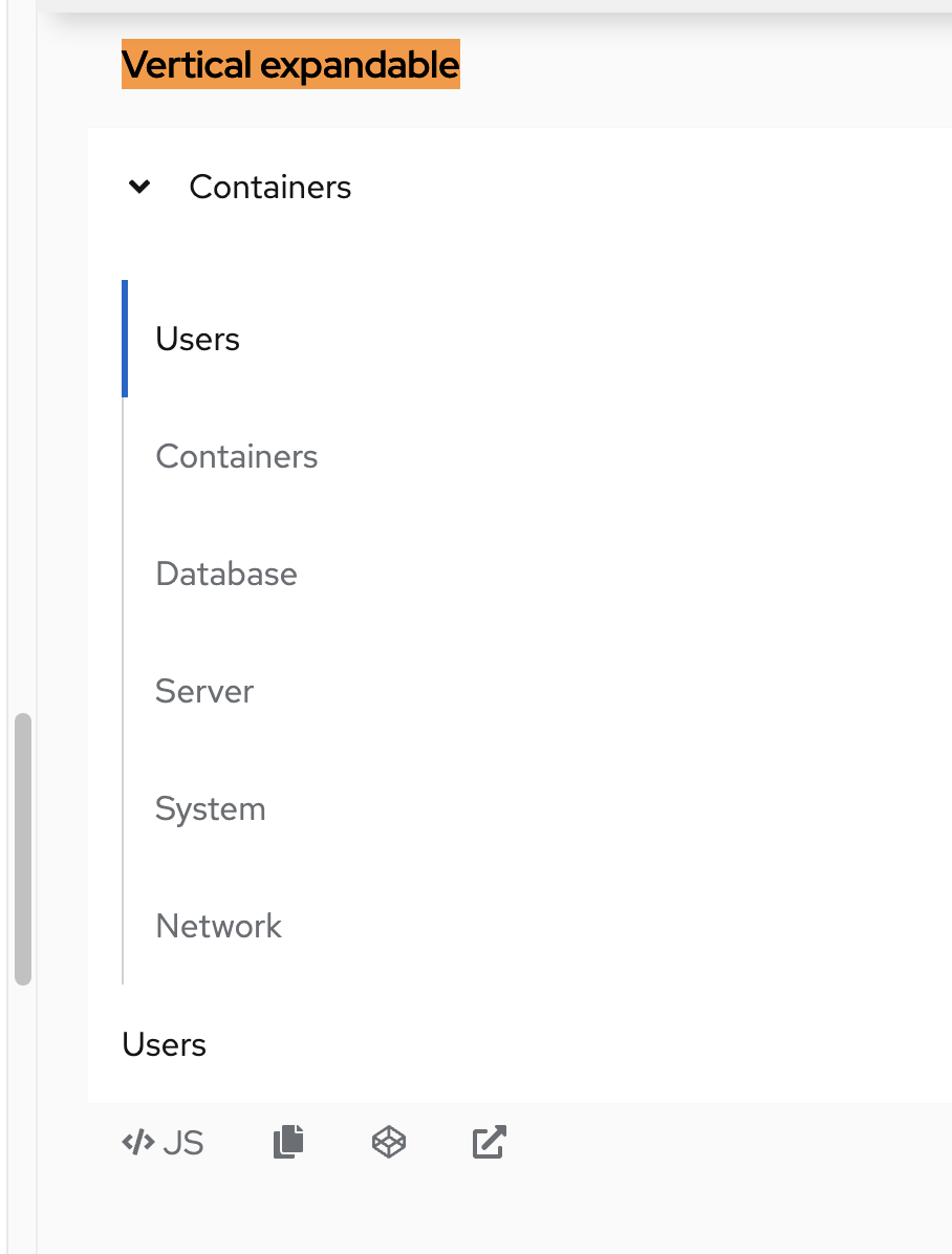
@mcoker @mcarrano @mmenestr This is how the vertical tabs present currently in context:
I agree that expandable tabs should be used until an appropriate viewport is reached, but they also look broken in demos, so we would need some design support to complete this implementation.
but they also look broken in demos, so we would need some design support to complete this implementation.
Which demos are we talking about @mattnolting ?
@mcarrano The only demos that showcase the expandable, vertical tabs are the new demos in this PR. They are present in examples only.
- https://patternfly-pr-4850.surge.sh/components/tabs/html-demos/vertical-tabs/
- https://patternfly-pr-4850.surge.sh/components/tabs/html-demos/vertical-tabs-full-height/
@mattnolting I agree that these don't feel right. Frankly, I'm not sure exactly what the use case is for vertical tabs. It was a feature I think we added for parity with RH marketing sites. Maybe we should put this on hold until we can take a look in design?
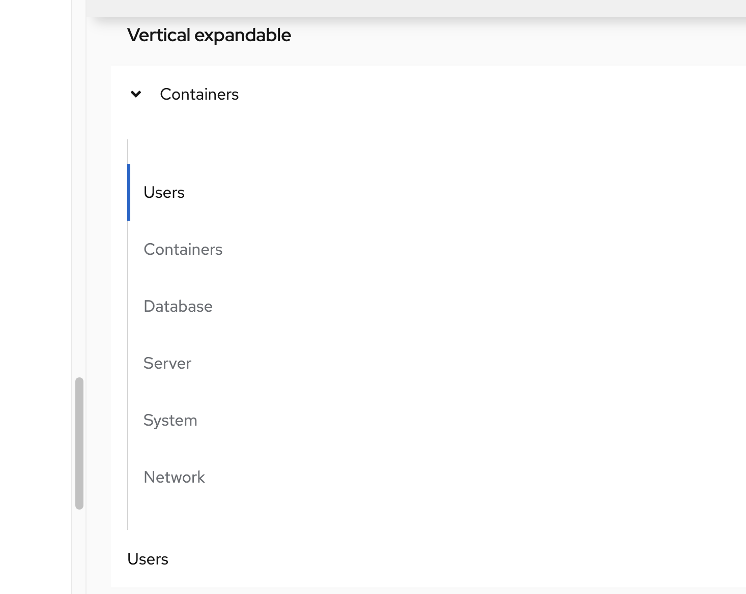
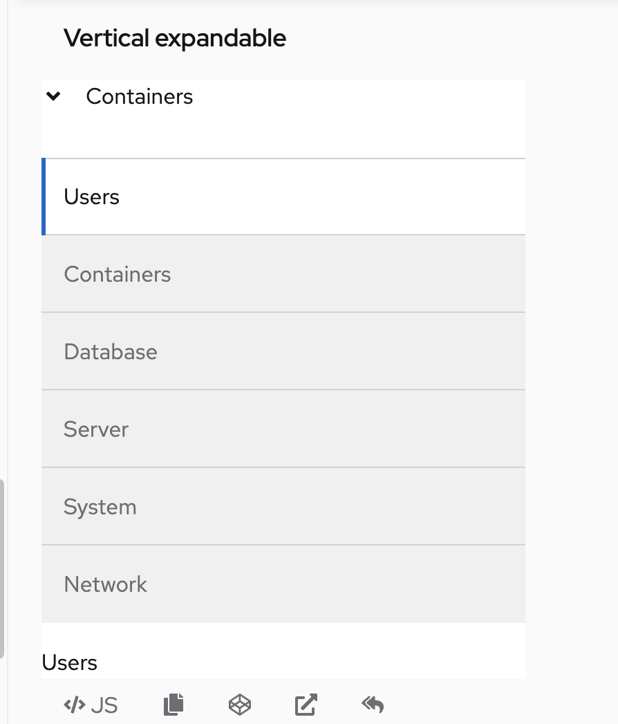
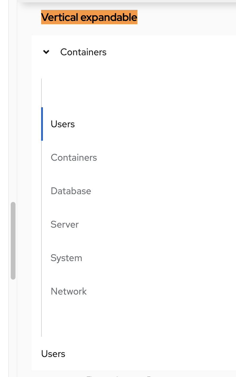
@mattnolting ah, I see, thanks for the screenshots. I wonder if part of the problem there is that there are vertical tabs style variations applying to expandable tabs when it probably doesn't make sense for that to happen. Here's what the expandable tabs demo currently looks like
Assuming that's correct, maybe we update expandable tabs to:
- Always use the default (don't apply "box" or "box-light" styles) when tabs are expandable. Any box or other styling like that will apply when the tabs are no longer expandable.
- Or we could keep the box styling if the user specifies that, and remove the right vertical border? And maybe the inset? It just looks a little odd
-
- Keep the inset fixed, or maybe even remove it
- Here is what it looks like with the inset removed:
-
- And with it set to 2xl - assuming the user set a 2xl inset, seems like we wouldn't want that when the list is expandable
-
- Here is what it looks like with the inset removed:
- We need to do something about the toggle button. Currently its position is offset so that the arrow in the button is left aligned with the tabs text.
- That's creating this lack of space/padding around the toggle button:
-
- This is the actual toggle button area with the red background showing the toggle button and how its position is offset to align the arrow with the tab items:
-
- That's creating this lack of space/padding around the toggle button:
@mcoker Thanks for the detail and screenshots
Maybe we should put this on hold until we can take a look in design?
@mcarrano Yes, I agree. I think we should have design take a look at the different use cases and variant combinations.
OK. I've opened https://github.com/patternfly/patternfly-design/issues/1165 to shift this to design.
This issue has been automatically marked as stale because it has not had activity in the last 60 days. It will be closed in 30 days if no further activity occurs.
![stale[bot] avatar](https://avatars.githubusercontent.com/in/1724?v=4 "Published by a pub.dev verified publisher")
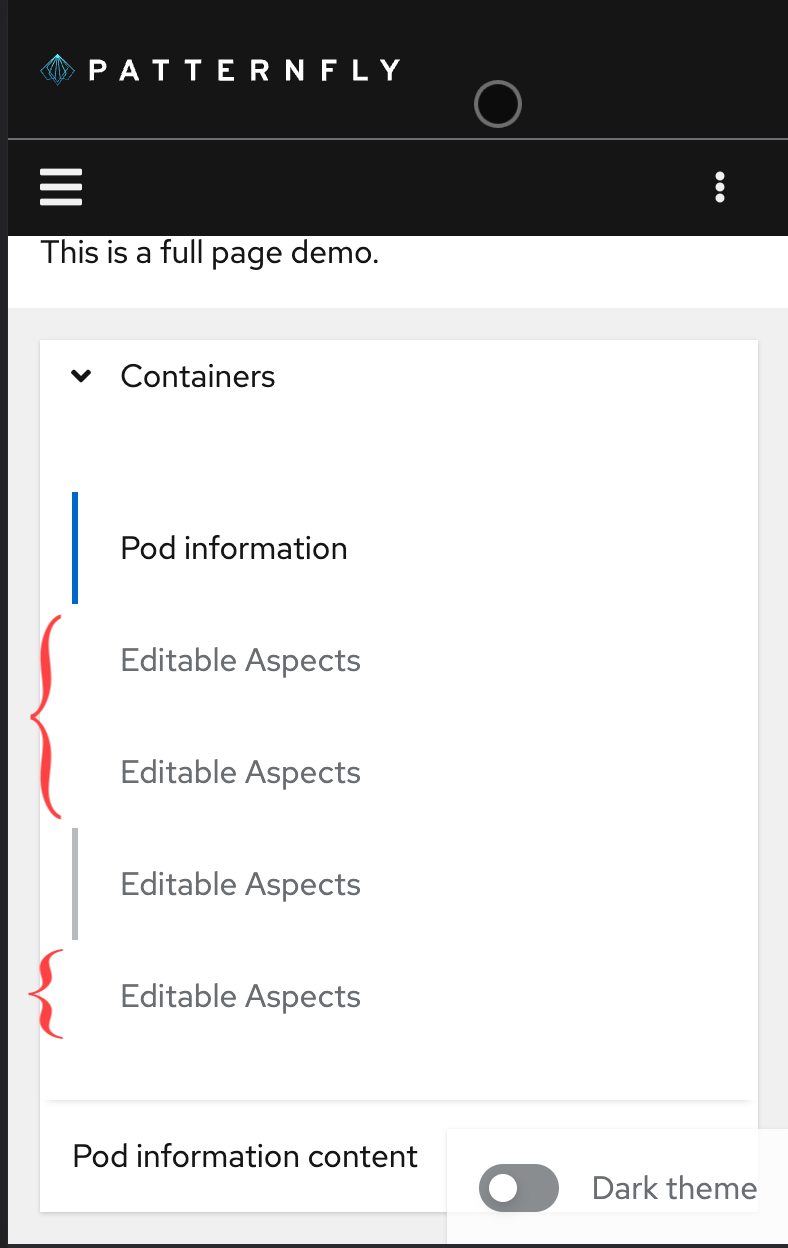
Should the vertical line be visible on https://patternfly-pr-4850.surge.sh/components/tabs/html-demos/vertical-tabs/ ?
You can (not!) see it here: https://user-images.githubusercontent.com/19825616/189410702-840a68a5-af20-447a-8798-104167553282.mp4
Should the vertical line be visible on https://patternfly-pr-4850.surge.sh/components/tabs/html-demos/vertical-tabs/ ?
You can (not!) see it here: https://user-images.githubusercontent.com/19825616/189410702-840a68a5-af20-447a-8798-104167553282.mp4
@mcarrano wdyt?
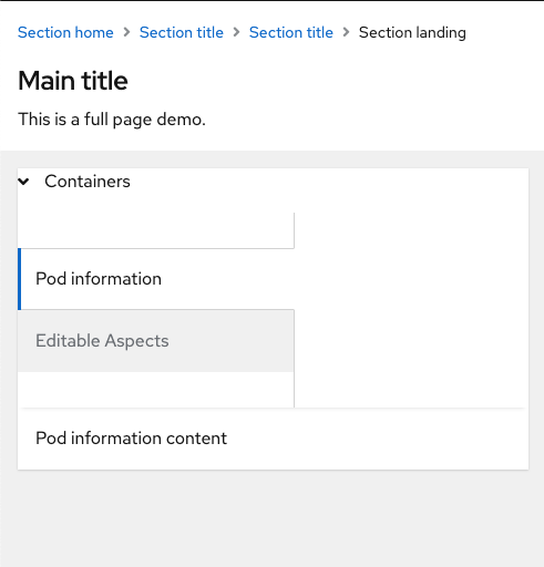
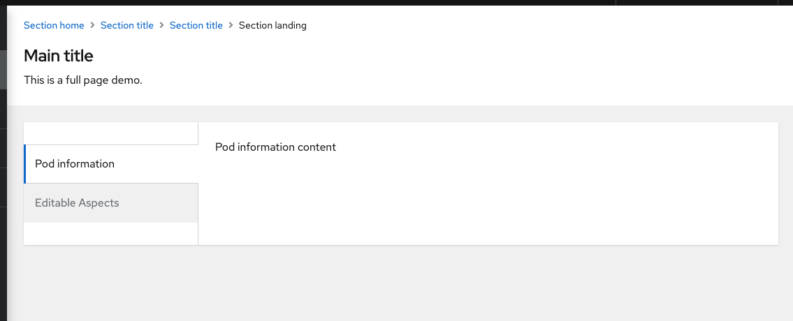
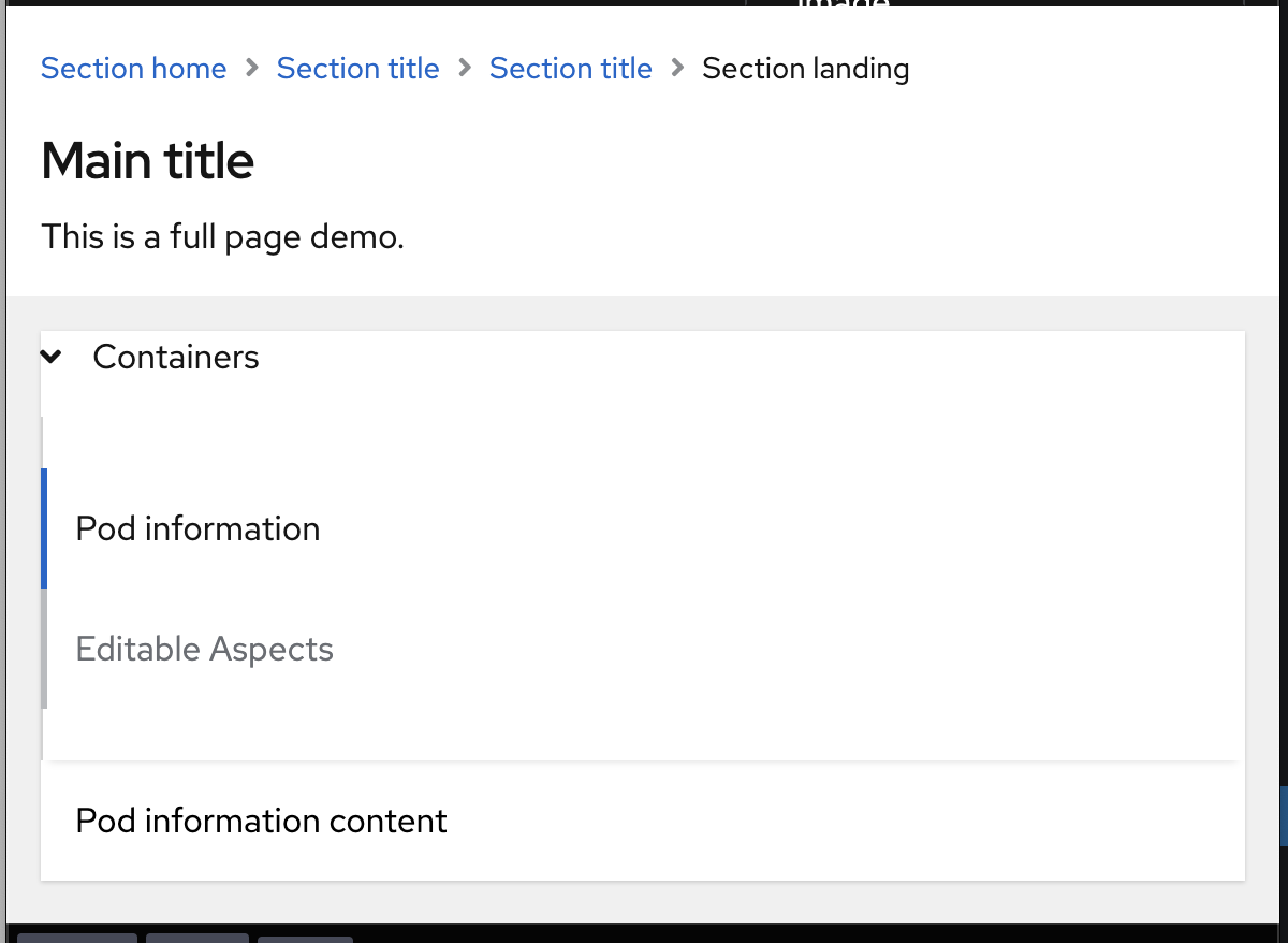
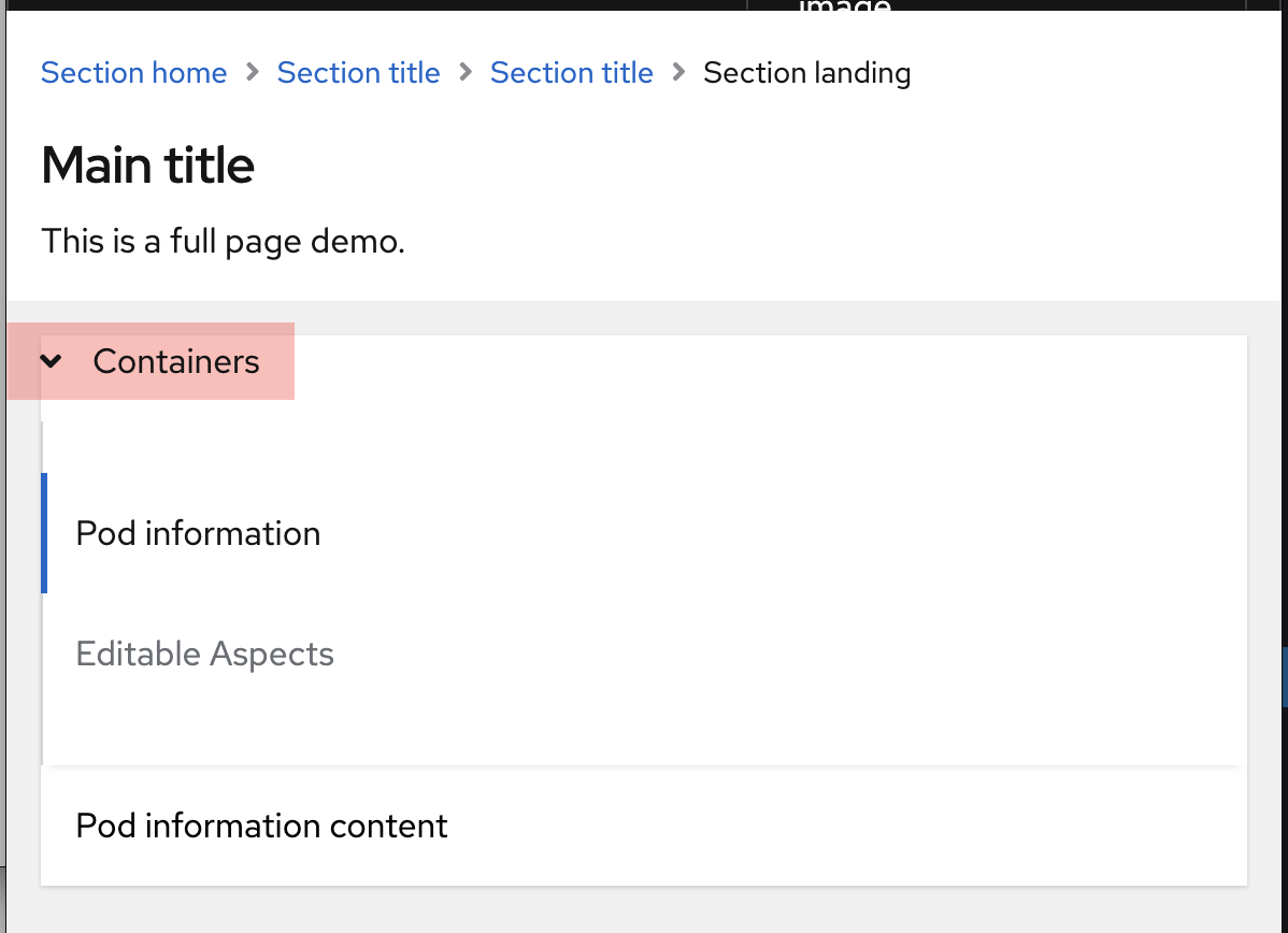
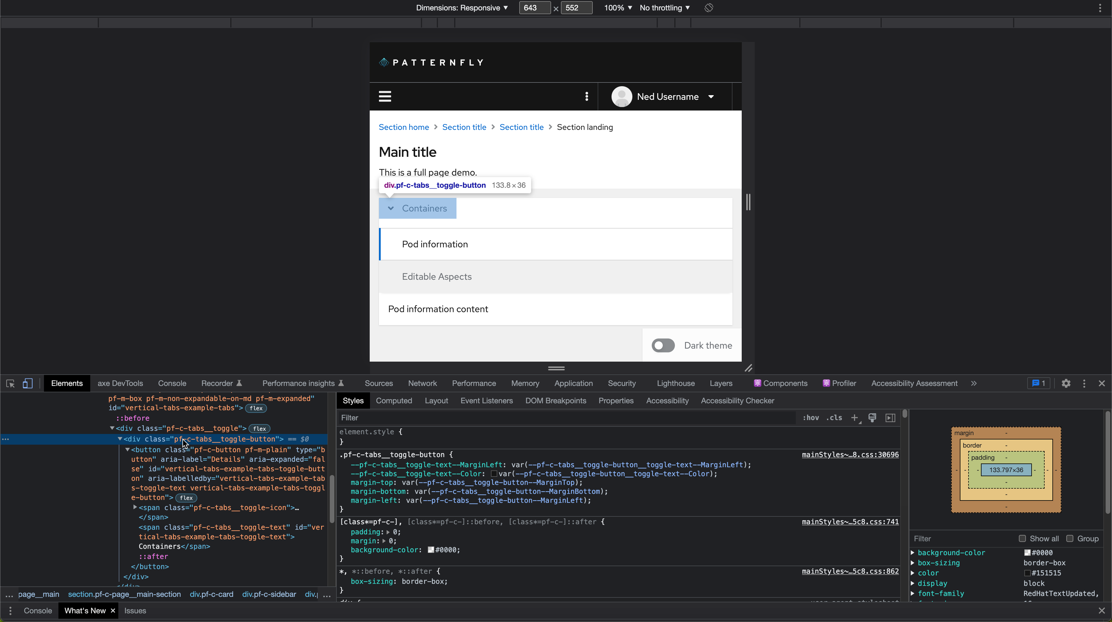
@mattnolting this demo feels kind of odd to me. I don't think that we would recommend using vertical tabs inside of a card like that. @mmenestr @doruskova do we have a mockup for a full page example of using vertical tabs that can be used here instead?
@mcarrano I don't personally. I guess we'd usually use jump links in this kind of scenario on a long scrolling form, instead of vertical tabs. I honestly can't think of a scenario where I'd recommend vertical tabs over horizontal tabs so I'm not sure how I'd go about demo-ing it in a "realistic" way
@mcarrano OpenShift is using vertical tabs here http://openshift.github.io/openshift-origin-design/designs/administrator/future-openshift/user-preferences/ and Satellite is using them here https://marvelapp.com/prototype/1121a8de/screen/72413287
@mcarrano OpenShift is using vertical tabs here http://openshift.github.io/openshift-origin-design/designs/administrator/future-openshift/user-preferences/ and Satellite is using them here https://marvelapp.com/prototype/1121a8de/screen/72413287
@doruskova Thanks for the refs! Looks like OS does not have a vertical divider and satellite does. Which is correct?
@mattnolting The correct one is with a vertical divider. OpenShift has a divider as well. http://openshift.github.io/openshift-origin-design/designs/administrator/future-openshift/user-preferences/
I'm not sure my original question was clear - I was asking about line at the smallest breakpoint, where you get hover and selection left border but they aren't connected by the faint gray line. It seems like the answer was yes to vertical line, but I don't see that connecting line at the smallest breakpoint. If that's the desired outcome, it's fine with me but it seemed off.
@mcoker @srambach I've updated the vertical, expandable tabs, box variant support. The extended borders are drawn by the sidebar component.
I'm not sure if it was resolved above, but this alignment looks off to me. If it's ok with design, then no problem.
@srambach which example is that? But you're right I think - looking at the expanded tab example the arrow is like slightly to the right of the 'left line' that borders the tabs