 patternfly
pfe-disclosure
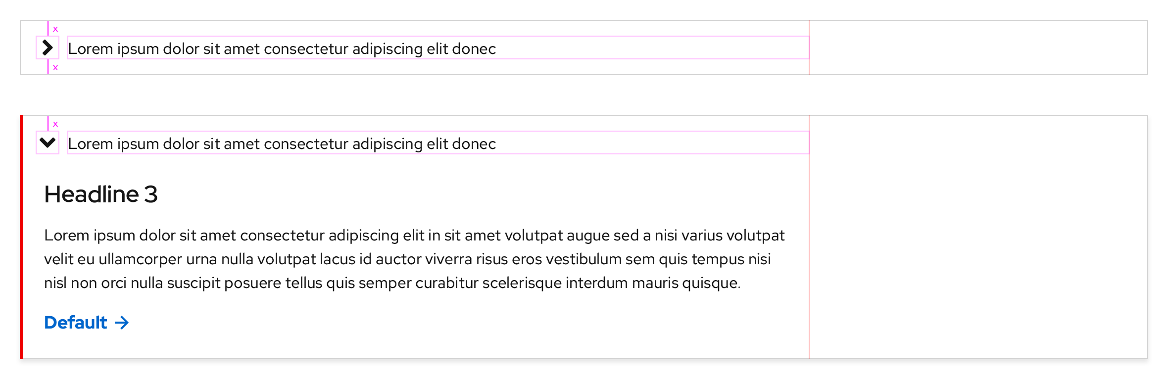
Disclosure
Themes
There are two themes available to choose from.
Light theme
Dark theme
Styles
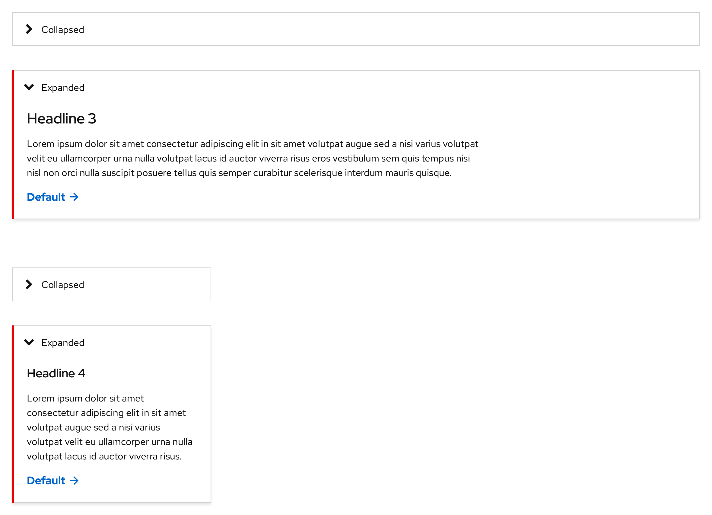
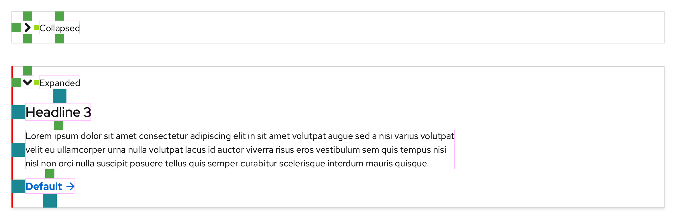
Light theme, Collapsed
https://xd.adobe.com/spec/3e62e93c-8338-4f31-5040-3b81f0ed5c71-4853/screen/e5f80536-7da1-421e-813a-1cb974cfcd02/Disclosure-light-theme
Typography
- Text label: Red Hat Text, Regular, 16pt / 24 (1.5), #151515
Color
- Angle/caret icon: #151515
- Border: #d2d2d2
-
Hover and Active/Pressed state panel backgrounds: #f0f0f0


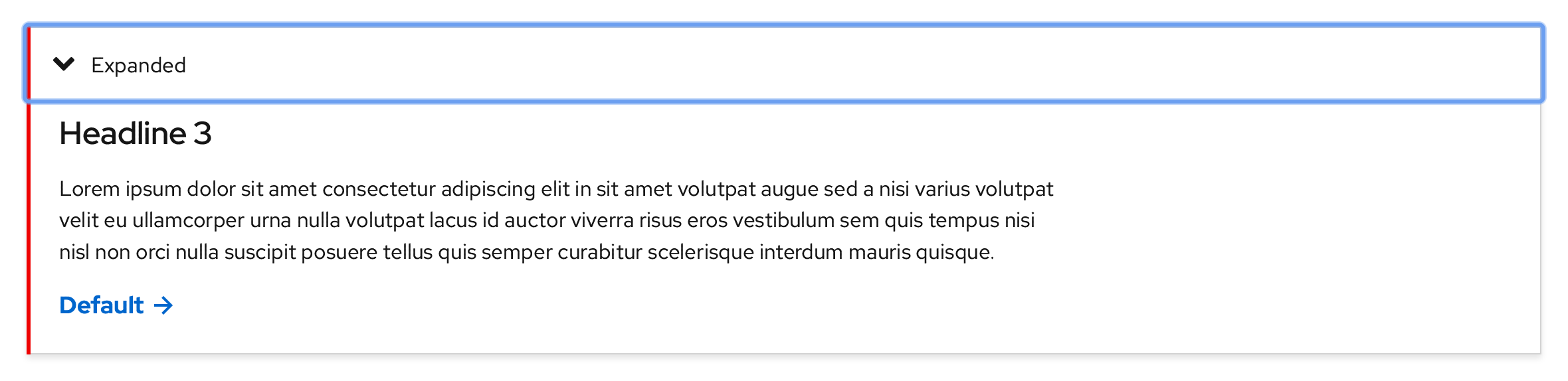
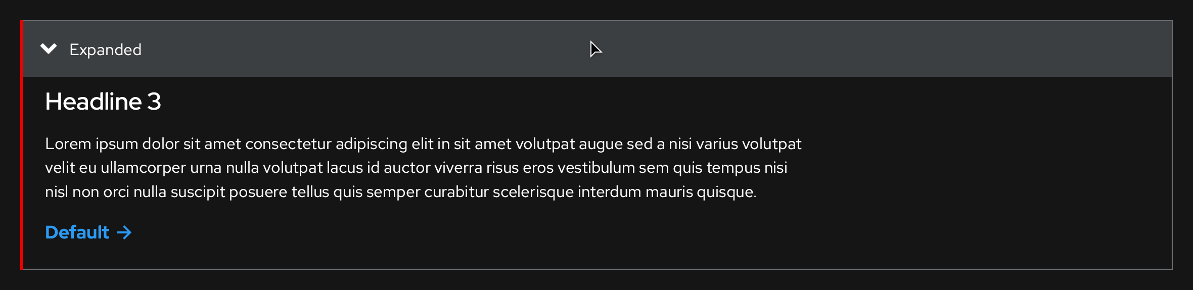
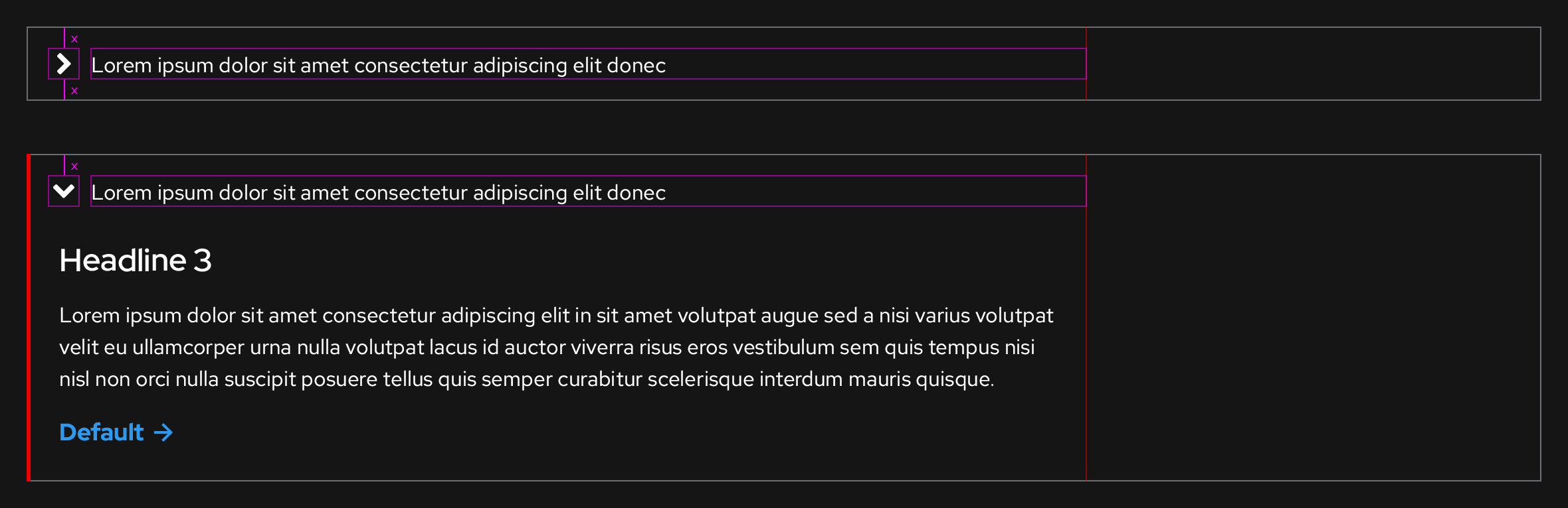
Light theme, Expanded
https://xd.adobe.com/spec/3e62e93c-8338-4f31-5040-3b81f0ed5c71-4853/screen/e5f80536-7da1-421e-813a-1cb974cfcd02/Disclosure-light-theme
Typography
- Text label: Red Hat Text, Regular, 16pt / 24 (1.5), #151515
Color
- Highlight bar: #e00
- Highlight bar width: 3px
- Shadow: #151515
- Shadow opacity: 10%
- Shadow distance: 3px
- Shadow blur: 4px
-
Hover and Active/Pressed state panel backgrounds: #f0f0f0

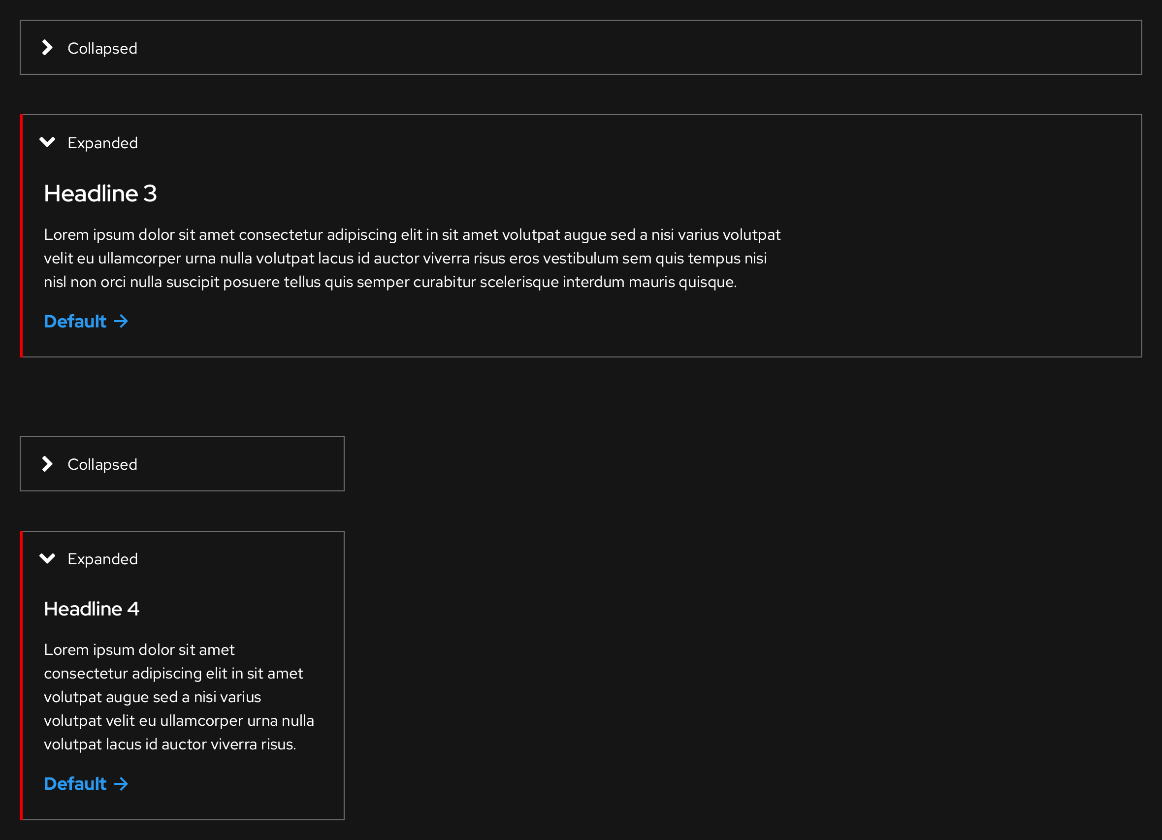
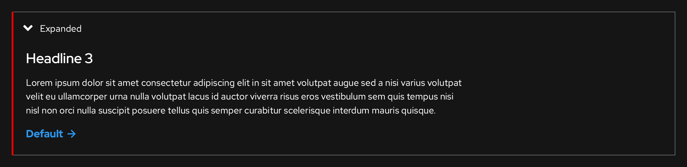
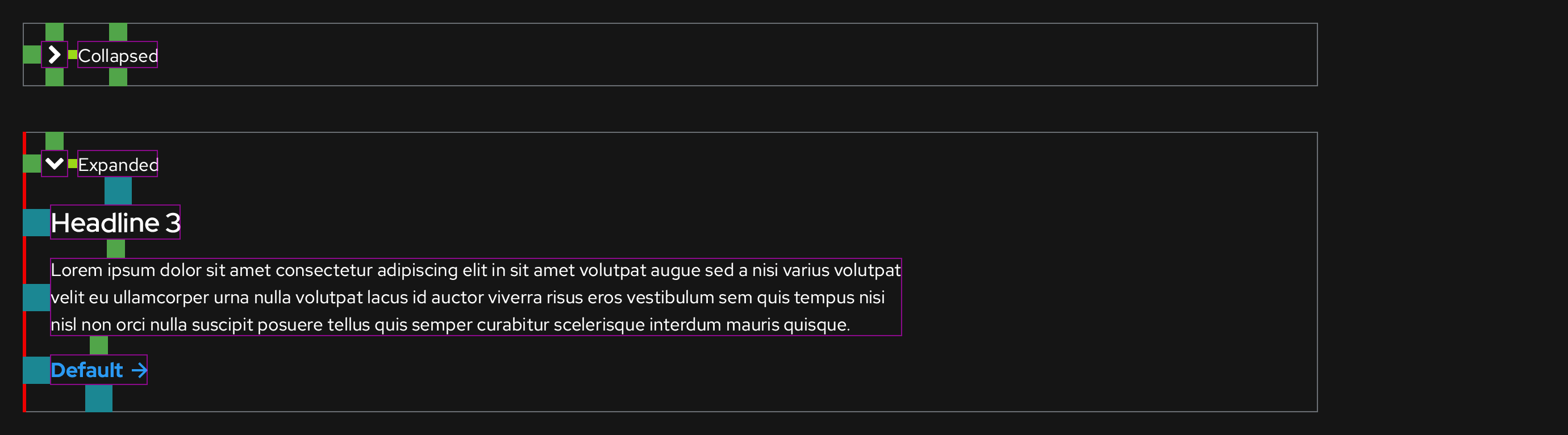
Dark theme, Collapsed
https://xd.adobe.com/spec/3e62e93c-8338-4f31-5040-3b81f0ed5c71-4853/screen/2fe14520-f086-4aca-ba9a-63a8118bbdd0/Disclosure-dark-theme
Typography
- Text label: Red Hat Text, Regular, 16pt / 24 (1.5), #fff
Color
- Angle/caret icon: #fff
- Border: #6a6e73
-
Hover and Active/Pressed state panel backgrounds: #3c3f42


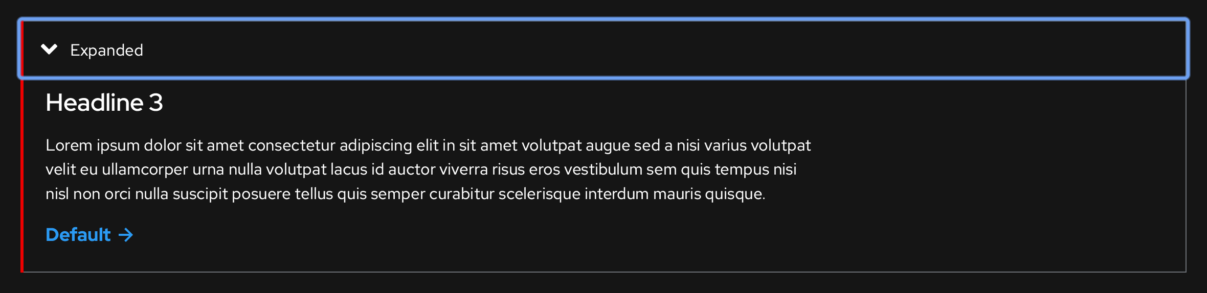
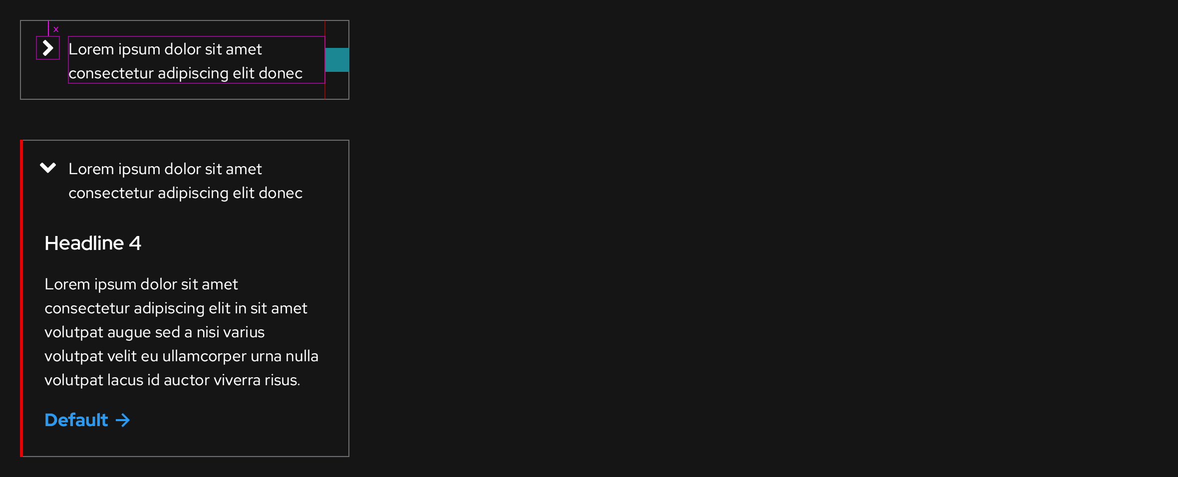
Dark theme, Expanded
https://xd.adobe.com/spec/3e62e93c-8338-4f31-5040-3b81f0ed5c71-4853/screen/2fe14520-f086-4aca-ba9a-63a8118bbdd0/Disclosure-dark-theme
Typography
- Text label: Red Hat Text, Regular, 16pt / 24 (1.5), #fff
Color
- Highlight bar: #e00
- Highlight bar width: 3px
- Shadow: N/A
- Shadow opacity: N/A
- Shadow distance: N/A
- Shadow blur: N/A
-
Hover and Active/Pressed state panel backgrounds: #3c3f42


Interaction states
Light theme
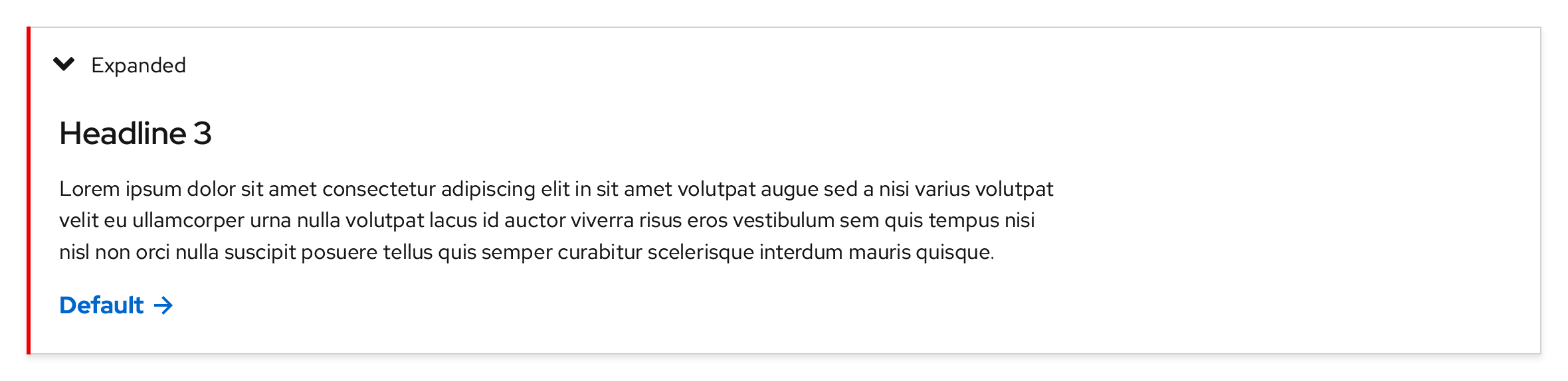
Default

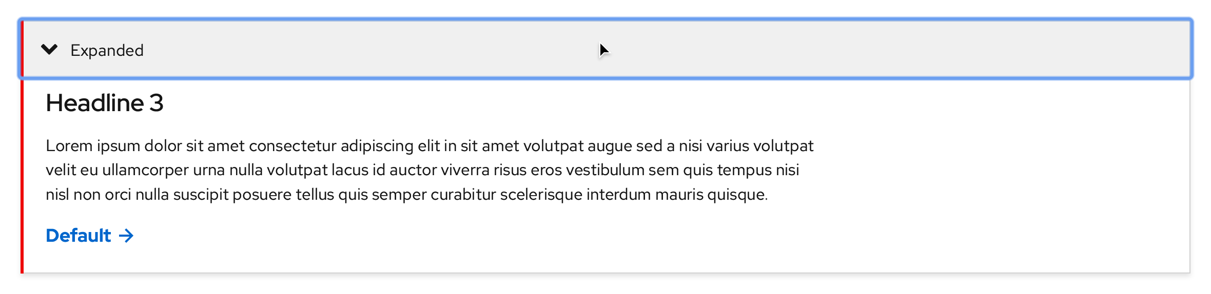
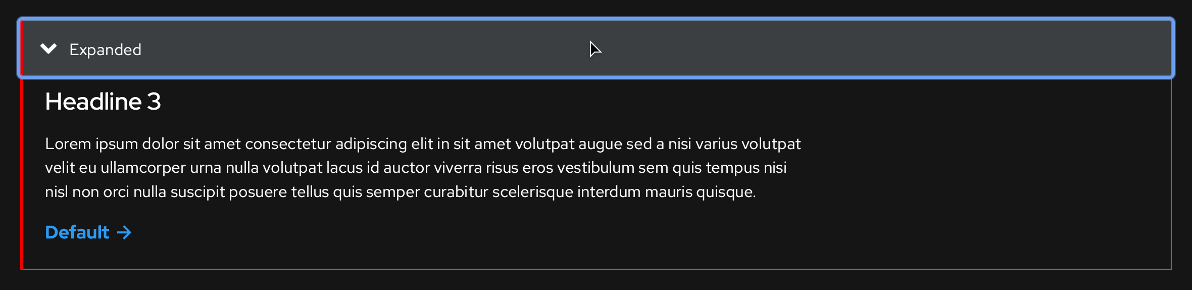
Focus
A focus indicator is added around the entire panel background.

Hover
Changes the panel background color to #f0f0f0.

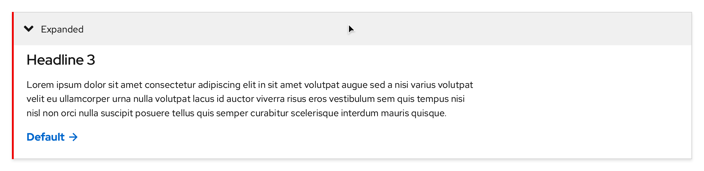
Active/Pressed
A focus indicator is added around the entire panel background and the background color remains the same as the Hover state.


Dark theme, Collapsed
Default

Focus
A focus indicator is added around the entire panel background.

Hover
Changes the panel background color to #3c3f42.

Active/Pressed
A focus indicator is added around the entire panel background and the background color remains the same as the Hover state.

Breakpoints
Light theme
https://xd.adobe.com/spec/3e62e93c-8338-4f31-5040-3b81f0ed5c71-4853/screen/26f7f59a-7dbe-45b4-9e7d-8883fe22d4c2/Disclosure-light-theme-overflows
Desktop
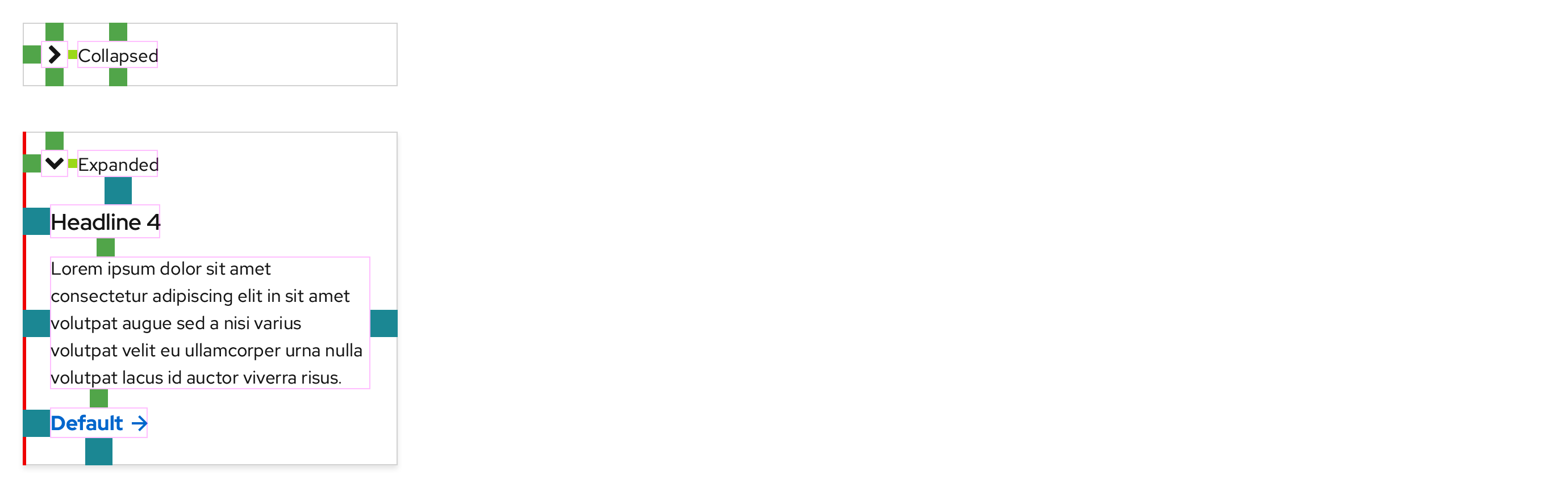
If a text box is used, the max width is 750px in large breakpoints like Desktop and Tablet.
Tablet, landscape

Tablet, portrait

Mobile, landscape

Mobile, portrait
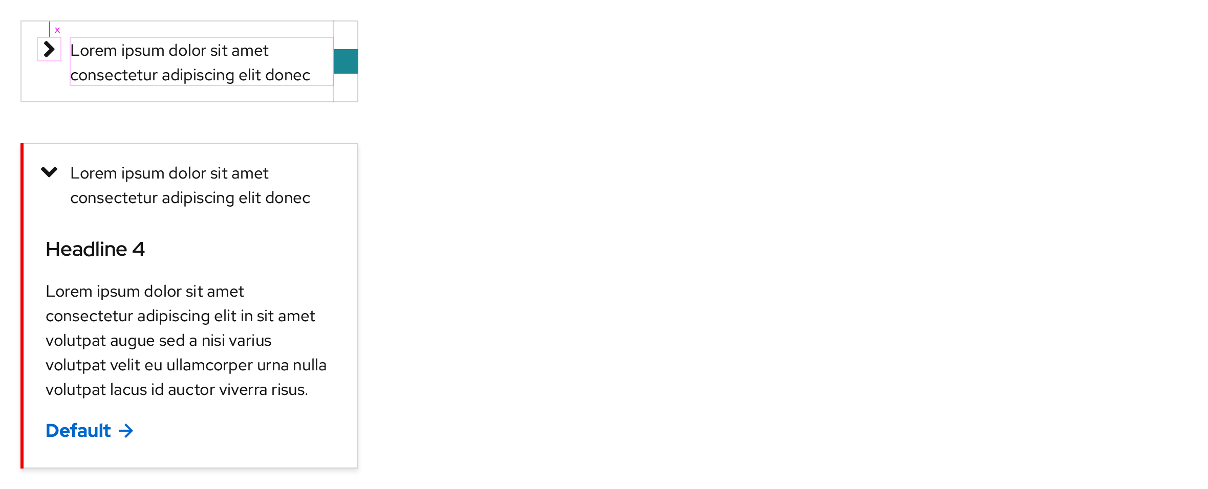
Text labels that are written longer will break to two lines in all breakpoints.
Dark theme
https://xd.adobe.com/spec/3e62e93c-8338-4f31-5040-3b81f0ed5c71-4853/screen/ecef1a5e-af9d-493b-9b74-20e5ee7e61c4/Disclosure-dark-theme-overflows
Desktop
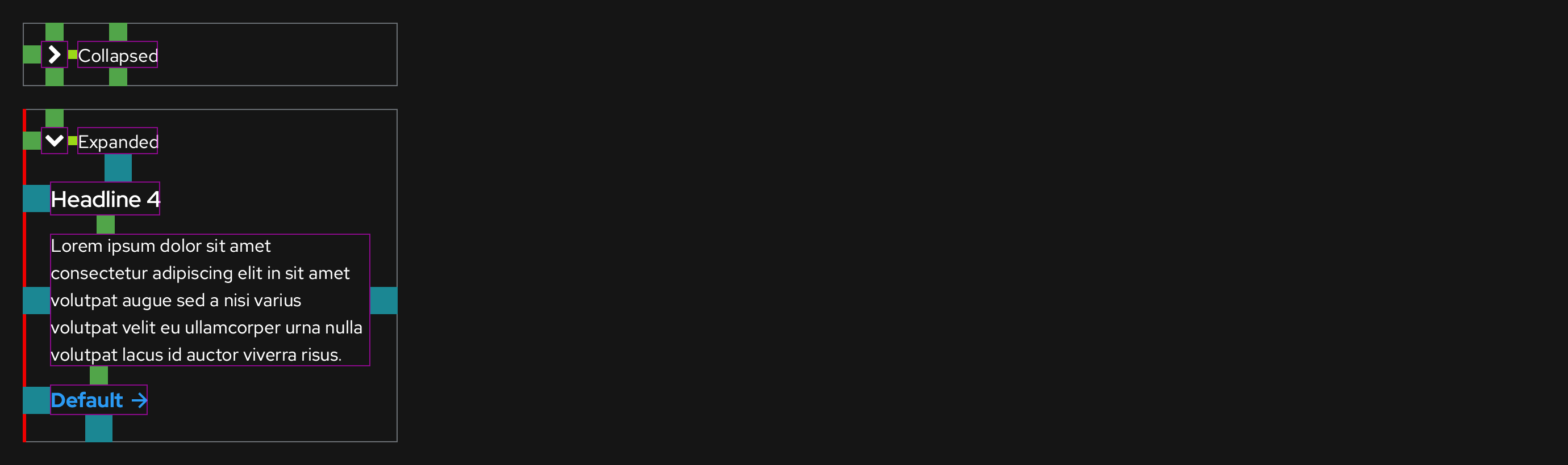
If a text box is used, the max width is 750px in large breakpoints like Desktop and Tablet.
Tablet, landscape

Tablet, portrait

Mobile, landscape

Mobile, portrait
Text labels that are written longer will break to two lines in all breakpoints.
Accessibility
If the Disclosure is collapsed:
| Key | Interaction |
|---|---|
| Tab | Focuses the entire panel background |
| Enter or Space | Expands the Disclosure |
If the Disclosure is expanded:
| Key | Interaction |
|---|---|
| Tab | Focuses the next interactive element in the tab order |
| Shift + Tab | Focuses the previous interactive element in the tab order or the panel background |
| Enter or Space | Activates the focused interactive element or collapses the Disclosure |
| Esc | Collapses the Disclosure and then moves the focus to the panel background |
Usage
Default state
- Disclosures should always appear on screen as Collapsed when the page or the parent component loads
Placing Disclosures on backgrounds
Light backgrounds
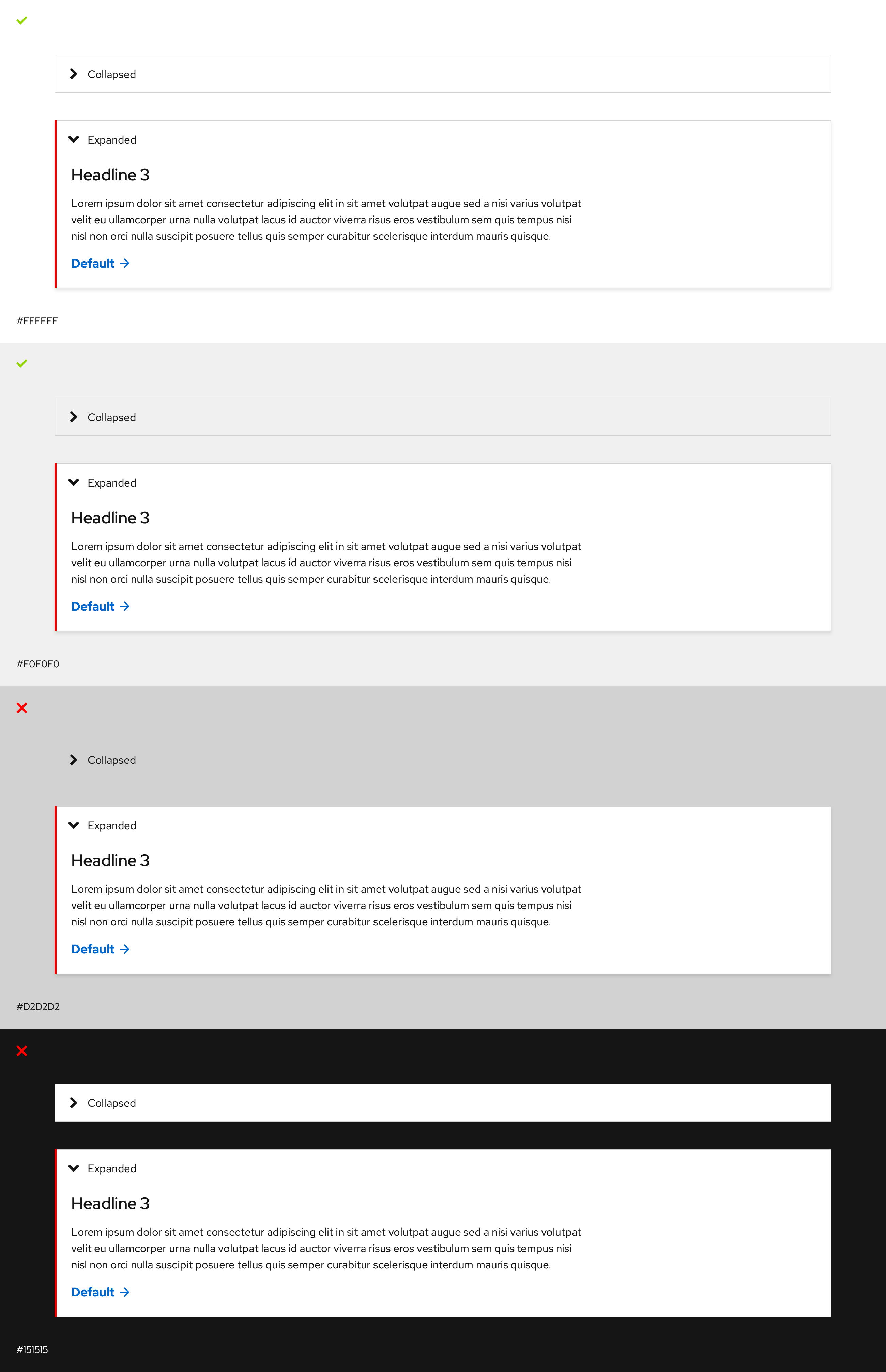
Guidelines
- Use on white or light gray backgrounds only
- Don't use on backgrounds that are the same color or darker than the border color
- Switch themes if it's used on an opposing background color
Dark backgrounds
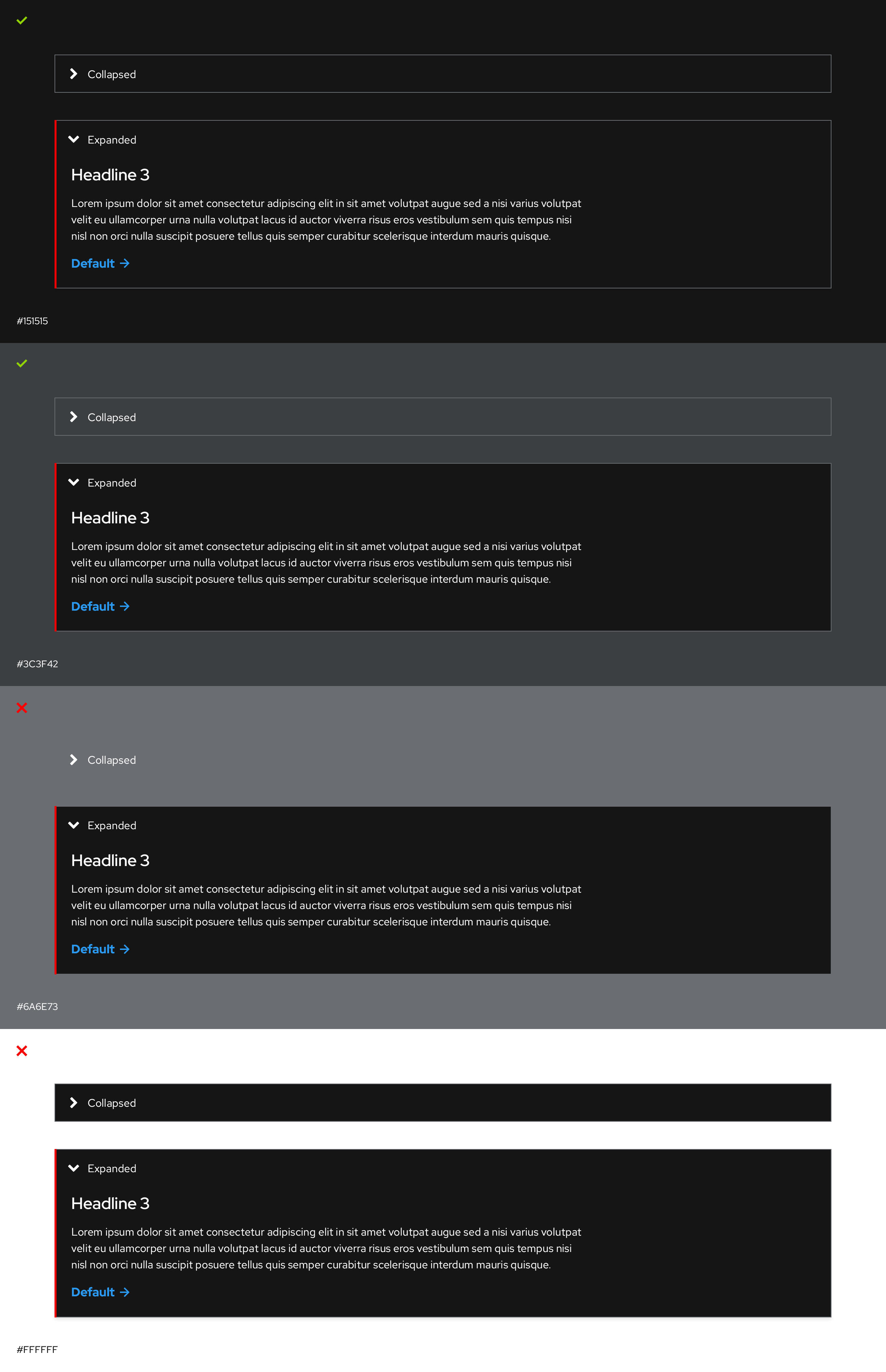
Guidelines
- Use on black or dark gray backgrounds only
- Don't use on backgrounds that are the same color or lighter than the border color
- Switch themes if it's used on an opposing background color
Spacing
Light theme
Desktop
Mobile
Dark theme
Desktop
Mobile
Spacing legend https://www.patternfly.org/v4/design-guidelines/styles/spacers
@starryeyez024 Since PatternFly doesn't have a Disclosure component, I was advised to change the name of our Disclosure component to pfe-expandable to map closer to their Expandable section component. I have already made this change in the design kit and I'm working on edits to ux.redhat.com. However, the styles will remain the same.
https://www.patternfly.org/v4/components/expandable-section/
Hey @coreyvickery, thanks for relaying this. We may want to bring together a meeting of the minds before we change names of existing components, because of the complexities therein. As you know we already have <pfe-accordion disclosure> .
That being said, we could explore the idea further of adding support for <pfe-expandable> or maybe an attribute called expandable on the accordion. Just for background context (if I remember correctly), we were trying to make it easier for developers to easily switch back and forth with as few markup adjustments as possible. For example, in the most basic version of the accordion (1 header, 1 panel) there are 6 instances where it says the name of the tag, so they'd have to change all of them from "accordion" to "expandable", vs. adding 1 attribute.
<pfe-accordion>
  <pfe-accordion-header>
  <h3>This is a disclosure</h3>
  </pfe-accordion-header>
  <pfe-accordion-panel>
  <p>Lorem ipsum dolo  a rebum.</p>
  <p>Stet clita kasd gubergren .</p>
  </pfe-accordion-panel>
</pfe-accordion>
There is also some handy logic baked-in, which makes this easier for developers not to have to do any guesswork. From the readme:
If
pfe-accordionhas onepfe-accordion-header, it will get tagged withdisclosure="true". This applies a slightly different set of styles: chevron appears on the left side, the header has a single border on all four sides. Applyingdisclosure="false"to apfe-accordionelement containing only one header/panel pairing will set the element to display as a standard accordion.
We could easily add support for the attribute name expandable as an alias for disclosure, if that's the way we decide to go. I think we chose the wording "disclosure" because that had more meaning when it comes to semantics & accessibility.
- https://developer.mozilla.org/en-US/docs/Web/HTML/Element/details.
- https://accessuse.eu/en/disclosure-widgets.html
Ok that's my brain dump! Happy to discuss more or have others chime in here.
Lots of +1 for Kendall's feedback above. I'll add, one workaround possible is to create a pfe-expandable component that is basically a wrapper for <pfe-accordion disclosure>. Both continue to work and styles continue to live in 1 place which is a better developer experience.
@starryeyez024 @castastrophe Thank you both for that information, I don't think we need to change anything. I will alert the PatternFly team that we need to keep the name Disclosure for marketing use cases for all of the reasons outlined here.
@castastrophe Are there other issues where the implementation for this is still being worked on or where can I see the latest web component?
@coreyvickery can you confirm styles are now correct, and if so close this issue? https://patternflyelements.com/elements/pfe-accordion/demo/
@starryeyez024 Not quite, but close. If you scroll up, you can see what the correct interaction states should look like, we pulled some of them from what PatternFly is doing.
https://www.patternfly.org/v4/components/accordion